Understanding SHAP importance in experiment training
SHAP importance offers important insight about the predictions created in experiments. It can help you understand which features are the most important to the prediction.
SHAP values represent how much each feature contributes to the predicted value of the target, given all the other features of that row.
After training an experiment version, select a model. The SHAP importance chart in the Models tab below the table visualizes the SHAP data from the model predictions created on the holdout (test) data.
SHAP importance is available for the following experiment types:
-
Binary classification
-
Multiclass classification
-
Regression
This help topic focuses on SHAP importance in experiment training. For information about SHAP importance datasets generated during a prediction, see Generating SHAP datasets during predictions.
Overview
SHAP importance is measured at row level. It represents how a feature influences the prediction of a single row relative to the other features in that row and to the average outcome in the dataset. The value has both direction and magnitude, but for model training, SHAP importance is represented in absolute value form.
In the SHAP importance chart, the row-level values are aggregated. This lets you understand feature influence within subsets of data.
Binary classification and regression experiments
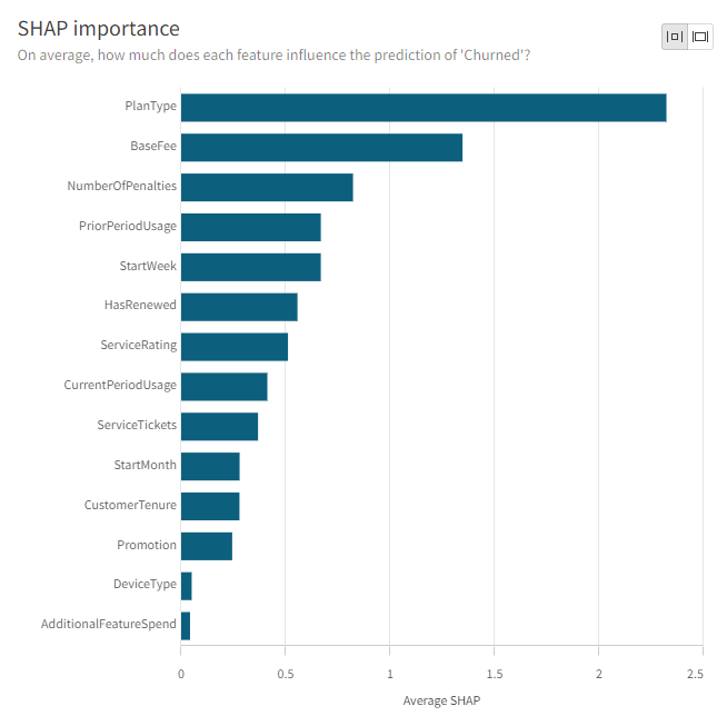
In a binary classification or regression experiment, the SHAP importance chart for each model version is a bar chart displaying the average absolute SHAP value for each feature in the experiment. SHAP importance is sorted from highest to lowest value. The chart indicates which features are exerting the most, and least, influence on the predicted outcome of the target, regardless of what that outcome is determined to be.
SHAP importance chart shown when training a binary classification model

Multiclass classification experiments
In a multiclass classification experiment, there are multiple options for the presentation of the SHAP importance chart. There are the following options:
-
Feature SHAP presented as a total
-
Feature SHAP values separated by class
-
Single-class SHAP importance charts
Feature SHAP presented as a total
By default, the SHAP importance chart will be configured with the All classes: Average feature SHAP setting.
This configuration shows the SHAP importance of each feature, regardless of what the predicted outcome of the target is. The features in the chart are sorted by total average absolute SHAP value and are not separated by class.
Feature SHAP values separated by class
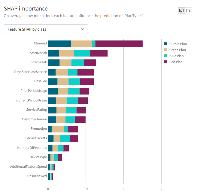
To display how much influence each feature has on the outcome of the target being a value of each class in the experiment, select the Feature SHAP by class setting. The configuration can be set to either Grouped or Stacked. The average absolute SHAP values for each class in the experiment are presented with different colors to allow comparison by class.
For example, let's say the target field in your experiment has four possible classes, or outcomes (Purple Plan, Green Plan, Blue Plan, or Red Plan). The multi-colored bar for each feature will break down how much influence that feature has exerted over each of the four possible outcomes of the experiment. If you look at the total length of the bar, you will see the total influence that the feature has exerted over the prediction of the target, regardless of predicted outcome.
SHAP importance chart for a multiclass classification model (Feature SHAP by class option)

Single-class SHAP importance charts
You also have the option to view a SHAP importance chart for each of the possible outcomes of the target prediction. Average absolute SHAP values for predicted outcomes of a single class are presented.
For example, if your experiment's target has four possible outcomes, you can view four separate charts breaking down the most influential features for predictions resulting in each of the four possible outcomes.
Calculation of SHAP values
SHAP values are calculated for a variety of algorithms. SHAP importance is calculated using two distinct methods:
-
Tree SHAP: A fast and exact method to estimate SHAP values for tree models
-
Linear SHAP: A method to compute SHAP values for linear models
| Algorithm | Supported model types | SHAP calculation method |
|---|---|---|
| Random Forest Classification | Binary classification, multiclass classification | Tree SHAP |
| XGBoost Classification | Binary classification, multiclass classification | Tree SHAP |
| LightGBM Classification | Binary classification, multiclass classification | Tree SHAP |
| CatBoost Classification | Binary classification, multiclass classification | Tree SHAP |
| Logistic Regression | Binary classification, multiclass classification | Linear SHAP |
| Lasso Regression | Binary classification, multiclass classification | Linear SHAP |
| Elastic Net Regression | Binary classification, multiclass classification | Linear SHAP |
| Gaussian Naive Bayes | Binary classification, multiclass classification | SHAP not calculated |
| CatBoost Regression | Regression | Tree SHAP |
| LightGBM Regression | Regression | Tree SHAP |
| Linear Regression | Regression | Linear SHAP |
| Random Forest Regression | Regression | Tree SHAP |
| SGD Regression | Regression | Linear SHAP |
| XGBoost Regression | Regression | Tree SHAP |
Key driver analysis
You can create key driver analyses directly in a Qlik Sense application to compare the importance of particular factors in determining data observed for a particular business or performance metric. Key driver analysis works by calculating SHAP values at the row level for each factor being considered, and displaying them in aggregated form. This provides a high-level view of what is driving trends and behavior in your application data. You can use the results of key driver analyses to enhance your organization's data literacy, and make more informed, effective decisions.
For more information, see Uncovering the key influencers behind your data using key driver analysis.
