Scatter Plot
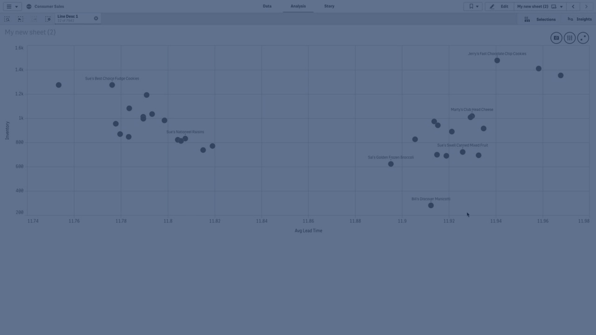
Discover how to craft a Scatter Plot in Qlik Sense with this instructional video. The Scatter Plot enables you to visualize pairs of values from two or three measures, making it ideal for showcasing relationships between different data points. Whether you're exploring the correlation between sales and quantity per customer or examining other numerical relationships, the Scatter Plot provides a clear and intuitive way to analyze your data. Additionally, you can enhance your visualization by incorporating a third measure to determine the size of the data bubbles, further enriching your insights. Unlock the power of Scatter Plots to gain deeper understanding and make informed decisions with your data.