
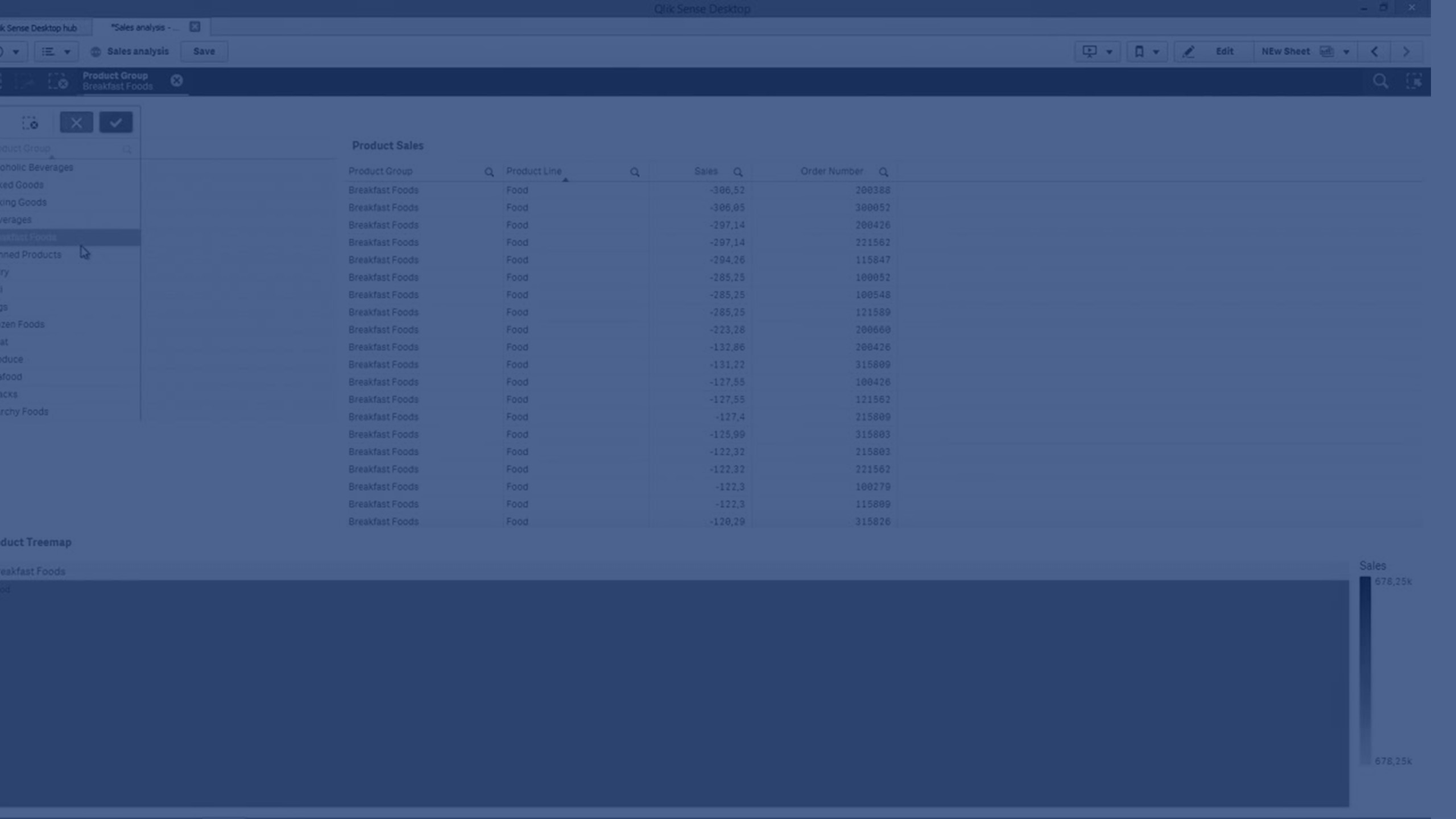
Straight table
The Straight table shows several fields simultaneously, where the content of each row is logically connected. A table can consist of as many dimensions and measures as needed. The Straight table is included in the Visualization bundle.
App creators can add many fields simultaneously, customize the table at the column-level, add alternative dimensions and measures, set column width, apply pagination and turn on chart exploration.
Chart exploration allows users that do not have edit rights to customize the original straight table when they are in analysis mode. These users can add or remove columns, change sort order, re-arrange columns, and make selections. They can then share, download, subscribe, or bookmark the new table layout. The changes made in chart exploration mode by a user are not seen by other users analyzing the sheet.
Straight table in a sheet with chart exploration turned on

When to use it
Use a straight table when you want to view detailed data and precise values rather than visualizations of values. Tables are good when you want to compare individual values. Drill-down group dimensions are very efficient in tables. Within a limited space, you can drill down to the next level of detail and analyze the updated measure values. Use this table when you want users to be able to create custom tables in analysis mode.
Advantages
You can filter and sort the table in different ways. Many values can be included in a table, and when you drill down in a table, you make good use of the limited space on the sheet. A table is excellent when you want to see exact values rather than trends or patterns. Tables are an easy way to export data into other programs.
Disadvantages
If the straight table contains many values, it is difficult to get an overview of how values are related. It is also hard to identify an irregularity within the table.
Best practices for optimizing tables
If a table has too many dimensions and measures, it may load slowly. As a best practice, add the majority of your fields and expressions as Alternative columns. This encourages users to add only the fields they need using chart exploration.
You can also increase performance by ensuring a table has 10 columns or less.
Tables that extract fields from a single data source will perform better than tables that contain fields from multiple data sources.
Creating a straight table
You can create a straight table on the sheet you are editing.
Do the following:
- In the assets panel, open Custom objects > Qlik Visualization bundle and drag a Straight table object to the sheet.
- Click Add columns to add items to the table. A dropdown will open:
- Fields & master items: Opens a searchable dialog box displaying every field and master item. You can choose to add any item as a dimension or measure.
- Custom expression: Opens a dialog box where you can type in an expression, or open the expression editor
 .
.
- In the properties panel, under Data, click
 to add more dimensions or measures to the table.
When you have created the table, you may want to adjust its appearance and other settings in the properties panel.
Working with table items
Do the following:
-
Under Columns and Alternative columns, click the checkbox next to any item and then
 to perform actions such as cut, paste, and delete. Click the checkbox next to Columns or Alternative columns to select all items in the list. Use the arrow icons to move items between each section. Information noteAlternative columns are columns that users can choose to add to the table when using Using chart exploration.
 -
To change the column order, click
 next to a field or expression and drag the item .
 -
Click on an item name to open its individual properties. Here you can change the label, set a background color for the column, control text alignment, set column width, and more.
Information noteIf Text alignment is set to Auto, column data is aligned according to data type: text values are left-aligned and number values, including date related values, are right-aligned. If you set it to Custom, you can align the data to the left, center, or right.
Data tab in the properties panel when a straight table is selected. The Customer field was clicked, so related dimension properties are displayed on the left.

Sorting the table
You can adjust the sorting of the table in several ways:
- Column sorting: Adjust the order of the dimensions and measures from left to right .
- Row sorting: Adjust the sorting priority order of the rows.
- Internal sorting: Use the internal sorting order of dimensions and measures.
- Interactive sorting: During analysis, you can click on a column header to sort the table.
Column sorting
By default, the order in which columns are sorted is set by the order in which dimensions and measures are added to the table. If you add the measure Sales first, it is presented first (leftmost) in the table. The next dimension or measure that is added is presented in the second column, and so on. The column sorting order can be changed in the properties panel, under Columns.
Row sorting
By default, rows are sorted by the first added dimension or measure, numeric values descending, text values ascending. A small arrow under the column header shows by which column the table is sorted.
You can change the row sorting in the properties panel, under Sorting. Drag the dimensions and measures to change the sorting priority order. In many cases, sorting is not only affected by the first dimension or measure in Sorting, but also the following ones.
Example:
In the following screenshot, the rows are first sorted by Customer, then by Month, and then by Product Type. As you can see, the columns Customer and Month have several rows with the same values (A-2-Z Solutions and Month). The rows in Product Type are ordered alphabetically, but only those that were sold in January to the customer A-2-Z Solutions are displayed.

By changing the sorting order, so that secondary sorting is by Product Type, followed by Month, all Product Type items sold to the customer A-2-Z Solutions are presented in alphabetical order, whereas only the months when they were sold are displayed under Month.

Internal sorting
Each dimension and measure has a default (Auto) internal sorting order, which can be changed. Under Sorting, click the item you want to change and click the button to switch to Custom sorting. Changes made to the internal sorting of an item may not have any effect if the sorting is in conflict with an item with higher priority.
Interactive sorting
During analysis, you can set which column to sort on by clicking the column header. The first click sorts the table according to the default sorting of the selected item. A second click reverses the sorting order. Interactive sorting is session based and is not saved. If you want your changes to the sorting to be persistent, you need to make the changes in the properties panel.
Users with the ability to edit the sheet can sort interactively using chart exploration, click Edit sheet, and save those changes to the original table.
Working with add-ons
Straight tables have the following options under Add-ons in the properties panel:
Data handling:
- Include zero values: When unselected, measures that have the value ‘0’ are not included in the presentation. If there is more than one measure value, all the measure values must have the value ‘0’ to be excluded from the presentation.
-
Calculation condition: Specify an expression in this text field to set a condition that needs to be fulfilled (true) for the object to be displayed. The value may be entered as a calculated formula. For example: count(distinct Team)<3. If the condition is not fulfilled, the message or expression entered in Displayed message is displayed.
A calculation condition is useful when a chart or table is slow to respond due to a large amount of data. You can use the calculation condition to hide an object until the user has filtered the data to a more manageable level by applying selections. Use the Displayed message property to guide the user to filter the data.
Styling the straight table
Straight tables have the following options under Appearance in the properties panel:
General
-
Show titles: On by default in all visualizations except filter panes, KPIs, and text & image visualizations.
Enter Title, Subtitle, and Footnote. By default, the string is interpreted as a text string. However, you can also use the text field for an expression, or a combination of text and expression. An equals sign (=), at the beginning of a string shows that it contains an expression.
Click
if you want to create an expression by using the expression editor. Information noteTitles are displayed on a single line. If you inject line breaks they will be ignored. -
Show hover menu: Turn this toggle on if you want the hover menu to display in the visualization.
- Show details: Set to Show if you want to allow users to be able to choose to view details, such as descriptions, measures, and dimensions.
- Show expressions: Set to Show if you want to allow users to be able to choose to view expressions.
Alternate states
State: Set the state to apply to the visualization. You can select:
- Any alternate state defined in Master items.
- <inherited>, in which case the state defined for the sheet is used.
- <default state>, which represents the state where no alternate state is applied.
For more information about alternate states, see Using alternate states for comparative analysis.
Presentation
-
Styling: You can change the styling of the table by clicking on
 Styling. You can reset your styles by clicking
  .
.-
General: Style your visualization with the following settings:
-
Title: Set the font, emphasis style, font size, and color for the title in this visualization.
-
Subtitle: Set the font, emphasis style, font size, and color for the subtitle in this visualization.
-
Footnote: Set the font, emphasis style, font size, and color for the footnote in this visualization.
-
-
Chart: Customize the styling of the table, overriding the app theme. You can add custom header, content font sizes, row height (in lines), and colors. You can set rows to be highlighted when hovered over and set colors for the row and font.
-
- Totals:
- Auto: The totals (the result of the expression), are automatically included at the top of the table.
- Custom: Select whether to display the totals and where to display them, at the top or bottom.
- Totals label: Set the label for the totals row. You can also use an expression as a label.
- Use pagination: Instead of displaying all rows at once, only a certain amount of rows are displayed. Users can use the arrow buttons at the bottom of the table to navigate.
Using chart exploration
Chart exploration allows app consumers and other users that do not have edit rights to customize the original straight table when they are in analysis mode. It is available in the ![]() menu under
menu under ![]() Chart exploration.
Chart exploration.
App consumers and viewers can use chart exploration to add or remove columns from a table, re-sort columns, change column width, and apply selections. You cannot change the size or layout of the entire table on the sheet in chart exploration mode.
Chart exploration mode is a great way to quickly remove or add data, and then share it, download it, or bookmark the new table state. It is very helpful in apps that have many viewers with different needs. The chart exploration panel is not shown in the resulting table that you have shared or downloaded.
If you customize a table using chart exploration mode, other users cannot see your changes, unless you save them as a public bookmark. This means that several users can alter the same table, at the same time. Your changes will remain visible to you if you refresh your browser page, but will be lost if you log out or your session times out. If this occurs, the table will return to its default state, as set by the person who created the straight table. If you want to save your table layout, create a bookmark. For more information, see Creating bookmarks.
Users with the ability to edit the sheet can make changes to the table using chart exploration, click Edit sheet, and save those changes to the original table.
App developers can turn on Chart exploration in the properties panel:
-
Enable chart exploration: Toggle this on to allow chart exploration.
-
Visibility option:
-
Auto: Chart exploration panel is visible when users open the sheet.
-
Minimized: Chart exploration is turned on, but not visible when users open the sheet. Users can open it in the hover menu by clicking
and then  Chart exploration.
-
For a table item to be available in chart exploration mode, the table creator (or a user who can edit the sheet) must have added those fields, master items, or expressions to the table as columns or alternative columns. For more information, see Working with table items.
Chart exploration of a straight table. The table has three columns: Customer, Region, City.

Chart exploration of the same table as above, but with two measures added to the table: Sales and Cost. The background colors are the result of an expression.

Limitations
Number of rows displayed
If pagination is turned on, you can only display 100 rows at a time. If pagination is turned off, you can display up to 250 000 rows at a time. If your table has more that 250 000 rows, pagination will be applied.
Because huge tables are impractical and hard to manage, the limit for what is practical is far less than the theoretical maximum. In most cases, it is desirable to see all the columns without scrolling horizontally.
Accessibility
The straight table is only fully accessible if pagination if turned on. For more information on keyboard navigation, see Keyboard navigation and shortcuts.