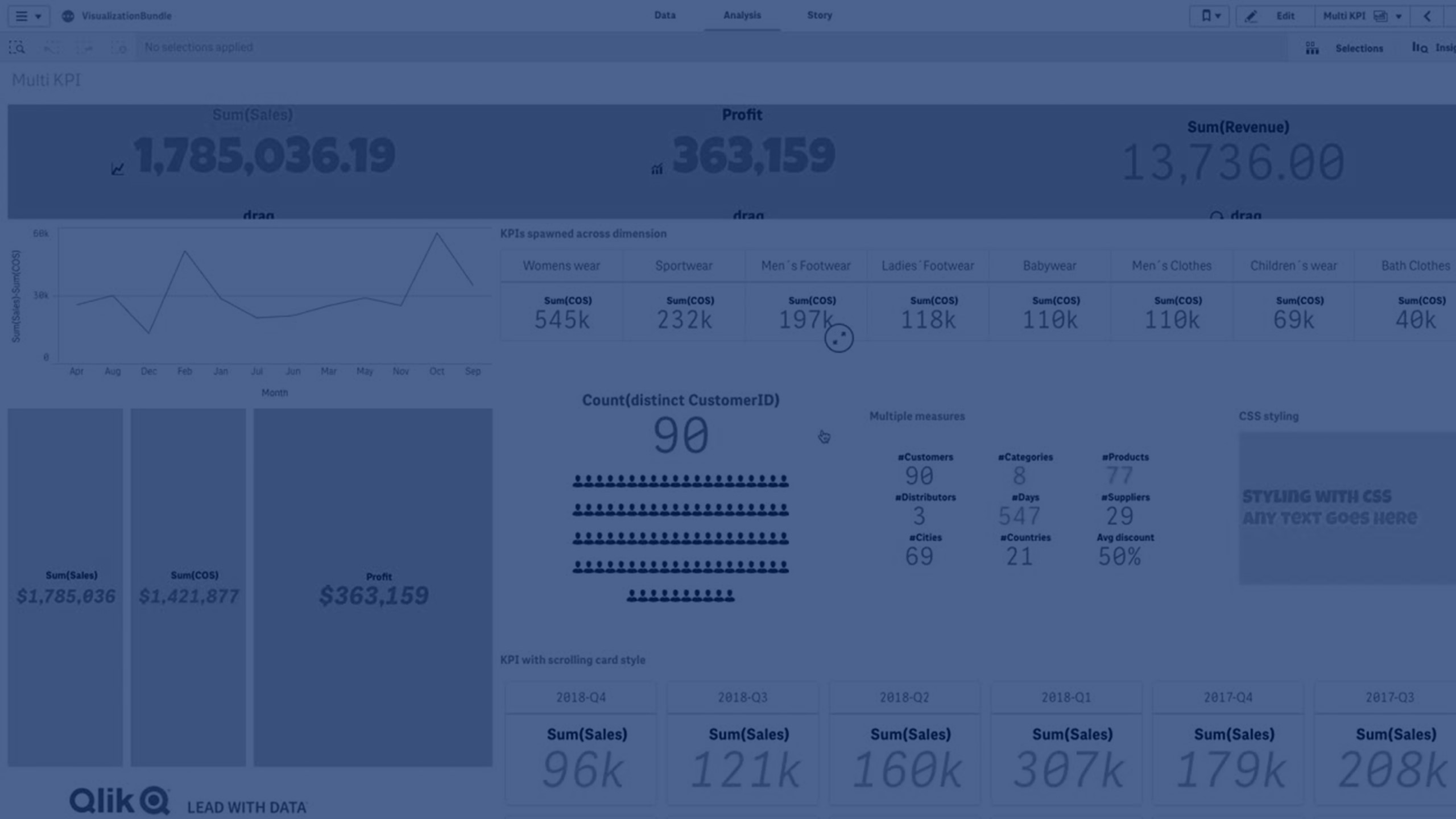
Multi KPI chart
The Multi KPI chart (Multi KPI) is a visualization that allows you to show multiple KPI values for different dimension values. The values can be individually customized using various conditional formatting settings. This enables an easy view and tracking of goals. It is included in the Visualization bundle.
The Multi KPI will no longer be available in the assets panel for creation of new charts as of April 5, 2025 on Qlik Cloud and the May 2025 release of Qlik Sense Client-Managed. It will still function on dashboards where it was previously added, but will be fully removed in November 2025 for Qlik Cloud and the November 2025 version of Qlik Sense Client-Managed.
- The chart shows KPIs using measures and one dimension.
-
Up to 15 measures and 80 values can display simultaneously.
- All KPI values can be grouped or displayed individually.
- Each value can be independently customized using for example, colors, icons, labels, font sizes, alignments, styles, links to different sheets, etc.
-
The chart supports adding graphics, embedding objects into a chart and to display measures infographically.

When to use it
The multi KPI chart is useful when you want to easily view, understand and track the performance of your goals. It is also helpful when you want to customize individual KPI values using conditional formatting. You can link KPIs to separate sheet and insert objects to represent information or data.
Creating a multi KPI chart
You can create a multi KPI chart on the sheet you are editing.
Do the following:
- In the assets panel, open Custom objects > Visualization bundle and drag a Multi KPI object to the sheet.
- Click the Add measure button and select the main measure of the KPI chart. The main measure and a KPI value for the chosen measure is displayed.
- Click Add under Data > Dimensions in the property panel and select dimension.
When you have selected measure and dimension, a multi KPI chart is displayed.
Example:

Adding additional measures
You can add additional measures to your chart in property panel under Data > Dimensions. The chart updates to reflect the added measures. Up to 15 measures and 80 values can display simultaneously. The main measure is always the top measure listed for each dimension. When you add more measures, they appear under the initial KPI value in the order they are entered.
Example:

Customizing the KPIs
You can customize your KPI values and measures with one or more conditional settings. You can add several KPIs together, group them and link to different sheets. You can also configure KPI values independently by differentiating them with one or more conditional settings such as text, color, icons, graphics, etc.
For conditional settings options, see Customizing your KPIs.
Limitations
For information about general limitations, see Limitations.
Multi KPI charts cannot be used in Qlik NPrinting reports.
