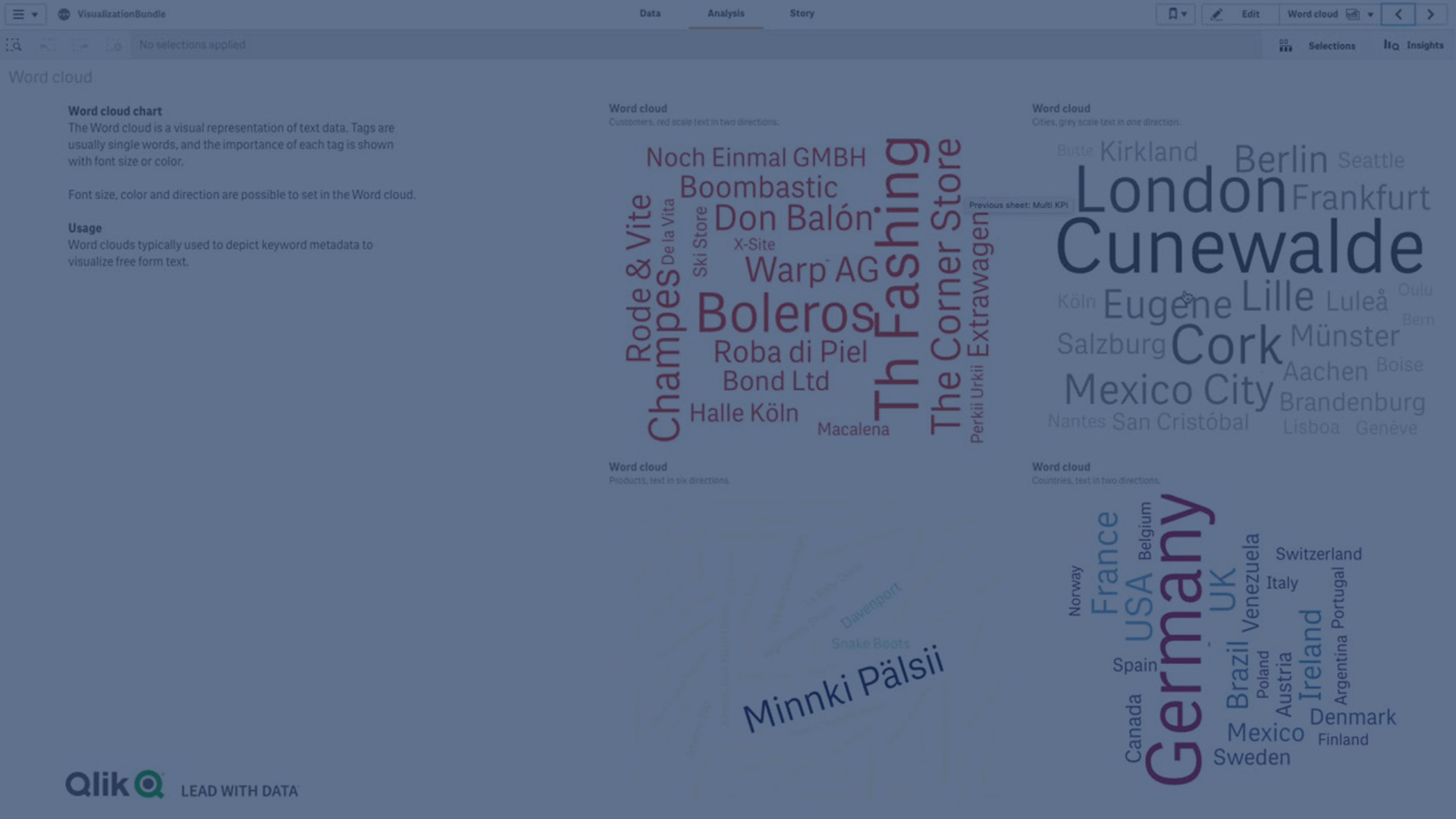
Word cloud chart
The Word cloud chart (Word cloud chart) lets you visualize text data. Text values are displayed with their size based on a measure value. The measure can be anything you want to measure against, for example: times used, alphabetically, by importance, or by context. You can customize your chart with different shapes, fonts, layouts, and color schemes. It is included in the Visualization bundle.
A word cloud chart displaying food items in different sizes and colors.

Requirements
Word cloud charts must have one dimension and one measure.
When to use it
A word cloud chart lets you visualize and identify the importance of a value against a measure. The more important the value is against the measure, the larger it displays in the cloud.
Creating a word cloud chart
You can create a word cloud on the sheet you are editing.
Do the following:
- In the assets panel, open Custom objects > Visualization bundle and drag a Word cloud chart object to the sheet.
- Click the Add dimension button and select the dimension.
- Click the Add measure button to select the measure of the chart.
Once a dimension and a measure have been selected, the word cloud chart displays automatically.
Changing the appearance of the word cloud
You can customize your word cloud with one or more features.
Changing the orientation
You can set the number of orientations with Appearance > Design > Orientations in the properties panel. You can set an integer from 1 to 10.
- 1 will display all words in the same direction, set with Appearance > Design > Start angle.
- 2 will display words in two orientations, Appearance > Design > Start angle and Appearance > Design > End angle.
- 3-10 will display words in the same number of orientations between Appearance > Design > Start angle and Appearance > Design > End angle.
Example:

Adjusting the start and end angles
You can adjust the starting point (angle) parameter of the word cloud under Appearance > Design > Start angle, and the end point under Appearance > Design > End angle in the properties panel. The angles can have positive or negative numbers.
Changing font size
You can set maximum word font sizes under Appearance > Design > Font max size and the minimum under Appearance > Design > Font min size in the properties panel.
If you set a large font size, this can result in the larger words not being displayed in the chart as they do not fit.
Changing scale
The word could chart scale can be either in linear or in log scale. Select scale Linear or Log under Appearance > Design > Scale in the properties panel. Only positive values can be used for the log scale. Zero or negative values return nothing.
Setting custom ranges
You can also specify a range of colors or select from a predefined color scheme.
Do the following:
- Click Appearance > Design in the properties panel.
- Ensure that the Enable color range is set to On (default).
- Click the color palette beside From, and choose a color.
- Click the color palette beside To, and choose a color.
You can set your own color range by clicking the easel symbol in the color palette, and selecting a color. You can also enter a color code string in the field next to the easel symbol. The colors should be valid CSS colors.
Do the following:
- Click Appearance > Design in the properties panel.
- Move the Enable custom range slide button to the left to turn the option off.
-
Select a color scheme under Scale color.

Formatting numbers
It is possible to format the measure value. Different formatting can be applied to the same value, for example as money, date, duration. The chart updates to reflect the changed number type.
Do the following:
- Click Data > Measures in the properties panel and click a measure.
- Select applicable number formatting form the Number formatting menu.
- Enter details in the panel fields. These display when choosing an option other than Auto when further configuring the chart.
Limitations
For information about general limitations, see Limitations.
- The word cloud chart can handle maximum of 100 words per entry.
- Words that take up more space than the chart are not displayed. You can adjust the font size to show more values, but we do not recommend that you use fields with long text values.
- Word cloud charts cannot be used in Qlik NPrinting reports.

