Creating combo charts
This section describes how to create combo charts with the Visualization API and qlik-visual.
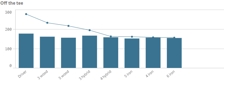
Creating a basic combo chart
In this example we want to create a basic combo chart, containing one dimension and two measures, and with a custom title. The chart applies custom sorting.
- Create the chart
Create the container for the chart. The visualization type is combochart.
Visualization API
app.visualization.create(
  'combochart',
  [],
  {}
)
qlik-visual
<qlik-visual appid="Tutorial-Golf.qvf" type="combochart" cols='[]' options='{}' > </qlik-visual> - Define the dimension
Define the dimension as a column. In this example we use a calculated dimension that does not include null values: "qNullSuppression": true.
[ { "qDef": { "qFieldDefs": [ "=If(Par<>3,TClubName)" ], "qFieldLabels": [ "Tee club" ] }, "qNullSuppression": true } ] - Define measures
Define the measures as columns. The first measure is to be presented as a bar on the primary axis: "series": { "type": "bar","axis": 0}. The second measure is to be presented as a line on the primary axis: "series": { "type": "line","axis": 0}.
[ { "qDef": { "qFieldDefs": [ "=If(Par<>3,TClubName)" ], "qFieldLabels": [ "Tee club" ] }, "qNullSuppression": true }, { "qDef": { "qLabel": "Avg", "qDef": "Avg(DrDist)", "series": { "type": "bar", "axis": 0 } } }, { "qDef": { "qLabel": "Max", "qDef": "Max(DrDist)", "series": { "type": "line", "axis": 0 } } } ] - Define sorting for the dimension
We want to sort the dimension values based on an expression: "qSortCriterias": [ { "qSortByExpression": -1, "qExpression": { "qv": "Max(DrDist)" } } ], "autoSort": false.
[ { "qDef": { "qFieldDefs": [ "=If(Par<>3,TClubName)" ], "qFieldLabels": [ "Tee club" ], "qSortCriterias": [ { "qSortByExpression": -1, "qExpression": { "qv": "Max(DrDist)" } } ], "autoSort": false }, "qNullSuppression": true }, { "qDef": { "qLabel": "Avg", "qDef": "Avg(DrDist)", "series": { "type": "bar", "axis": 0 } } }, { "qDef": { "qLabel": "Max", "qDef": "Max(DrDist)", "series": { "type": "line", "axis": 0 } } } ] - Define the title in the options{ "showTitles": true, "title": "Off the tee" }
Result
Code examples
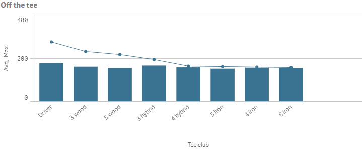
Presentation and color settings
In this example we want to change the way the combo chart is presented by adding data points and changing the color used.
- Show data points
Start by showing data points, which is defined in the options.
{ <!--Show data points--> "dataPoint": { "show": true } } - Color settings
In this example we want to define a single color to be used. The colors used are set in the color object. Disable automatic colors ("auto": false) and set that a single color will be used: "mode": "primary". Then define the color in the paletteColor object: "paletteColor": { "index": -1, "color": "#3a7391" }.
Information noteColor legends are automatically disabled when single color mode is used.{ <!--Show data points--> "dataPoint": { "show": true }, <!--Single color: "#3a7391"--> "color": { "auto": false, "mode": "primary", "paletteColor": { "index": -1, "color": "#3a7391" } } }
Result
Code examples
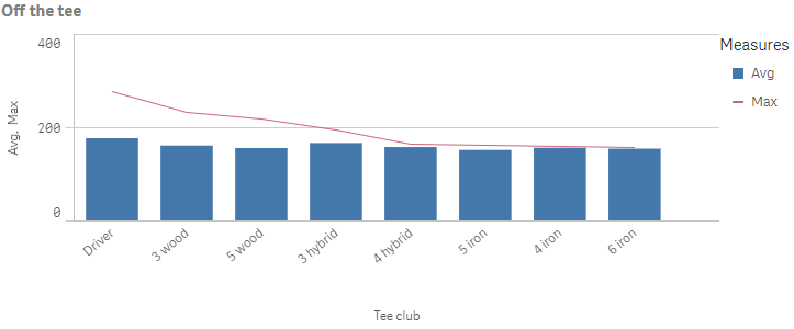
Dimension and measure axis settings
In this example we want to do some changes to how the dimension axis and the measure axes are presented.
- Dimension axis
Dimension axis settings are set in the dimensionAxis object. This example display labels only on the dimension axis.
Set to display labels only on the dimension axis: "show": "labels".
/*Dimension axis: show labels only*/ "dimensionAxis": { "show": "labels" } - Measure axis
Measure axis settings are set in the measureAxes object. This example uses narrow spacing and display labels only on the measure axis.
Set to display labels only on the measure axis: "show": "labels". Then set narrow scaling: "spacing": 0.5.
The measureAxes object contain two measure axes: one for the primary and one for the secondary axis. Since both measures are displayed on the primary axis, changes done to the first axis apply for both measures.
/*Dimension axis: show labels only*/ "dimensionAxis": { "show": "labels" },/*Measure axis: show labels only, narrow scale*/ "measureAxes": [ { "show": "labels", "dock": "near", "spacing": 0.5, "autoMinMax": true }, { } ]
Result
Code examples
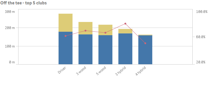
Stacked bars, line on secondary axis and dimension limits
In this example we create a combo chart containing one dimension and three measures, where the first two measures are displayed as stacked bars on the primary axis and the third measure is displayed as a line on the secondary axis.
- Define the dimension and dimension limit
Define the dimension as a column. This example uses the same dimension as in the previous examples but with some alterations.
Now we want to display only the top five results based on the first measure. So we set "qOtherMode": "OTHER_COUNTED" and we then define "qOtherCounted": {"qv": "5"}. We do not want to show an others value, so we set "qSuppressOther": true.
Information noteIf qSuppressOther is not defined, the last value in the visualization (colored gray), summarizes all the remaining values and the value counts as 1 in that setting. In this example, the third value would be Others.Since we want to show the top (highest) five values we set "qOtherSortMode": "OTHER_SORT_DESCENDING" to sort the values in descending order.
"qOtherTotalSpec": { "qOtherMode": "OTHER_COUNTED", "qOtherCounted": { "qv": "5" }, "qSuppressOther": true, "qOtherSortMode": "OTHER_SORT_DESCENDING" } - Define the first measure
Define the measures as columns.
The first measure is displayed as a bar on the primary axis: "series": { "type": "bar", "axis": 0 }. Note the custom numeric formatting defined in qNumFormat.
{ "qDef": { "qLabel": "Typical", "qDef": "Median(DrDist)", "qNumFormat": { "qType": "F", "qFmt": "#,##0 m" }, "numFormatFromTemplate": false, "series": { "type": "bar", "axis": 0 } } } - Define the second measure
The second measure is also displayed as a bar on primary axis: "series": { "type": "bar", "axis": 0 }. Note the custom numeric formatting defined in qNumFormat.
{ "qDef": { "qLabel": "Max", "qDef": "Max(DrDist)-Median(DrDist)", "qNumFormat": { "qType": "F", "qFmt": "+#,##0" }, "numFormatFromTemplate": false, "series": { "type": "bar", "axis": 0 } } } - Define the third measure
The third measure is displayed as a line on the secondary axis: "series": { "type": "line", "axis": 1 }. Note the custom numeric formatting defined in qNumFormat.
{ "qDef": { "qLabel": "FIR%", "qDef": "Avg(FwHit)", "qNumFormat": { "qType": "F", "qFmt": "0.0%" }, "numFormatFromTemplate": true, "series": { "type": "line", "axis": 1 } } } - Some general settings
Group the first two measures as stacked bars: "barGrouping": { "grouping": "stacked" }.
Add a title to the visualization: "title": "Off the tee - top 5 clubs". Then we want to show data points on the line: "dataPoint": { "show": true }.
The dimension axis should show labels only: "dimensionAxis": { "show": "labels", "dock": "near" }.
- Define the measure axes
The measureAxes object contain two measure axes: one for the primary and one for the secondary axis. Since this example display measures on both the primary and secondary axis, changes done to the first axis apply for the first and second measure, and changes done to the second axis apply for the third measure.
Set to display labels only on the both measure axes: "show": "labels". Then set narrow spacing: "spacing": 0.5 for the primary axis and medium spacing: "spacing": 1 for the secondary axis. On the secondary axis we set a custom range where we define both the minimum value and the maximum value: "autoMinMax": false, "minMax": "minMax", "min": 0.2, "max": 1.
"measureAxes": [ { "show": "labels", "dock": "near", "spacing": 0.5, "autoMinMax": true }, { "show": "labels", "dock": "far", "spacing": 1, "autoMinMax": false, "minMax": "minMax", "min": 0.2, "max": 1 } ]
Result