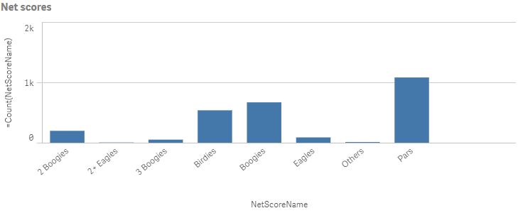
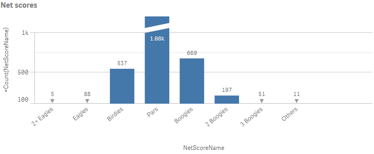
Bar charts
The bar chart is suitable for comparing multiple values. The dimension axis shows the category items that are compared, and the measure axis shows the value for each category item.
You can make more complex comparisons of data by using grouped or stacked bars. With grouped bars, you can easily compare two or more items in the same categorical group. Stacked bars combine bars of different groups on top of each other and the total height of the resulting bar represents the combined result.
The bar chart can be displayed horizontally or vertically.
Number of columns (dimensions and measures)
In a bar chart you need at least one dimension and one measure. The following maximum limits apply:
- 1 dimension, 15 measures
- 2 dimensions, 1 measure
- 1 measure, 2 dimensions
- 2-15 measures, 1 dimension
Columns (dimensions and measures)
Default settings for a bar chart
The following default behaviors apply for bar charts:
-
The first dimension is by default alphabetically sorted if the dimension has exactly ten or less than ten values, and numerically sorted if the dimension has more than ten values.
-
The second dimension is automatically sorted on the dimension content:
- Numeric content is numerically sorted.
- Categorical content is alphabetically sorted.
- If the bar chart contains more than one dimension, it is auto-colored by the second dimension.
- Measures are by default numerically sorted, in ascending order.
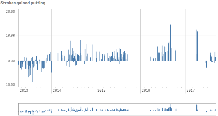
Scrolling and mini chart
When the number of dimension values exceeds the width of the visualization, a mini chart with a scroll bar is displayed. You can scroll by using the scroll bar in the mini chart, or, depending on your device, by using the scroll wheel or by swiping with two fingers. When a large number of values are used, the mini chart no longer displays all the values. Instead, a condensed version of the mini chart (with the items in gray) displays an overview of the values, but the very low and the very high values are still visible.
Out of range
You can set a limit for the measure axis range. Without a limit, the range is automatically set to include the highest positive and lowest negative value, but if you set a limit you may have values that exceed that limit. A bar that exceeds the limit will be cut diagonally to show that it is out of range.
When a reference line is out of range, an arrow is displayed together with the number of reference lines that are out of range.
"measureAxis": {
  "show": "labels",
  "dock": "near",
  "spacing": 1,
  "autoMinMax": false,
  "minMax": "minMax",
  "min": 40,
  "max": 75
}
Display limitations
When displaying large amounts of data in a stacked bar chart, there may be cases when not each dimension value within a bar is displayed with correct color and size. These remaining values will instead be displayed as a gray, striped area. The size and total value of the bar will still be correct, but not all dimension values in the bar will be explicit.
To remove the gray areas, you can either make a selection or use dimension limits.
The approximate limit for how many stacked bars that can be displayed without gray areas is 5000 bars, assuming that each bar consists of 10 inner dimension values and one dimension value and one measure value for the whole bar.
The initial data load is 500 dimension values or dimension stacks. (The value 500 refers to the outer dimension values, not each dimension value in a stack.) When you have scrolled past those 500 values, an incremental load is performed, where values are instead loaded based on the current view or scroll position.
Time-aware charts
Time-aware charts are visualizations that use a continuous scale to provide a complete and accurate view of time-based data. That is, when you enable continuous scaling on the x-axis in a chart with date fields, data points are separated from each other by a distance relative to their associated time. As well, the axis labels are evenly separated whether or not there is data for that point and the chart view is compressed to avoid scrolling.
A continuous scale is most commonly used with date fields such as:
- Second
- Minute
- Hour
- Week
- Month
- YearMonth
- Quarter
- YearQuarter
- Year
- Date
- Timestamp