
Waterfall charts
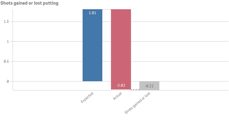
The waterfall chart is suitable for illustrating how an initial value is affected by intermediate positive and negative values. The starting and the final values are represented by whole bars, and intermediate values by floating bars. You can also show subtotals in the chart.
Number of columns (dimensions and measures)
In a waterfall chart you need to use one measure for every bar in the chart. The order of the measures defines the order of the bars in the chart. For each measure, you need to define how it affects the previous value.
Columns (dimensions and measures)
Default settings for a waterfall chart
Most native Qlik Sense chart types are automatically sorted on the dimension content:
- Numeric content is numerically sorted.
- Categorical content is alphabetically sorted.
Defining your measures
You can use the valueType option of each measure to set how it affects the previous value.
-
NORMAL
Corresponds to Measure operation: Add in Qlik Sense.
The measure value adds to the previous bar. If this is the first measure, a whole bar is shown starting at 0.
-
INVERSE
Corresponds to Measure operation: Subtract in Qlik Sense.
The measure value subtracts from the previous bar.
Information noteIf the data already contains a negative sign, the result of subtraction will be a positive change. -
SUBTOTAL
Corresponds to Measure operation: Subtotals in Qlik Sense.
The measure value is considered a subtotal.
Tip noteIf you do not have sub-totals as a field, you can add subtotals automatically by enabling Subtotals in the measure before you want the subtotal.