
Distribution plots
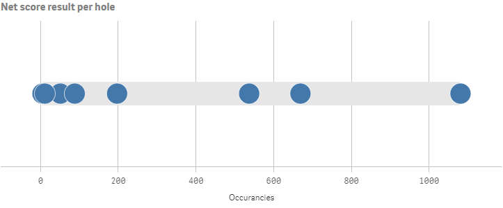
The distribution plot is suitable for comparing range and distribution for groups of numerical data. Data is plotted as value points along an axis. You can choose to display only the value points to see the distribution of values, a bounding box to see the range of values, or a combination of both.
Number of columns (dimensions and measures)
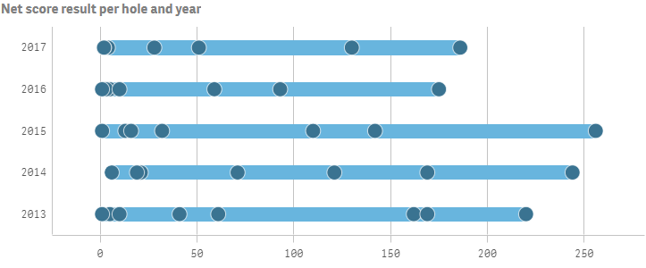
In a distribution plot you need to use one or two dimensions, and one measure. If you use a single dimension you will receive a single line visualization, as in the image above. If you use two dimensions, you will get one line for each value of the second, or outer, dimension, as in the example below.
Columns (dimensions and measures)
Default settings for a distribution plot
Most native Qlik Sense chart types are automatically sorted on the dimension content:
- Numeric content is numerically sorted.
- Categorical content is alphabetically sorted.