Line charts
The line chart is used to show trends over time. The dimension is always on the x-axis, and the measures are always on the y-axis. The orientation cannot be changed to vertical.
A line chart can also be displayed as an area chart.
Number of columns (dimensions and measures)
In a line chart you need at least one dimension and one measure. The following table shows the maximum limits. The following maximum limits apply:
- 1 dimension, 15 measures
- 2 dimensions, 1 measure
- 1 measure, 2 dimensions
- 2-15 measures, 1 dimension
When using more than three measures the chart may be difficult to interpret.
Columns (dimensions and measures)
Default settings for a line chart
Most native Qlik Sense chart types are automatically sorted on the dimension content:
- Numeric content is numerically sorted.
- Categorical content is alphabetically sorted.
In addition, the following default settings are applied for line charts:
- Sets the hypercube mode (qMode) to S or DATA_MODE_STRAIGHT if the hypercube contains one dimension.
- Sets the hypercube mode (qMode) to K or DATA_MODE_PIVOT_STACK if the hypercube contain two dimensions.
Scrolling and mini chart
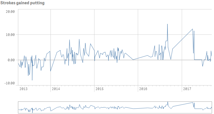
When the number of dimension values exceeds the width of the visualization, a mini chart with a scroll bar is displayed. You can scroll by using the scroll bar in the mini chart, or, depending on your device, by using the scroll wheel or by swiping with two fingers. When many values are used, the mini chart no longer displays all the values. Instead, a condensed version of the mini chart (with the items in gray) displays an overview of the values, but the very low and the very high values are still visible.
Out of range
You can set a limit for the measure axis range. Without a limit, the range is automatically set to include the highest positive and lowest negative value, but if you set a limit you may have values that exceed that limit. When a data point value cannot be displayed, due to the range limits, an arrow indicates the direction of the value.
When a reference line is out of range, an arrow is displayed together with the number of reference lines that are out of range.
Display limitations
When displaying large amounts of data in a line chart, the message "Currently showing a limited data set." is shown to indicate that not all data is displayed. The approximate limit for the number of data points that can be displayed in a line chart is 10000. Above that number, data points are neither displayed, nor included in selections made in the line chart.
To avoid displaying limited data sets, you can either make a selection or use dimension limits in the properties panel.
The initial data load is 500 dimension values or dimension stacks. (The value 500 refers to the outer dimension values, not each dimension value in a stack.) When you have scrolled past those 500 values, an incremental load is performed, where values are instead loaded based on the current view or scroll position.
Time-aware charts
Time-aware charts are visualizations that use a continuous scale to provide a complete and accurate view of time-based data. That is, when you enable continuous scaling on the x-axis in a chart with date fields, data points are separated from each other by a distance relative to their associated time. As well, the axis labels are evenly separated whether or not there is data for that point and the chart view is compressed to avoid scrolling.
A continuous scale is most commonly used with date fields such as:
- Second
- Minute
- Hour
- Week
- Month
- YearMonth
- Quarter
- YearQuarter
- Year
- Date
- Timestamp