Gauges
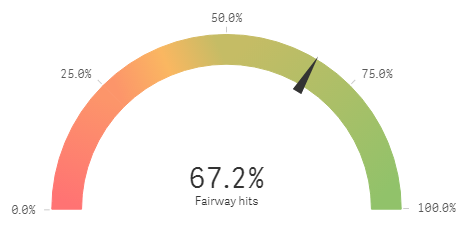
The gauge is designed to show a single measure value and visualize how to interpret that value.
The gauge is often used to present KPIs, for example, on an executive dashboard, and together with segmenting and color coding, it is an effective way of illustrating a performance result.
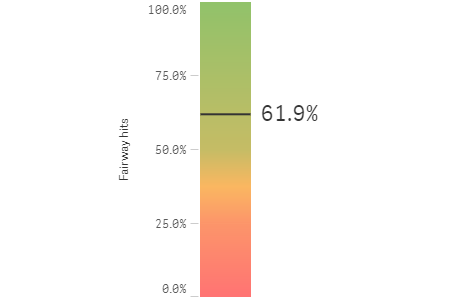
It is important to set relevant max and min values to support the interpretation of the value. You can use a reference line to provide additional context.
Default settings for a gauge
The following settings are used by default in a gauge:
- A radial gauge.
- A single (blue) color.
- Range limits: min (0), max (100).
- No segments.
- Label and title are displayed.
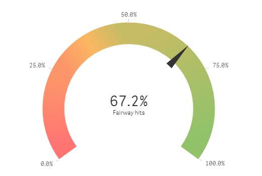
You can change the radial gauge to a bar.
With segments, another color is introduced. You can set the color for each segment.
You can use expressions for the range limits. When a measure value is outside the range limits, an arrow indicates whether the measure value is higher or lower than the range values.
Number of columns (dimensions and measures)
In a gauge you can only have one measure and no dimensions.
Columns (dimensions and measures)
Gauge types
Gauges can be displayed as a radial or as a bar. This is defined by the gaugetype property in the options.
Arc sizes
The arc size can be changed by setting the angle property in the options. All gauges created with Qlik Sense by default sets "angle": 0.7 which means that 70 per cent of the arc is displayed. If you set "angle": 0.5, half of the arc is displayed, as in the example below.