Coloring your visualizations
Qlik Sense automatically colors visualizations as they are added to your web pages. You can manually set the colors in your visualizations to meet your requirements or preferences.
Overview
Not all Qlik Sense visualizations support the same coloring options. Additionally, some visualization types have specific behaviors or limitations when using certain coloring methods. Color methods supported by visualizations and their limitations are determined primarily by the kinds of data the visualizations displays. For example, visualizations that only support displaying measures cannot be colored by dimension or through using master dimensions.
The following table outlines color method support by visualization type.
| Visualization type | Single color | Multicolor | By dimension | By measure | By expression |
|---|---|---|---|---|---|
| Mode | "mode": "primary" | "mode": "byMultiple" | "mode": "byDimension" | "mode": "byMeasure" | "mode": "byExpression" |
| Bar chart |
|
|
|
|
|
| Box plot |
|
- | - | - | - |
| Combo chart |
|
|
|
|
|
| Distribution plot |
|
- | - | - | - |
| Gauge |
|
- | - | - | - |
| Histogram |
|
- | - | - | - |
| KPI |
|
|
- | - | - |
| Line chart |
|
|
|
|
|
| List box | - | - | - | - | - |
| Pie chart |
|
|
|
|
|
| Pivot table | - | - | - | - |
|
| Scatter plot |
|
- |
|
|
|
| Table | - | - | - | - |
|
| Treemap |
|
|
|
|
|
| Waterfall chart |
|
- | - | - | - |
Coloring limitations and behaviors
Different visualizations have different behaviors with the methods of setting color in visualizations. This section outlines specific considerations when coloring different visualizations.
Line charts
Line charts do not support coloring by measure if they have two or more dimensions.
The color object
Most color options for visualizations are set in the color object in the options. You activate custom coloring by setting "auto": false which turns off auto-coloring.
If "auto": true, no other properties need to be defined in the color object.
The following parameters can be set in the color object:
Color by single color
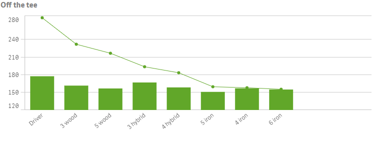
When you color by single color, one color is used for all objects in the chart. Coloring by a single color is best used for visualizations, such as bar or line charts, with a single dimension and measure.
You color by single color by setting "mode": "primary". You then define the color in the paletteColor object, see paletteColor (object).
Example: single custom color
Color by multiple colors
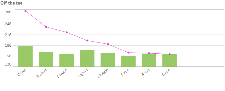
When you have multiple measures in a visualization, you can set "mode": "byMultiple" to color each measure with a different color. Qlik Sense offers a 12-color and a 100-color palette to apply to the visualization in the dimensionScheme property.
- 12: 12 colors where all can be distinguished by people with vision deficiency.
- 100: 100 colors where not all can be distinguished by people with vision deficiency
By default, 12 colors is selected as the color scheme dimensions.
Example: color by multiple colors
Color by dimension
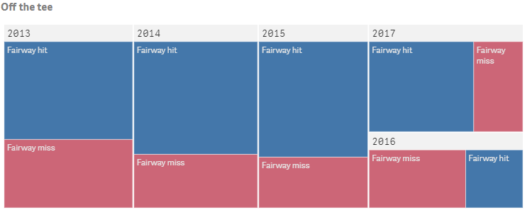
When you color a visualization by a dimension, all values in the visualization are colored by the corresponding values in the dimension field selected. You set "mode": "byDimension" to color by dimension. You define the dimension to color by in the byDimDef object. Qlik Sense offers a 12-color and a 100-color palette to apply to the visualization in the dimensionScheme property.
- 12: 12 colors where all can be distinguished by people with vision deficiency.
- 100: 100 colors where not all can be distinguished by people with vision deficiency
By default, 12 colors is selected as the color scheme dimensions.
You can set "persistent": true which means that colors persist between selection states. If "persistent": false, colors will be changed and reassigned for different dimension values as selections are made in the visualization.
byDimension can only be used in conjunction with an attribute on the dimension to color by, as shown in the example below.
Example: color by dimension
Color by measure
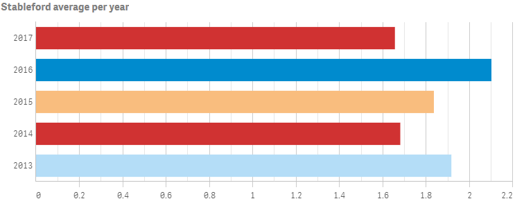
When you color a visualization by a measure, all values in the visualization are colored by a gradient or class based on the values in the selected measure. Coloring by measure is useful when you want to clearly see objects colored by their corresponding measure value.
You set "mode": "byMeasure" to color by measure. You then have four available color schemes that you define in the measureScheme property.
- sg: (sequential gradient) the transition between the different color groups is made using different shades of colors. High measure values have darker hues
- sc: (sequential classes) the transition between the different color groups is made using distinctly different colors.
- dg: (diverging gradient) used when working with data that is ordered from low to high, for instance, to show the relationship between different areas on a map. Low and high values have dark colors, mid-range colors are light.
- dc: (diverging classes) can be seen as two sequential classes combined, with the mid-range shared. The two extremes, high and low, are emphasized with dark colors with contrasting hues, and the mid-range critical values are emphasized with light colors.
You can reverse the color scheme by setting "reverseScheme": true which switches which colors are used for low values and which colors are used for high values in the selected color scheme.
You can define a custom measure value range by setting "autoMinMax": false. You then define measureMin and/or measureMax depending on how you want to set the range.
| Name | Type | Description |
|---|---|---|
| autoMinMax | Boolean |
Set to false to define custom color range. Custom color range is only applicable when coloring is by measure ("mode": "byMeasure") or by expression ("mode": "byExpression"). When coloring is by expression, "expressionIsColor": "false" must be set for custom color range to work. Default: true |
| measureMin | Value Expression Container |
Set the min value for the color range. Only applicable if autoMinMax: false. Can be used in conjunction with measureMax or by its own. |
| measureMax | Value Expression Container |
Set the max value for the color range. Only applicable if autoMinMax: false. Can be used in conjunction with measureMin or by its own. |
Example: color by measure
Color by expression
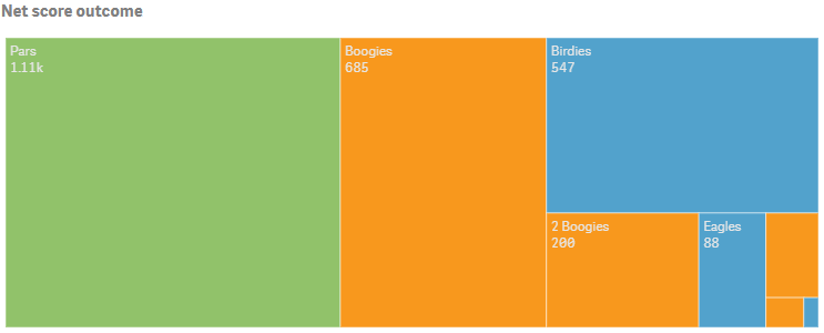
Coloring by expression applies colors to a visualization based on a user-defined expression. This enables you to use expressions to define both the colors used and the values upon which the colors are applied in a visualization. You could, for example, use an expression to set conditional colors in a chart.
Supported formats for color expressions are: RGB, ARGB, and HSL.
You set "mode": "byExpression" to color by expression. Details are then defined in the expressionIsColor, expressionLabel and colorExpression properties.
byExpression can only be used in conjunction with an attribute expression on the first measure, as shown in the example below.
Example: color by expression
Color by expression in tables and pivot tables
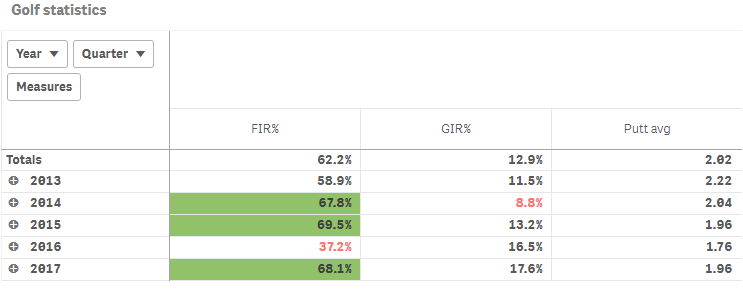
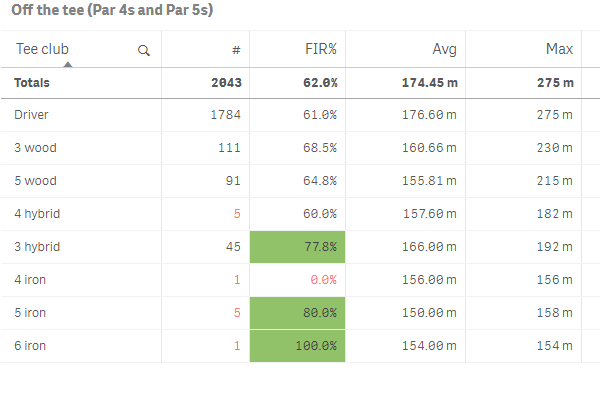
Expressions can be used to color table and pivot table backgrounds and text. This enables you to use expressions to define both the colors used and the conditional values upon which the colors are applied in a visualization. You could, for example, use expressions to change text and background colors depending on the values within different table cells.
Cell background color in straight tables
Cell background color is applied as an attribute expression on the applicable column measure with "id": "cellBackgroundColor".
Text color in straight tables
Text color is applied as an attribute expression on the applicable column measure with "id": "cellForegroundColor".
Using both background color and text color in a straight table column
When defining both background color and text color for a measure, you include two definitions in the attribute expression .
Cell background color and text color in pivot tables
The qAttributeExpressions property behaves differently in pivot tables compared to in straight tables. For pivot tables, it consists of two arrays, where the first array is for defining the background color and the second array is for defining the text color. There is therefore no need to define "id": "cellBackgroundColor" or "id": "cellForeroundColor" for pivot tables.
