
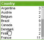
The list box is the most basic sheet object. It contains a list of all possible values of a specific field. Each row in the list box can represent several records in the loaded table, all with identical values. Selecting one value may thus be equivalent to selecting several records in the loaded table.
A list box may also contain a cyclic or drill-down group. If a drill-down group is used, selecting a single value in the list box will cause the list box to drill down and switch to the next underlying field in the group. Drilling back up can be accomplished by clicking the drill-up icon in the list box caption.
If a cyclic group is assigned to a list box it can be made to show the next field in the group by clicking on the cycle icon that appears in the list box caption. You may also go directly to any field in the group by using the Cycle option on the list box object menu.
Right-click on the list box to display the Object menu.
The list box Object menu is opened by right-clicking the object. The menu commands are:
| Command | Description |
|---|---|
| Properties... | Opens the List Box Properties dialog where a number of parameters can be set. |
| Notes |
Allows creating and sharing notes about the current object. |
| Cycle |
Only available when the list box is set to display a cyclic group. Opens a cascade menu with the fields of the group for direct selection of which field to be displayed in the list box. For more information, see Non-hierarchic groups (cyclic) |
| Search |
Opens the search box. For more information, see Search |
| Fuzzy Search |
Opens the text search box in fuzzy search mode. For more information, see Fuzzy Search |
| Advanced Search |
Opens the advanced search dialog. The dialog makes it possible to enter advanced search expressions. This command can also be invoked by the following keyboard shortcut: Ctrl+Shift+F. For more information, see Advanced Search dialog |
| Order |
This cascade menu is only available when the Design Grid command of the View menu is activated or when the Always Show Design Menu Items under User Preferences: Design is checked. It contains four commands to set the layout layer of the sheet objects. Valid layer numbers are -128 to 127.
|
| Change Value | Only available for list boxes displaying input fields. Sets the cell clicked on in input edit mode. Equivalent to clicking the input icon in the cell. |
| Restore Values |
Only available for list boxes displaying input fields. Opens a cascade menu with three options:
|
| Select Possible | All non-excluded values in the list box are selected. |
| Select Excluded | All excluded values in the list box are selected. |
| Select All | All values in the list box are selected. |
| Clear | Clears all the current selections in the active list box. |
| Clear other fields | Clears the selections in all the other sheet objects, while maintaining the ones in the current list box. |
| Lock | Locks the selected value(s) in the active list box. (Grayed if no selections have been made). |
| Unlock | Unlocks the locked value(s) in the active list box. (Appears instead of Lock if selections have been locked). |
| Create Quick Chart... |
Opens the Quick Chart wizard that helps you create a chart in a quick and easy way. For more information, see Quick Chart Wizard |
| Create Time Chart... |
Opens the Time Chart that makes it possible to build a chart where a given measure (expression) should be qualified and often compared by different time periods. For more information, see Time Chart Wizard |
| Create Statistics Box | Performs various statistical calculations on selected values of a field (sample) and displays the results in a statistics box. |
| Print Possible... |
Opens the Print dialog where print settings can be specified. All non-excluded values of the active list box are sent to the printer. For more information, see Print: General |
| Print Possible as PDF... |
Opens the Print dialog with the Microsoft Print to PDF printer pre-selected. After pressing the Print button you will be prompted for a file name for the PDF output file. This command is only available if a PDF printer is available on the system. |
| Send to Excel |
Exports possible (including selected) values to Microsoft Excel, which is automatically launched if not already running. The exported values will appear in a new Excel worksheet. For this functionality to work Microsoft Excel 2007 or later must be installed on the computer. Information noteMini charts will not be displayed when exporting to Excel!
|
| Export... | Opens the Save as dialog where path, file name and (table) file type for the exported data content can be specified. |
| Copy to Clipboard |
This cascade menu contains the various copy options for the sheet object.
|
| Linked Objects |
Opens a menu with the following commands for linked objects.
|
| Minimize | Iconizes the object. Clicking on the  icon in the object caption (if shown) produces
the same result. This
command is available only if minimizing is allowed in the object's Properties dialog on the Caption page. icon in the object caption (if shown) produces
the same result. This
command is available only if minimizing is allowed in the object's Properties dialog on the Caption page. |
| Maximize | Enlarges the object to fill the sheet. Clicking on the  icon in the object caption (if shown) produces the same result. This command is available
only if maximizing is allowed in the object's Properties
dialog on the Caption page. icon in the object caption (if shown) produces the same result. This command is available
only if maximizing is allowed in the object's Properties
dialog on the Caption page. |
| Restore | Restores a minimized or maximized object to its previous size and
location. Double-clicking the icon of a minimized object or clicking the  icon in the object caption (if shown) of a maximized object produces
the same result. This command is available only for minimized or
maximized objects. icon in the object caption (if shown) of a maximized object produces
the same result. This command is available only for minimized or
maximized objects. |
| Help | Opens QlikView help. |
| Remove | Removes the sheet object from the sheet. |
The List box Properties: General tab is opened by a right-click on a list box and choosing the Properties command in the float menu. Here it is possible to set general parameters of the list box.
| Parameter | Description |
|---|---|
| Title |
The text to appear in the list box caption. The default text is the name of the selected field. The title can also be defined as a calculated formula for dynamic update of the label text. Click the ... button to open the Edit Expression dialog for easier editing of long formulas. For more information, see Expression syntax for calculated formulas |
| Field | Select a field from the list. The list box
will contain the values of the selected field. A list box may instead display a cyclic or drill-down group. Only one field will be shown at a time, though. Such groups are created from the Document Properties: Groups dialog and will be listed with the available fields. If a drill-down group is used, selecting a single value in the list box will cause the list box to drill down and switch to the next underlying field of the group. Drilling back up can be accomplished by clicking the drill-up icon appearing in the list box caption. If a cyclic group is assigned to a list box it can be made to switch to show the next field in the group by clicking on the cycle icon appearing in the list box caption. It is also possible to go directly to any field in the group by using the Cycle-> option on the list box's object menu. Furthermore it is possible to display a calculated field in a list box. A calculated field does not come out of script execution, but is defined from an expression. The same rules applies on Calculated Dimensions. If a calculated field should be used in the list box, select <Expression> in the drop-down after which the Edit Expression dialog will open where it is possible to define the expression describing the calculated field. Use as Title By selecting this check box, the field name will be used as Title. The text <use field name> will appear in the Title edit box. Edit... This button is only available when <Expression> has been selected as a field name. The button opens the Edit Expression dialog where you can define the expression describing the calculated field. For more information, see Calculated fields. |
| And mode |
Multiple selections within a field must be of either AND or OR type. By default, the selection is of OR type. This command toggles the logical mode by which multiple value selections are made. This menu option is disabled if the field does not satisfy certain conditions. This option is not available for calculated fields. |
| Show Alternatives | Toggles whether a selection directly in the active field list box is to exclude the other values of the field or not. If Show Alternatives is checked, all values except the selected value will be displayed as Optional but may become excluded by association with selections in other fields. Otherwise, all other values are shown as excluded by default. This option is not available for calculated fields. |
| Hide Excluded | Toggles whether the excluded values of the field should be shown or not. Excluded values become unselectable as well. |
| Read Only | Checking this option will prevent you from making selections in the list box. However, it will still reflect selections made elsewhere in the document. |
| Always One Selected Value |
Checking this option assures that only one value can be selected, which is useful in documents where the data only makes sense when one value is already selected, such as one currency rate. This option is enabled after one value is already selected in the list box. This option is not available for calculated fields. Information noteEnabling this option modifies the data model. As a result, existing bookmarks may stop working even if you retain the same field names.
|
| Override Locked Field | Checking this option enables selections to be made in the list box even if it is locked. The list box will still be locked for selections made elsewhere in the document. |
| Show as TreeView |
Shows the list box as a tree view. This control is only relevant if the field contains the path representation of nodes in a hierarchy. Such a field can be generated using the Path parameter of the Hierarchy prefix. For more information, see List Box Tree View |
| With Separator | Sets the character that should be interpreted as separator in the path used for the Tree View. |
| Show Frequency | Toggles the status for whether the frequency of a field value is shown or not. By frequency is meant the number of selectable combinations in which the value occurs. This option is not available for calculated fields. |
| In Percent | Toggles the status for whether the frequency should be shown in absolute numbers or as percentages of the total number of entries. |
| Alternate State | Choose one of the available states in the list. The following Alternate States are always available. Inherited: The sheets and sheet objects are always in the inherited state unless overridden by the QlikView developer. This setting is inherited from the object on the level above, a chart in a sheet gets the same settings as the sheet if inherited is chosen. Default state: This is the state where most QlikView usage occurs and is represented by $. The QlikView document is always in the default state. |
| Object ID |
This is used for macro purposes. Every sheet object is assigned a unique ID. We recommend that you use alphanumeric characters only in the ID. For list boxes, the ID starts with LB01. Linked objects share the same object ID. You may edit this ID number later on. For more information, see Internal Macro Interpreter |
| Include Excluded Values in Search | The drop-down list lets you choose between Yes, No or <use default> which applies the default setting as specified under User Preferences: General. |
| Default Search Mode | Specifies the initial default search mode to be used in text searches. The mode can always be changed on the fly by typing * or ~ as part of the search string. The following alternatives are available:
For more information, see Search |
| Print Settings | Here you set the print settings for the print job. |
| Print All Values | The normal print behavior for list boxes is to print only possible values. By marking this check box, all values (also excluded values) will be printed. |
| Layout Dependent Print | By marking this check box, the list box will be printed as it appears on the screen in terms of multiple columns, selection color coding of cells etcetera. This may be useful e g when including list boxes in reports. |
Calculated fields
On the Expressions tab you define expressions to be displayed in the list box. Each expression will be placed in a new column in the list box. The upper left corner of the dialog contains a list of the expressions.
Expression data can also be dynamically formatted by means of attribute expressions. Click on the expansion icon in front of any expression to display the expression’s attribute expressions.
You may choose to use any number and combination of attribute expressions on a given base expression. Formatting defined by means of attribute expression supersede default formatting of the data plots in terms of color etc.
| Command | Description |
|---|---|
| Add | By clicking this button, you get to the Edit Expressions dialog, in which it is possible to create new expressions. This option is also available in the context menu that appears when right-clicking on an expression in the list of expressions. |
| Delete | Deletes the selected expression. The option is also available in the context menu that appears when right-clicking on an expression in the list of expressions. |
| Copy | The option is only available in the context menu that appears when right-clicking on an expression in the list of expressions. When using this command on a main expression, all data and settings associated with the expression (including label) will be copied to the clipboard as a piece of xml. The expression may then be pasted back into the same object or into any other QlikView object in the same or another document. If you use the command on an attribute expression, only the attribute expression definition will be copied. An attribute expression may then be pasted onto any main expression in the same or another object. |
| Export... | The option is only available in the context menu that appears when right-clicking on a main expression in the list of expressions. When using this command on a main expression, all data and settings associated with the expression (including label) may be exported to an xml file. The expression may then be imported back into the same chart or into any other QlikView chart in the same or another document. The command opens the Export Expression as dialog from which you can choose the destination of the export file. The file will receive an extension, for example xml. |
| Paste | The option is only available in the context menu that appears when right-clicking in the list of expressions and only if an expression has previously been copied to the clipboard. If a main expression has previously been copied to the clipboard, you may paste it into the blank area in the list of expressions, creating a new expression identical to the copied one. If an attribute expression has been copied, you may paste it onto a main expression. |
| Import... | The option is only available in the context menu that appears when right-clicking in the blank area in the list of expressions. The command opens a dialog where you can browse to previously exported expressions. The imported expression will appear as a new main expression in the chart. |
| Promote | Promotes the selected expression one step up in the list. Use this button if you want to change the order of the expressions. |
| Demote | Demotes the selected expression one step down in the list. Use this button if you want to change the order of the expressions. |
| Null Symbol | The symbol entered here will be used for displaying NULL values in the table. |
| Missing Symbol | The symbol entered here will be used for displaying missing values in the table. |
| Enable | Marking this check box will enable the selected expression. If the box is not marked, the expression will not be used at all. |
| Definition | Shows the composition of the selected expression. It is possible to edit the expression directly in this box. By clicking the … button the full Edit Expressions dialog is opened. |
| Show | If Always is selected, the expression will always be shown in an extra column in the list box. If Conditional is selected, the expression will be dynamically shown or hidden depending on the value of a condition expression entered in the edit box to the right. |
| Alignment | In this group, the default alignment of your expressions can be set. Text and numbers can be individually set to left-adjusted, centered or right-adjusted. |
| Display Options | This group defines what will be written in the list box expression cells. |
| Representation | The following alternatives are given: Text:When selecting this option the expression values will always be interpreted and displayed as text. Image: When selecting this option QlikView will try to interpret each expression value as a reference to an image. The reference may be a path to an image file on disk (e.g. C:\Mypic.jpg) or inside the QlikView document (e.g. qmem://<Name>/<Peter>). If QlikView cannot interpret an expression value as a valid image reference, the value itself will be displayed. Circular Gauge: When selecting this option QlikView will display the expression value in a circular style gauge. The gauge chart will be inscribed in the available table cell. The visual settings for the gauge can be modified via the Gauge Settings... button. Linear Gauge: When selecting this option QlikView will display the expression value in a horizontal linear style gauge. The gauge chart will be inscribed in the available table cell. The visual settings for the gauge can be modified via the Gauge Settings... button. Traffic Light Gauge: When selecting this option QlikView will display the expression value in a horizontal traffic light style gauge. The gauge chart will be inscribed in the available table cell. The visual settings for the gauge can be modified via the Gauge Settings... button. LED Gauge: When selecting this option QlikView will display the expression value in a LED style gauge. The gauge chart will be inscribed in the available table cell. The visual settings for the gauge can be modified via the Gauge Settings... button. Mini Chart: When selecting this option QlikView will display the expression value in a miniature chart with the expression aggregated over an extra dimension. The chart will be inscribed in the available table cell. The mini chart dimension can be defined and visual settings for the chart can be modified via the Mini Chart Settings button (see below). Information noteThe mini chart will not be displayed when exporting to Excel. |
| Gauge Settings... | Only available when one of the gauge options has been selected above. Opens a dialog for setting the properties of the gauge. This dialog is essentially equal to the Chart Properties: Presentation dialog for gauge charts. |
| Mini Chart Settings | Only available when Mini Chart has been selected as Display Option for an expression in the table. Opens a dialog for setting the properties of the mini chart. |
| Image Formatting | Only available when the image options have been selected above. This setting describes how QlikView formats the image to fit in the cell. There are four alternatives. No Stretch: If this option is selected, the image will be shown as is, without any stretching. This may cause parts of the picture to be invisible or only part of the cell to be filled. Fill: If this option is selected, the image will be stretched to fit the cell without bothering about keeping the aspect ratio of the image. Keep Aspect: If this option is selected, the image will be stretched as far as possible to fill the cell while keeping the aspect ratio. This typically results in areas either on both sides of or above and below which are not filled by the image. Fill with Aspect: If this option is selected, the image will be stretched to fill the cell in both directions while keeping the aspect ratio. This typically results in cropping of the image in one direction. Hide Text When Image Missing: If this option is selected, QlikView will not display the field value text if interpretation as an image reference fails for some reason. The cell will then be left blank. |
Only available when the Mini Charts option has been selected in the Expressions page of a straight table's Properties dialog. Opens a dialog for setting the properties of the mini chart.
| Property | Description |
|---|---|
| Dimension | Choose the dimension for which the expression should be plotted. |
Appearance
| Property | Description |
|---|---|
| Mode | Set the mini chart as sparklines, line with dots, dots, bars or whiskers. |
| Color | Opens the Color Area dialog where the color of the mini chart can be set. |
| Highlight Max Value With Color | Mark the check box and click on the colored button to open the Color Area dialog where the color for the maximum value can be set. |
| Highlight Min Value With Color | Mark the check box and click on the colored button to open the Color Area dialog where the color for the minimum value can be set. |
| Highlight Start Values With Color | Mark the check box and click on the colored button to open the Color Area dialog where the color for the start values can be set. Not available for Bars and Whiskers. |
| Highlight End Values With Color | Mark the check box and click on the colored button to open the Color Area dialog where the color for the end values can be set. Not available for Bars and Whiskers. |
| Set Default Colors | Sets the colors for the highlight settings to QlikView default colors. |
| Force Zero Based Scaling | Fixes the lower edge of the chart to zero on the axis. Not available for Whiskers. |
| Force Shared Scale for Y-Axis | Forces all cells in the column to use the same y-axis scale. |
You reach the Sort tab by right-clicking a sheet object (List Box, Multi Box, Table Box, Chart or Slider/Calendar object) and choosing Properties from the float menu (or Object, Properties in the main menu). Here you set the sort order of the values in the sheet object. Some sort options may not be available for some sheet objects.
| Sort by: | Result |
|---|---|
| State |
Sorts the field values according to their logical state (selected, optional
or excluded). Information note Do not use Auto Ascending order in a list box inside a Container object.
|
| Expression | Sorts the field values according to the expression entered into the text edit box below this sort option. If using sort by expression, an alternative set of records
must be defined by a set expression, as the expression is calculated on selected/possible values in the list and the sort only would apply to selected/possible values in the list. Information note Sort by expression only works with numeric fields, and not with text fields. |
| Frequency | Sorts the field values by frequency (number of occurrences in the table). |
| Numeric Value | Sorts the field values by numeric value. |
| Text | Sorts the field values in alphabetical order. |
| Load Order | Sorts the field values by the initial load order. |
The Default button sort order sets the default sort order.
The order of priority is State, Expression, Frequency, Numeric Value, Text, Load Order. Each of these sort criteria can be set to Ascending or Descending.
The List Box Properties: Presentation tab is opened by right-clicking on a list box and choosing the Properties command in the float menu. Here it is possible to adjust the layout of the list box cells.
In the Image Options group you can let a field value comprising a reference to an image in memory or on disk be interpreted as that image:
Under Representation you can choose between Text (default), Image and Info as Image.
When you select Image, QlikView will attempt to interpret each field value as a reference to an image. The reference may be a path to an image file on disk (e.g. C:\Mypic.jpg) or inside the qvw document itself (e.g. qmem://<Name>/<Peter>). If QlikView cannot interpret a field value as a valid image reference, the value itself will be displayed, unless the Hide Text When Image Missing box is checked.
When you select Info as Image, QlikView will display image info linked to the field value via info load/info select in the script. If no image info is available for a field value, the value itself will be displayed, unless the Hide Text When Image Missing box is checked.
Provided that either image option is selected, the settings under Image Formatting can be used for fitting the image into the cell.
| Option | Description |
|---|---|
| No Stretch | The image is displayed as is, which may cause masking problems. |
| Fill | The image is stretched in order to fill the cell, without regard to aspect ratio. |
| Keep Aspect | The image is stretched as far as possible while retaining the correct aspect ratio. |
| Fill with Aspect | The image is stretched as far as possible while retaining the correct aspect ratio. Areas not covered are then filled by cropping of the image. |
When images are shown instead of text it may be necessary to use another selection style than the document default so that the logical state of the field values remains visible. Use the drop-down list under Selection Style Override to select a suitable selection style, e.g. Corner Tag.
| Option | Description |
|---|---|
| Single Column | With this option checked, the list box field values will always be presented in a single column. |
| Suppress Horizontal Scroll Bar | Check this option to suppress the horizontal scroll bar that is normally displayed when field values are too wide to for the specified width of the list box. Instead, field values will be truncated as needed. |
| Fixed Number of Columns | Check this option to set a fixed number of columns for the list box. The option is unavailable when Single Column is selected. |
| Order by Column | In list boxes with more than one column, values are displayed row-wise in the sort order specified. The Order by column option switches to column-wise display. |
| Cell Borders | The field values will be separated by horizontal lines, resembling the rows of a table. Cell Borders is automatically activated when the Wrap Cell Text option is checked, but may be subsequently deactivated. |
| Highlight Search Substring |
The search string entered in a search object so far will be highlighted in the matches. |
| Background... | Opens the Background Settings dialog. |
| Alignment | Here you set the alignment of field values in the list box. The alignment of Text and Numbers is set separately. |
| Multiline Settings | In this group the list box cells may be set
to display values in multiple rows, which is useful for long text strings. Wrap Cell Text With this option selected, a cell will display its contents in more than one row. Height n Lines Here the desired limits to the number of cell rows are specified. |
| Setting | Description |
|---|---|
| Color | If this setting is enabled the background of the object will be colored. Choose a color by clicking on the Color button. |
| Color Transparency | Only available when the color option has been enabled. Sets the transparency of the background color. |
| Image | If this setting is enabled, the background of the object will be an image. Click Browse to choose an image. Click Remove to remove it from the background. |
| Image Stretch | Only available when the image option has been enabled. The setting describes how QlikView formats the image to fit. No Stretch: The image will be shown as is, without any stretching. This may cause parts of the image to be invisible or only fill part of the background. Fill: The image will be stretched to fit the background without keeping the aspect ratio of the image. Keep Aspect: The image will be stretched as far as possible to fill the background while keeping the aspect ratio. Fill with Aspect: If this option is selected, the image will be stretched to fill the background in both directions while keeping the aspect ratio. This typically results in cropping of the image in one direction. |
| Horizontal Alignment | Only available when the image option has been enabled. Aligns the image to the Left, Center or Right. |
| Vertical Alignment | Only available when the image option has been enabled. Aligns the image to the Top, Center or Bottom. |
| Image Transparency | Only available when the image option has been enabled. Sets the transparency of the background image. |
Number
The Properties: Number page is opened by right-clicking a sheet object and choosing the Properties command from the float menu.
Each field has a default number format which can be set in the Document Properties: Number page. It is however possible to use a separate number format for an individual sheet object. To do this, check the alternative Override Document Settings and specify a number format in the group control below. This property page applies to the active object and contains the following controls for formatting values:
| Format | Description |
|---|---|
| Mixed | Both numbers and text. Numbers shown in original format. |
| Number | Shows numeric values with the number of digits set in the Precision spinner box. |
| Integer | Shows numeric values as integers. |
| Fixed to | Shows numeric values as decimal values with the number of decimal digits set in the Decimals spinner box. |
| Money | Shows values in the format set in the Format Pattern edit box. An example of this format is shown in the Preview text box. The default format is the Windows Currency setting. |
| Date | Shows values that can be interpreted as dates in the format set in the Format Pattern edit box. An example of this format is shown in the Preview text box. |
| Time | Shows values that can be interpreted as time in the format set in the Format Pattern edit box. An example of this format is shown in the Preview text box. |
| Timestamp | Shows values that can be interpreted as date + time in the format set in the Format Pattern edit box. An example of this format is shown in the Preview text box. |
| Interval | Shows time as sequential time increment (e.g. format = mm shows the value as the number of minutes since calendar start ( 1899:12:30:24:00). |
| Show in Percent (%) | This check box affects the following formats: Number, Integer and Fixed. |
Decimal and Thousand separators can be set in the edit boxes of the Separators group.
The ISO button uses the ISO standard for the formatting of date, time and timestamp.
The System button applies the settings of the system to the formatting.
The Change Document Format button opens the Document Properties: Number page where the default number format of any field can be edited.
Font
Here the Font, Font style and Size of the font to be used can be set.
The font can be set for any single object (Object Properties: Font), or all objects in a document (Apply to Objects on Document Properties: Font).
Further, the default document fonts for new objects can be set on Document Properties: Font. There are two default fonts:
- The first default font (List Boxes, Charts, etc) is used for most objects, including list boxes and charts.
- The second default font (Text Objects and Buttons) is used for buttons and text boxes, which are objects that usually need a larger font.
Finally, the default fonts for new documents can be set on User Preferences: Font.
For charts, buttons and text objects (except search objects) a font Color can also be specified. The color may Fixed or it can be dynamically Calculated from an expression. The expression must be a valid color representation, which is created using the color functions. If the result of the expression is not a valid color representation, the font color will default to black.
Additional settings are:
- Drop Shadow: If this option is checked a drop shadow will be added to the text.
- Underline: If this option is checked the text will be underlined.
A sample of the selected font is shown in the preview pane.
Layout
A Layout setting will apply to the current object only, if it is made
from the Object Properties
page.
A Layout setting will apply to all objects of the specified type(s) in
the document, if it is made from the Document
Properties page.
Use Borders
Enable this setting in order to use a border around the sheet object. Specify the type of border by selecting it in the drop-down menu.
- Shadow Intensity: The Shadow Intensity drop-down menu makes it possible to set the intensity of the shadow that surrounds the sheet objects. There is also the choice of No Shadow.
- Border Style: The following predefined border types are available:
- Solid: A solid unicolored border.
- Depressed: Border giving the impression of depressing the sheet object from the background.
- Raised: Border giving the impression of raising the sheet object from the background.
- Walled: Border giving the impression of a wall around the sheet object.
- Border Width: This option is available for all border types. The width can be specified in mm, cm, inches (", inch), pixels (px, pxl, pixel), points (pt, pts, point) or docunits (du, docunit).
- Color: Click this button to open a dialog in which an appropriate base color can be chosen from the color palette for all border types.
- Rainbow: Creates a rainbow colored border for all border types. The rainbow will start with the selected base color on top of the sheet object.
When Simplified is the chosen Styling Mode in Document Properties: General, there is no choice of border type, there is only the Shadow Intensity drop-down menu and the Border Width setting.
Rounded Corners
In the Rounded Corners group the general shape of the sheet object is defined. These settings allow for drawing of sheet objects ranging from perfectly circular/elliptical via super elliptical to rectangular. Rounded Corners is only available if you have selected Advanced Styling Mode in Document Properties: General.
- Rounded Corners: Checking this option makes the alternatives for rounded corner shapes possible.
- Corners: Corners for which the check box remains unmarked will be drawn rectangular instead.
- Squareness: A variable number between 2 and 100 where 100 defines a rectangle with perfectly square corners and 2 corresponds to a perfect ellipse (a circle for a 1:1 aspect ratio). A squareness between 2 and 5 is usually optimal for achieving rounded corners.
- Corner Radius: This setting determines the radius of the corners in fixed distance (Fixed) or in percent of the total quadrant (Relative (%)). This setting lets you control the extent to which the corners will be affected by the underlying general shape set under Squareness. The distance can be specified in mm, cm, inches (", inch), pixels (px, pxl, pixel), points (pt, pts, point) or docunits (du, docunit).
Layer
In the Layer group an object can be defined as residing in one of three layers:
- Bottom: A sheet object with the Bottom layer property can never obscure sheet objects in the Normal and Top layers. It can only be placed on top of other sheet objects in the Bottom layer.
- Normal: When created, sheet objects reside in the Normal (middle) layer. A sheet object in the Normal layer can never be obscured by sheet objects in the Bottom layer and can never obscure sheet objects in the Top layer.
- Top: A sheet object in the Top layer can never be obscured by sheet objects in the Normal and Bottom layers. Only other sheet objects in the Top layer can be placed on top of it.
- Custom: The Top, Normal and Bottom layers correspond to internally numbered layers 1, 0 and -1 respectively. In fact all values between -128 and 127 are accepted. Choose this option to enter a value of your choice.
Theme Maker...
Opens the Theme Maker wizard where you can create a layout theme.
Apply Theme ...
You can apply a layout theme to the object, sheet or document.
Show
In the Show group it is possible to specify a condition under which the sheet object is displayed:
- Always: The sheet object will always be displayed.
- Conditional: The sheet object will be shown or hidden depending
on a conditional function which will be evaluated continuously depending on e.g.
selections etc. The sheet object will only be hidden when the condition
returns FALSE.
Users with Admin privileges for the document can override all show conditions by selecting Show All Sheets and Sheet Objects in Document Properties: Security. This functionality can be toggled by pressing Ctrl+Shift+S.
Options
In the Options group, it is possible to disallow moving and resizing of the sheet object. The settings in this group are only relevant if the corresponding check boxes are enabled in Document Properties: Layout and Sheet Properties: Security.
- Allow Move/Size: If this option has been deselected it will be impossible to move or resize the sheet object.
- Allow Copy/Clone: If this option has been deselected it will be impossible to make a copy of the sheet object.
- Allow Info: When the info function is in use an info icon will be displayed in the window caption
whenever a field value has information associated to it. If you don't
want the info icon to be displayed in the caption, you can uncheck this
option.
Info - Size to Data: Normally the borders around all table sheet objects in QlikView will shrink when selections cause the size of the table to be less than allocated size for the sheet object. By deselecting this check box this automatic adjustment of size will be turned off leaving any surplus space blank.
Scrollbars
Various controls for changing the scrollbar layout are located in the Scrollbars group:
- Preserve Scroll Position: With this setting enabled, QlikView will try to preserve the scroll position of tables and charts with a scroll bar when a selection is made in another object. The setting must be enabled in User Preferences: Objects as well. The scroll position is not preserved when you close the document.
- Scroll Buttons: Sets the scroll button color. Select a color by clicking the button. Note that medium gray tones often render the best results for scroll bars. Either color can be defined as a solid color or a gradient via the Color Area dialog that opens when you click the appropriate button.
- Scroll Background: Sets the scrollbar background color. Select a color by clicking the button.
- Scrollbar Width: This control affects both the width and the relative size of the scrollbar symbols.
- Scroll Style: Sets the scroll bar style. Select a style in the drop-down control.
The Classic scroll bar style corresponds
to QlikView 4/5 scroll bars. The Standard
scroll bar style gives a more modern look. The third style is Light,
which is a thinner, lighter bar.
The Styling Mode must be set to Advanced for the scroll bar style to be visible. This setting can be found on the General tab by opening the Settings drop-down menu and selecting Document Properties.
- Apply To...: Opens the Caption and Border Properties dialog where you can set where to apply the properties that have been set on the Layout page.
A Caption setting will apply to the current object only, if it is made
from the Object Properties
page.
A Caption setting will apply to all objects of the specified type(s) in
the document, if it is made from the Document
Properties page.
On the Caption page, specify layout options that are completely different from the general layout of the object.
- Show Caption: When this option has been checked a caption will be drawn at the top of the sheet object. List boxes and other "box objects" will have the option switched on by default whereas buttons, text objects and line/arrow objects will not.
- Title Text: In the text box you can enter a title to be shown in the caption of the sheet object. Use the Font... button to change the caption font.
Set the colors of the caption in its different states. The settings for Active Colors and Inactive Colors can be made separately from each other.
Click the Background Color or Text Color button to open the Color Area dialog. The Background Color can be defined as a solid or a gradient color on the Color Area dialog. Text Color can be defined a Fixed or a Calculated color using color functions.
- Wrap Text: If this option is checked, the caption will be displayed in two or more rows.
- Caption Height (Lines): Set the number of caption lines in this edit box.
The precise size and position of the QlikView object can be determined and adjusted by the size/position settings for the Normal or Minimized QlikView sheet object. These settings are measured in pixels:
- X-pos: Sets the horizontal position of the left side of sheet object in relation to the sheet's left edge.
- Y-pos: Sets the vertical position of the top side of sheet object in relation to the sheet's upper edge.
- Width: Sets the width of the QlikView sheet object.
- Height: Sets the height of the QlikView sheet object.
The orientation of the caption label can be altered with the Caption Alignment options:
- Horizontal: The label can be horizontally aligned: Left, Centered or Right within the caption area.
- Vertical: The label can be vertically aligned: Top, Centered or Bottom within the caption area.
Special Icons
Many of the object menu commands of the sheet objects can be configured as caption icons. Select commands to be shown as caption icons by marking the check box to the left of each command in the list.
- Allow Minimize: When this option has been checked a minimize icon will be displayed in the window caption of the sheet object, providing that the object is minimizable. Furthermore, this will make it possible to minimize the object by double-clicking the caption.
- Auto Minimize: This option becomes available when Allow Minimize is checked. When Auto Minimize is checked for several sheet objects on the same sheet, all but one will be automatically minimized at any time. This is useful e.g. for alternately displaying several graphs in the same sheet area.
- Allow Maximize: When this option has been checked a maximize icon will be displayed in the window caption of the sheet object, providing that the object is maximizable. Furthermore, this will make it possible to maximizing the object by double-clicking the caption. If both Allow Minimize and Allow Maximize are checked, double-clicking will effect minimizing of the object.
- Help Text: Here you may enter a help text to be displayed in a pop-up window. The
help text may be specified as a calculated formula. This option is not available at document level. Click the ...
button to open the Edit Expression
dialog for easier editing of long formulas.
Expression syntax for calculated formulasEnter e.g. a description of the sheet object. A help icon will be added to the window caption of the object. When the mouse pointer is over the icon, the text will be displayed in a pop-up window.
In the Caption and Border Properties dialog you set to which objects in the document the caption and border properties should apply.
- Apply properties to...: Mark this check box to apply the settings to other objects than the
current one.
- Choose one of the options:
- Objects on this sheet: Applies the settings to objects on the current sheet only. Only available when this dialog is opened from the Layout page of a sheet object.
- Objects in this document: Applies the settings to objects of the entire document.
- Choose one of the options:
- Only this object type: Applies the settings to all objects of this type. Only available when this dialog is opened from the Layout page of a sheet object.
- All object types: Applies the settings to all objects.
- Choose one of the options:
- Set as default for new objects in this document: Mark this check box to use the settings as default for all new objects in the current document. Only available when this dialog is opened from the Layout page of a sheet object.
If a field contains paths of nodes in a hierarchy, e.g. World/North America/USA/California/NapaValley, a list box can be displayed as a tree view. The tree view will show the nodes with indentation to facilitate navigation and allow the user to collapse nodes so that one row in the list box represents a branch in the hierarchy, rather than an individual node.
Selections will be made in the usual manner, and multiple selections across different levels in the hierarchy are of course supported.
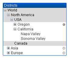
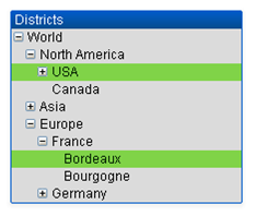
For expanded nodes and leaves (bottom nodes) the QlikView standard color coding is used. Collapsed nodes, however, may contain a mix of different states. In such a case, the node is displayed green only if all values have been selected, gray if all values are excluded, and white in other cases. In addition, a small beacon is displayed, indicating the status of the hidden nodes.
List Boxes
List Boxes can be created with DIMENSION fields and MEASURE fields. When using a MEASURE field in a List Box expression, the aggr() function should be used to show the aggregated value of the MEASURE field with a DIMENSION field. Selections made with DIMENSION fields in a List Box generate SQL queries on the data source to create the associative table in memory.
DETAIL fields are not available in List Boxes.
Because List Boxes display only the unique values of a DIMENSION field, the query QlikView generates to display List Box data uses the DISTINCT keyword to retrieve data from the database. However, some databases require that the query instead include a GROUP BY class instead of the DISTINCT keyword. If the Direct Discovery table comes from a database that requires GROUP BY, you use the DirectDistinctSupport variable to change the default behavior of the DIMENSION queries.
Table Boxes
Table Boxes can display all Direct Discovery field types and provide a means to drill to the details of records that contain Direct Discovery fields. Table Boxes are the only QlikView objects in which fields designated DETAIL in the Direct Query load statement can be used.
When Direct Discovery fields are used in a Table Box, a threshold is set to limit the number of rows displayed. The default threshold is 1000 records. The default threshold setting can be changed by setting the DirectTableBoxListThreshold variable in the load script. For example:
SET DirectTableBoxListThreshold=5000
The threshold setting applies only to Table Boxes that contain Direct Discovery fields. Table Boxes that contain only in-memory fields are not limited by the DirectTableBoxListThreshold setting.
No fields are displayed in the Table Box until the selection has fewer records than the threshold limit.
Direct Discovery fields can be mixed with in-memory fields in a Table Box. Table Boxes that contain only Direct Discovery fields must include a DIMENSION field.
Table Boxes with Direct Discovery data show all selected rows even if they contain identical data. Table Boxes with in-memory data, on the other hand, shows only one of the selected rows when they contain identical data.