Filtering visualization by dimension values
In this short tutorial, you'll learn how to filter a Qlik visualization by specific dimension values—like region or product type—to focus on the data that matters most.
We'll guide you step-by-step through:
- Creating a pie (donut) chart
- Applying filters for region and product type
Perfect for Qlik Cloud users who want to tailor visual insights quickly and effectively.
⏱️ Chapters:
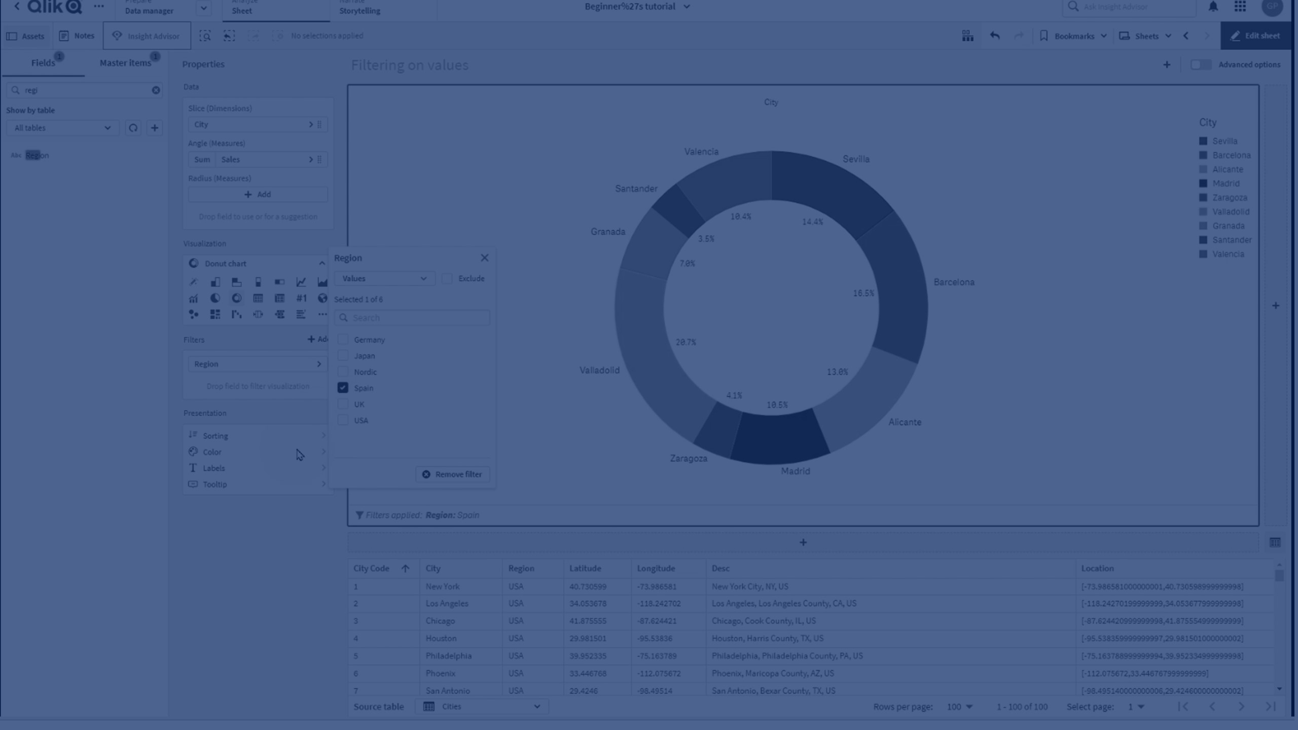
🎬 00:00 – Intro: Filtering visualizations in Qlik
📊 00:15 – Create a pie chart using sales and city
🎯 00:27 – Goal: Limit visualization to data from Spain
⚙️ 00:28 – Apply filter by region
🧮 00:38 – Add a second filter: product type = vegetables
🧹 00:51 – Visualization now filtered by both dimensions
🎨 01:02 – Switch to donut chart mode
🖊️ 01:08 – Add a title to the visualization
✅ 01:10 – Final result: Filtered donut chart
👋 01:14 – Wrap-up and thanks for watching