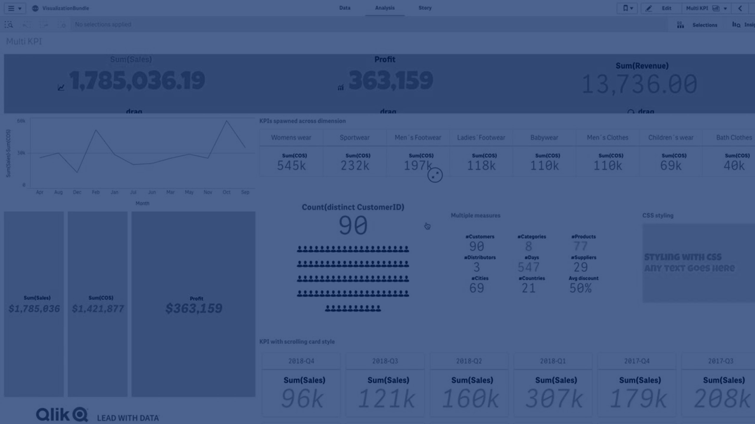
The Multi KPI chart (Multi KPI) is a visualization that allows you to show multiple KPI values for different dimension values. The values can be individually customized using various conditional formatting settings. This enables an easy view and tracking of goals. It is included in the Visualization bundle.
The Multi KPI will no longer be available in the assets panel for creation of new charts as of April 5, 2025 on Qlik Cloud and the May 2025 version of Qlik Sense Client-Managed. It will still function on dashboards where it was previously added, but will be fully removed in May 2027 for Qlik Cloud and the May 2027 version of Qlik Sense Client-Managed.
Use instead
The old Multi KPI will be retired. Consider replacing the object with other charts. If you have not already, please explore all the new app, sheet, and chart styling settings. Do also make use of the Layout container and the Navigation menu when replacing the functionality. If you used CSS in the past, here is a list of native settings you can use instead. Note also that CSS can be applied through a theme.
Features
- The chart shows KPIs using measures and one dimension.
-
Up to 15 measures and 80 values can display simultaneously.
- All KPI values can be grouped or displayed individually.
- Each value can be independently customized using for example, colors, icons, labels, font sizes, alignments, styles, links to different sheets, etc.
-
The chart supports adding graphics, embedding objects into a chart and to display measures infographically.

When to use it
The multi KPI chart is useful when you want to easily view, understand and track the performance of your goals. It is also helpful when you want to customize individual KPI values using conditional formatting. You can link KPIs to separate sheet and insert objects to represent information or data.
Creating a multi KPI chart
You can create a multi KPI chart on the sheet you are editing.
Do the following:
- In the assets panel, open Custom objects > Visualization bundle and drag a Multi KPI object to the sheet.
- Click the Add measure button and select the main measure of the KPI chart. The main measure and a KPI value for the chosen measure is displayed.
- Click Add under Data > Dimensions in the property panel and select dimension.
When you have selected measure and dimension, a multi KPI chart is displayed.
Example:
A chart with the measure (Margin %) shown for different values of the dimension (City).

Adding additional measures
You can add additional measures to your chart in property panel under Data > Dimensions. The chart updates to reflect the added measures. Up to 15 measures and 80 values can display simultaneously. The main measure is always the top measure listed for each dimension. When you add more measures, they appear under the initial KPI value in the order they are entered.
Example:
A chart with a two measures (Margin %, Quantity) grouped per dimension (City).

Customizing the KPIs
You can customize your KPI values and measures with one or more conditional settings. You can add several KPIs together, group them and link to different sheets. You can also configure KPI values independently by differentiating them with one or more conditional settings such as text, color, icons, graphics, etc.
For conditional settings options, see Customizing your KPIs.
Customizing styling
You have a number of styling options available under Appearance in the properties panel.
Click Styling under Appearance > Presentation to further customize the styling of the chart. You can reset your styles by clicking
next to each section. Clicking
Reset all resets styles for all available tabs in the styling panel.
For general information about styling an individual visualization, see Applying custom styling to a visualization.
Customizing the text
You can set the text for the title, subtitle, and footnote under Appearance > General. To hide these elements, turn off Show titles.
The visibility of the different labels on the chart depends on chart-specific settings and label display options. These can be configured in the properties panel.
You can style the text that appears in the chart.
Do the following:
-
In the properties panel, expand the Appearance section.
-
Under Appearance > Presentation, click
Styling.
-
On the General tab, set the font, emphasis style, font size, and color for the following text elements:
-
Title
-
Subtitle
-
Footnote
-
Customizing the background
You can customize the background of the chart. The background can be set by color and image.
Do the following:
-
In the properties panel, expand the Appearance section.
-
Under Appearance > Presentation, click
Styling.
-
On the General tab of the styling panel, you can select a background color (single color or expression). You can also set the background to an image from your media library or from a URL.
When using a background color, use the slider to adjust the opacity of the background.
When using a background image, you can adjust image sizing and position.
Customizing the border and shadow
You can customize the border and shadow of the chart.
Do the following:
-
In the properties panel, expand the Appearance section.
-
Under Appearance > Presentation, click
Styling.
-
On the General tab of the styling panel, under Border, adjust the Outline size to increase or decrease the border lines around the chart.
-
Select a color for the border.
-
Adjust the Corner radius to control the roundness of the border.
-
Under Shadow in the General tab, select a shadow size and color. Select None to remove the shadow.
Limitations
For information about general limitations, see Limitations.
Multi KPI charts cannot be used in Qlik NPrinting reports.
