Custom tooltips
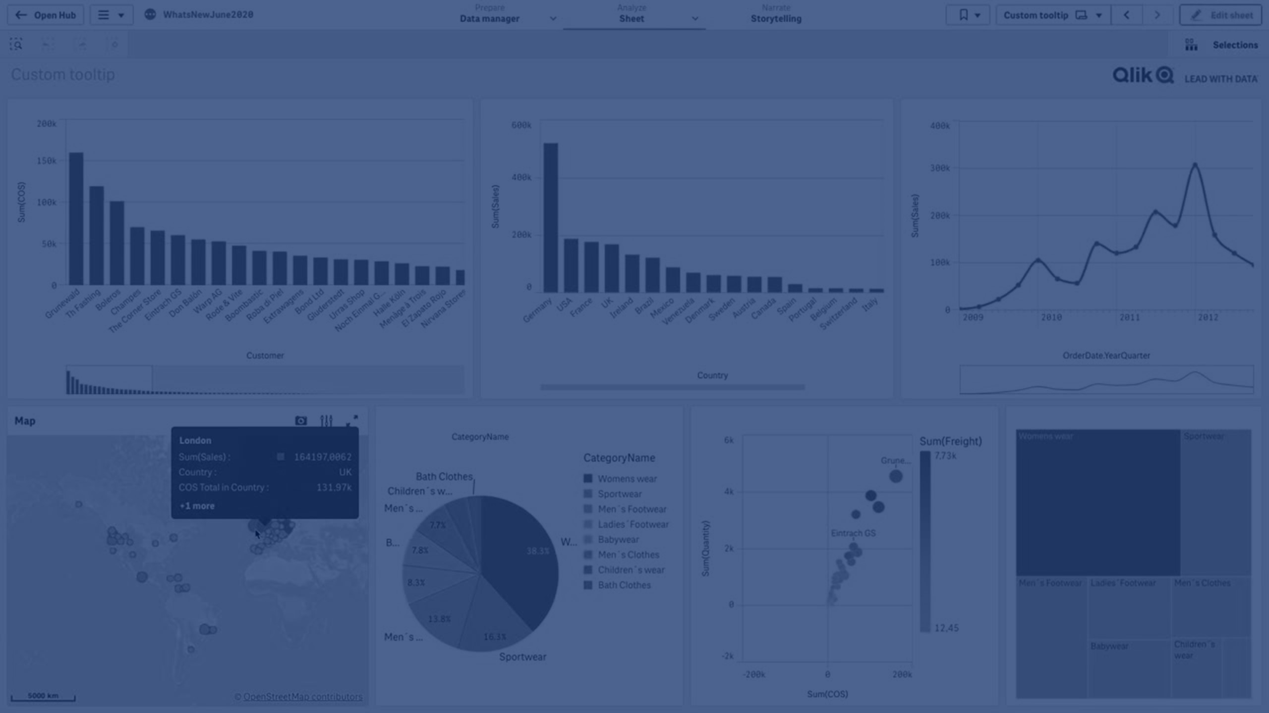
Learn how to create custom tooltips in Qlik Sense with titles, descriptions, and expressions for richer context in your visualizations. This example walks through enhancing tooltips across various chart types, including bar, combo, line, map, pie, and scatter plots, to deliver more informative and engaging dashboards.
This video covers:
- Adding multiple measures and expressions to tooltips
- Customizing titles and descriptions per chart type
- Using functions like rank, aggregation, and set analysis
- Creating dynamic tooltips for maps, pies, and scatter plots
⏱️ Chapters
💡 00:10 – Overview: Creating Custom Tooltips in Qlik Sense
📊 00:27 – Adding Custom Tooltip to a Bar Chart with Three Measures
📈 01:09 – Customizing Tooltips in a Combo Chart with Titles & Descriptions
📉 01:37 – Adding Year & Quarter in Line Chart Tooltips
🗺️ 02:03 – Customizing Map Chart Tooltips with Country & Sales Data
🥧 02:40 – Pie Chart Tooltips with Rank and Custom Text
🔍 03:09 – Scatter Plot Tooltips with Customer ID, Name, Address & Country
⭐ 03:36 – Final Example: Rank and Deviation from Average in Tooltips
🎬 04:03 – Conclusion