
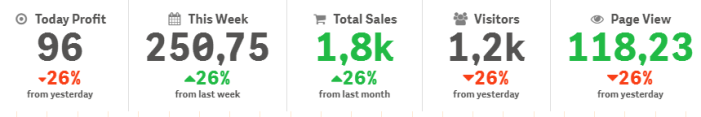
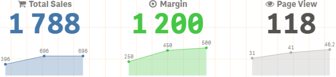
With the Multi KPI chart (Multi KPI) values and measures can be customized using one or more conditional settings. You can add several KPIs together, group them, and link to different sheets. KPI values can also be customized independently by differentiating them using one ore more CSS-properties, such as text color, fonts, sizes, icons, labels, graphics.
KPI values can also be customized independently by differentiating them using one ore more css-properties such as text color, background color, fonts, sizes, icons, labels, graphics.
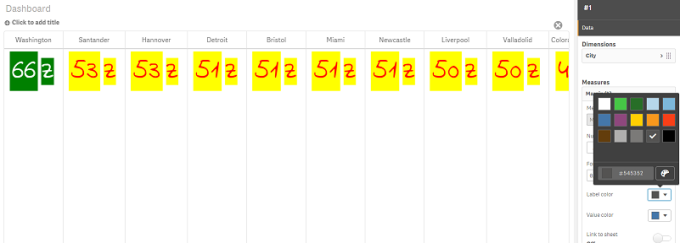
Coloring a Multi KPI
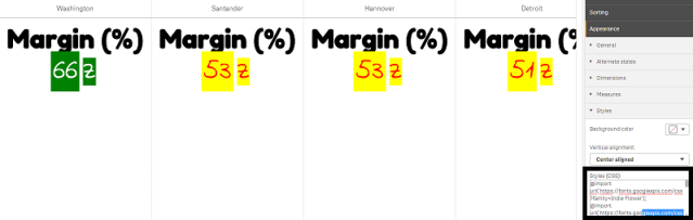
The color option enables all KPI values (measures and labels) to be differentiated by colors. You can change the colors of text, icons and background color. The colors should be valid css-colors.
You can choose from the following options:
- The color palette with a set of predefined colors.
- The color circle (click the easel symbol in the color palette and choose individually).
- Enter a color code string in the field next to the easel symbol.
Changing a measure/label color
Do the following:
- Click Data > Measures in the property panel.
- Click applicable measure and select to color the value (Value color) or the label (Label color).
-
Select color from the color palette that opens.
Changing background color
Do the following:
-
You can also set your own color by clicking the easel symbol in the color palette and select color or enter a color code string in the field next to the easel symbol. The colors should be valid css-colors.
- Click Appearance > Styles in the property panel.
- Click the Background color box.
- Select color from the color palette that opens and the chart updates.
Changing sizes of a Multi KPI
The size of dimensions, measures, labels and icons can be configured using predefined sizes available from a drop-down menu:
- Dimension labels: Select the size of the labels from the drop-down menu under Appearance > Dimensions > Size in the property panel.
- Measure labels: All measures can have individual sizes.
Do the following:
- Select the size of the measures in the property panel under Data > Measures.
- Select measure and click the Override parameters box.
- Enter the label type as a string or in the expression under Label and select the size from the options in the drop-down menu under Size.
Icons: All icons can be differentiated by applying different colors.
Do the following:
- Go to Data > Measures in the property panel.
- Select measure and choose icon from the icon option.
- Then choose icon size from the drop-down menu under Icon.
Changing the fonts of a Multi KPI
You can change the font-family of all labels if you go to Data > Measures in the property panel and select applicable measure. Under Font style enter a label string and press Enter.
You can also change the font using an expression in the Expression editor (![]() ) or apply individual font css properties entered through Appearance > Styles > Styles (CSS) in the property panel.
) or apply individual font css properties entered through Appearance > Styles > Styles (CSS) in the property panel.
Changing icons
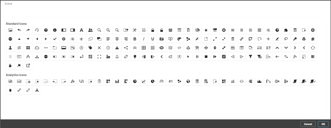
You can set a predefined icon to represent a value and/or label by selecting from the icon set. The icons can then be further customized by differentiating using the colors, fonts, labels and sizes options.
Do the following:
- Click Data > Measures in the property panel.
-
Check the Select icon box and click applicable icon from the icons set that opens.
- Click OK. The pop-up will close and your chart update.
- Choose whether to configure your label or value by selecting Label or Value under Icon position.
You can also change a value/label to an icon by entering an icon string under Icon (Data > Measures > applicable measure in the property panel) and then press Enter. Thereafter click Label or Value under Icon position depending on which you want to configure. It is also possible to change an icon using an expression in the Expression editor (![]() ). The icons should be valid CSSicons.
). The icons should be valid CSSicons.
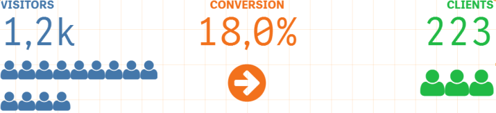
Using infographic mode
The infographic mode allows you to show each measure graphically as an appropriate number of icons.
Do the following:
- Click the applicable measure under Data > Measures in the property panel and click the Icon button.
- Select an icon to represent a measure from the predefined icon set (Icons) that opens.
-
Click the Infographic mode button. The resulting KPI chart updates and graphically shows the measures with applicable number of icons (max. 100 icons per measure).
You can also select an icon using an expression in the Expression editor (
 ).
).
Embedding a master visualization
To graphically illustrate the KPI object, you can embed a master visualization.
Do the following:
- In the in the property panel go the Data > Measures and click Add.
- Click the Expression editor () button.
- Enter the string ='Drag and Drop here' into the Expression editor and click Apply.
- Drag and drop a master visualization object into the value region of each measure placeholder.
You can also change insert the object ID string into the expression in the Expression editor (![]() ) under Visualization for each measure (Data > Measures > applicable measure in the property panel).
) under Visualization for each measure (Data > Measures > applicable measure in the property panel).
Using Styles (CSS) properties
You can further configure your measures using non-predefined Styles (CSS) property for each measure. This can be icons, changing color of text/icons, label, font, background color, size, etc. Copy and paste the styles into the Styles (CSS) field (under Appearance > Styles in the property panel).
For icons, enter appropriate classes in the Icon field of the chosen measure under Data > Measuresin the property panel. You can also enter the icon string using an expression in the Expression editor (![]() ).
).
Formatting your KPIs
You can format the chart layout to be presented in different ways.
Alignment
You can configure the main chart text alignment by selecting applicable box under Alignment of chosen measure under Data > Measures in the property panel.
All KPIs can also be vertically aligned. This alignment can be adjusted to align top, bottom and center or as stretched. Select applicable alignment from the Vertical alignment menu under Appearance > Styles in the property panel. It is also possible to center align labels by checking the Center align labels in the property panel under Appearance > Dimensions.
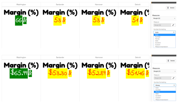
Number formatting
You can also custom format the KPI number values. Different formatting can be applied to the same values. The chart updates to reflect the changed number type.
Do the following:
- Click Data > Measures in the property panel and select applicable measure.
-
Select applicable number formatting from the Number formatting menu.
Format pattern
The text of a specific measure can be changed or removed.
Do the following:
- Click Data > Measures in the property panel.
- Click applicable measure and enter/remove the applicable format string under Format pattern and press Enter.
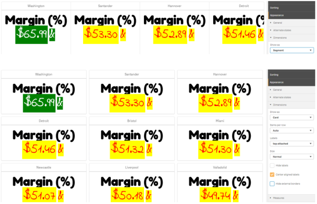
Segment/card
It is also possible to configure the layout of the KPI chart where dimensions and values display in a segment or card layout.
Do the following:
- Click Appearance > Dimensions in the property panel.
-
Choose Segment or Card layout from the Show as menu. The chart will update.
The segment layout can be configured horizontally or vertically under Appearance > Dimensions > Orientation in the property panel. Click either the Horizontal or the Vertical buttons.
Items per row
It is also possible to decide the number of items (KPIs) per line in a chart in the property panel under Appearance > Measures. Use the default Auto or select applicable number from the Items per row menu (between 1-8).
Borders
You can hide external and internal borders of the chart. By default all borders are visible. To configure borders go to Appearance > Dimensions in the property panel and check , as applicable, Hide external borders or Hide internal borders.
Value/Label layout and formatting
The position and order of labels for both dimension and measure values can be altered and displayed in different ways. Labels can be hidden or displayed vertically or horizontally. By default Horizontal is selected.
Dimension label layout
Do the following:
- Click Appearance > Measures in the property panel.
- Click either Horizontal or Vertical under Labels orientation to select how the labels should display.
Measure value layout
Measure value layout can be set in two different ways.
Do the following:
- Existing parameters:
- Click Appearance > Measures in the property panel.
- Click either Horizontal or Vertical under Labels orientation to select how the labels should display.
- New parameters:
- Click Data > Measures in the property panel.
- Click applicable measure and check the Override parameters box.
- Enter the label string under Label and press Enter.
Label order
You can also adjust the order in which measure value labels appear.
Do the following:
- Click Appearance> Measures in the property panel.
- Click either Label, Value or Value, Label under Labels orientation to select how the labels should display.
Icon order
You can decide where to show icons - before or after a value. In the property panel under Appearance > Measures go to Icon order and click either the Icon, Value or Value, Icon buttons to select which displays first in the chart.
Hide Labels
- Measure labels: This option hides the measure label of each KPI. To hide the labels click Data > Measures in the property panel and select applicable measure. Then check the Hide labels box.
- Dimension labels: This option hides the dimension label of each KPI. To hide the labels click Appearance > Dimensions in the property panel. Then check the Hide labels box.
Hide Values
This option hides the value for each KPI. To hide the value, click Data > Measures in the property panel. Then check the Hide values box.
Group KPI values
All KPI values can be grouped or displayed individually per measure. Go to the Data> Measures in the property panel. Choose applicable measure and check the Group by dimension box.
Another option is to enter a dimension value string under Dimension value and press Enter. The chart will update. You can also enter the dimension value using an expression in the Expression editor (![]() ). The values should be valid CSS values.
). The values should be valid CSS values.
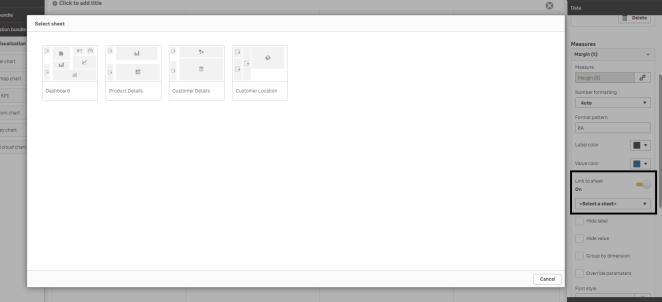
Link to a separate sheet
Each measure can be linked to another sheet.
Do the following:
- Click Data > Measures in the property panel and select applicable measure.
- Move the Link to sheet slider to the right to turn the option on.
-
Click the Select sheet button and from the Select sheet pop-up click the page you want a link to. The sheet will close and your pages link.
Limitations
For information about general limitations, see Limitations.