KPI
The KPI visualization can show one or two measure values, and is used to track performance.
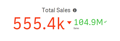
A KPI visualization with two measure values, using conditional colors and symbols.

When to use it
Use KPIs to get an overview of performance values that are central to an organization. Use color coding and symbols to indicate how the figures relate to the expected results.
Advantages
KPIs give a quick understanding of the performance within an area.
Disadvantages
The KPI is somewhat limited when it comes to graphical components. You can use symbols to help illustrate the performance, but if you want a more conspicuous component, consider using a gauge.
Creating a KPI
You can create a KPI visualization on the sheet you are editing.
Do the following:
- From the assets panel, drag an empty KPI chart to the sheet.
-
Click Add measure and select a measure or create a measure from a field.
In a KPI visualization, you can have one or two measures and no dimensions. With two measures, the second value automatically becomes a complementary value and is shown with a smaller font size. You can easily switch their order by dragging the measures in the properties panel under Measures.
When you have created the KPI visualization, you may want to adjust its appearance and other settings in the properties panel.
The following settings are used by default in a KPI visualization:
- Centered alignment.
- Black text color.
- No background color.
- Responsive layout behavior.
- Medium font size.
- No titles.
- Measure label displayed.
- Conditional colors and symbols are turned off.
- No link to sheet.
Using conditional colors and symbols
You can set your KPI visualization to display in different colors, and with different symbols, depending on the value of the selected measure. Conditional colors and symbols can be configured in the properties panel.
You can do this by adding multiple range limits to the KPI, creating subsections that indicate performance. For example, you can set your KPI so that it displays in:
-
Green with a check mark symbol when performance is strong.
-
Yellow with a caution symbol when performance falls below expectations.
-
Red with an X symbol when performance is low.
You can also set range limits with expressions, rather than defining a single value.
Do the following:
-
In the properties panel for a KPI visualization, select Appearance and expand Color.
-
If necessary, turn off Library colors and turn on Conditional colors.
-
Click Add limit to create a new limit. Multiple limits can be added to a single KPI chart.
-
Specify a value for the limit, or enter an expression using the expression editor.
-
On the Value color bar, click the range area of the KPI you would like to modify.
-
Under Colors, select a preset color or use a custom color. Toggle, if needed, to Symbols to choose the symbol displayed when your KPI falls within the specified limit.
Linking to another sheet
You can link from the KPI visualization to a sheet in the app. When making data analysis and clicking the visualization, you can click a second time to go to a predefined sheet. The sheet is opened in a new tab. When hovering over , the name of the sheet is displayed. The icon is only displayed when Show title is selected, under Presentation.

