
The bullet chart (Bullet chart) displays a gauge with extended options. Bullet charts can be used to visualize and compare performance of a measure to a target value and to a qualitative scale, such as poor, average, and good. The bullet chart is included in the Visualization bundle.
A bullet chart can contain from one to three measures:
- The first measure (Measure) is the actual value, represented by the bar.
- The second measure (Marker) defines a target value, which is represented by a vertical marker line.
- The third measure (Range) defines a qualitative range displayed behind the bar. This consists of three ranges.
You can also add a dimension. This will show one gauge for every dimension value. If you do not define a dimension, the chart will show a single gauge.
When to use it
Bullet charts let you compare and measure performance with more enriched information than a common gauge. This is helpful when comparing performance according to a target and a simple performance rating. For example: you can show how sales relate to a target value, and in context of poor, good, and stretched performance.
Creating a bullet chart
You can create a bullet chart on the sheet you are editing.
Do the following:
- In the assets panel, open Custom objects > Visualization bundle and drag a Bullet chart object to the sheet.
-
Click the Add measure button to select the value measure of the chart.
Once the first measure is selected the bullet chart is displayed.
- To add a target value, click Add under Measures. You can define a fixed value or use a measure with target values.
- To add performance ranges, click Add under Measures. This will define the maximum performance range value. You can set the internal range limits later.
- To show one gauge for every dimension value, click Add under Dimensions.
The bullet chart is now displayed with the dimensions and measures you selected.
Changing the appearance of the chart
You can customize the appearance of your bullet chart.
Changing the color scheme
You can change color scheme of the value bar, the marker and the range.
Do the following:
- Set value bar color in Appearance > Measure bar > Change bar color in the property panel.
- Set marker color in Appearance > Marker > Change marker color in the property panel.
-
Set range color in Appearance > Range > Change range color in the property panel. The color you select is used for the highest range. The two lower ranges are displayed in darker shades of that color.
Tip noteIt's a good idea to select a light range color to avoid poor contrast between the ranges. You should also make sure that the range color is less visually dominant than the value bar.
Changing the range limits
You can also customize the limits of the ranges under Appearance > Range in the properties panel. The full range is defined by the value of the third measure of the chart.
- Set middle range (%) defines the upper limit of the middle range.
- Set lower range (%) defines the upper limit of the lower range.
Changing the scale of the axis
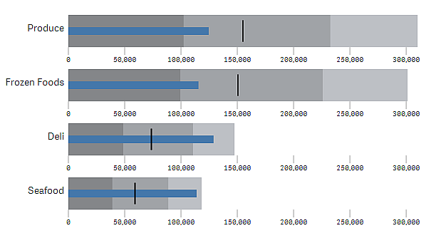
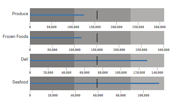
If you use a dimension to show several gauges, you can select how to show the scale of the axis with Axis > Consistent for all axis dimension values.
- If you want each dimension gauge to use the same scale, enable this option. If the range measure depends on the dimension value, the range bars will have different lengths. This is useful when you want to be able to compare the actual values.
- If you want each range bar to be equally long, disable this option.
Example:
In this example, Consistent for all axis dimension values is disabled. This makes it easier to compare the relative performance of each product group.
Limitations
For information about general limitations, see Limitations.
- You can not make selections in a bullet chart.
- If you want to change the number format, you need to set the same format in Number formatting for all three measures.