
Charts
Charts and tables are sheet objects that can show numbers very compactly. It is possible e.g. to show sums of money, distributed over different fields such as year, month, account number, etc.
Charts and tables can be set to display either the frequencies of different values of a field, or a calculated entity, e.g. the sum of the possible values of a field. In both cases, a certain field must be chosen as x-axis, i.e. this field will be used to label the slices of the pie, the different bars in the bar chart and the rows in the pivot table, respectively.
The Different Chart Types Available
The chart types you can choose between are bar chart, pie chart, combo chart, scatter chart, line chart, radar chart, grid chart, gauge chart, block chart, funnel chart, pivot table, straight table, and mekko chart.
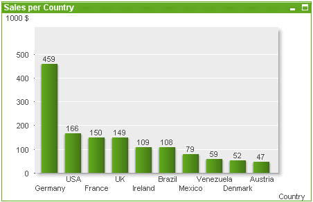
Bar Chart
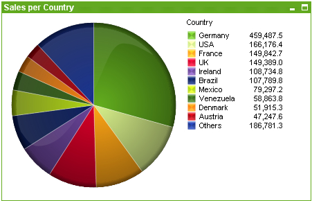
Pie chart
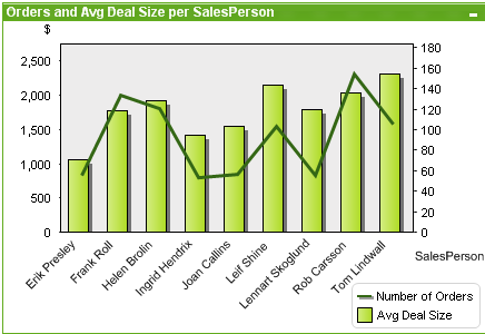
Combo chart
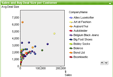
Scatter chart
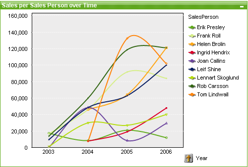
Line chart
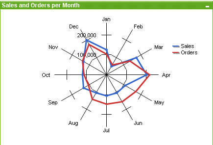
Radar chart
Grid chart
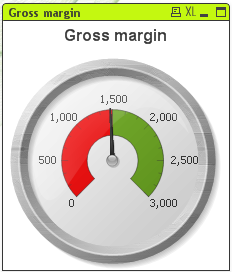
Gauge chart
Block chart
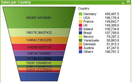
Funnel chart
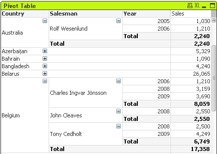
Pivot table
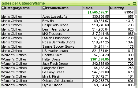
Straight table
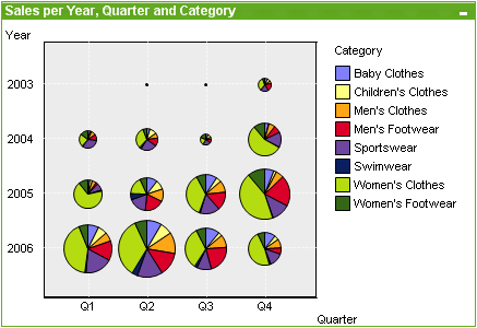
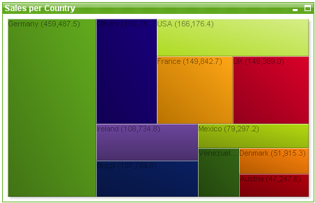
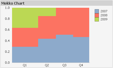
Mekko chart
QlikView charts can be divided into two major categories. The first, graph charts, consists of bar, line, combo, pie, scatter, radar, grid, block, mekko and gauge charts. The second category, table charts, consists of straight tables and pivot tables. These chart types are drawn as tables with cells in columns and rows. Please note that table boxes, although in many respects similar to table charts are not charts but a separate type of sheet objects.
Graph Charts
The bar chart below shows some of the more common components of a QlikView graph chart:
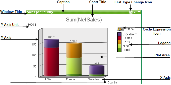
The position of the different components can in many cases be altered by the user.
Sizing and moving chart components
Table Charts
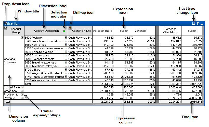
The pivot table above shows some of the more common components of a QlikView table chart.