
Slider/Calendar objects provide alternative means for selecting field values in QlikView. They can also be used for entering values in QlikView script variables. As its name suggests, the slider/calendar object has two completely different modes. As different as they may look, they still work very much the same way behind the visual user interface.
Right-click on a slider/calendar object and the Slider/Calendar Object: Object Menu will be displayed. It can also be accessed from the Object menu, when the slider/calendar object is the active object.
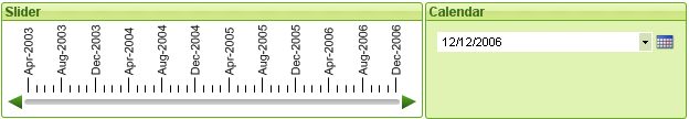
Using a Slider/Calendar Object
Slider Mode
A single value, two values or a range of values (depending on the properties of the object) is selected in a field or inserted into one or two variables by means of dragging a thumb tack along the slider background. The thumb tack can also be moved by means of scroll arrows. Some sliders may incorporate a scale and tick marks for navigation.
Calendar Mode
A slider/calendar object in calendar mode appears in the layout as drop-down box with a calendar icon to the right. When clicking on the calendar icon it will expand to a calendar control. It is possible to navigate between months and years by means of the arrow buttons or the month and year drop-down controls. After selecting a date or a range of dates (depending on the properties of the object) in the calendar control the selection will be applied to the underlying field or variable.
If the object is connected to a field, selections in the field will be reflected in the expanded calendar control, using the same selection color codes as found in list boxes (e.g. green for selected values). Provided that the object is configured for multiple values, it will be possible to paint over multiple values just like in a list box. By pressing the Ctrl-key it is even possible to select multiple ranges of values, even if they appear in different months or years. Once the calendar control is closed after the selection, the drop-down box will function essentially as a field drop-down in a multi box.
The slider/calendar object Object menu is opened by right-clicking the object. The menu commands are:
| Command | Description |
| Properties... | Opens the Slider/Calendar Object Properties dialog where a number of parameters can be set. |
| Notes |
Allows creating and sharing notes about the current object. |
| Order |
This cascade menu is only available when the Design Grid command of the View menu is activated or when the Always Show Design Menu Items under User Preferences: Design is checked. It contains four commands to set the layout layer of the sheet objects. Valid layer numbers are -128 to 127.
|
| Copy to Clipboard | This cascade menu contains the various copy
options for the sheet object. Image Copies an image of the sheet object to the clipboard. The image will include or exclude the sheet object caption and border depending on the settings in the User Preferences: Export page. Object Copies the entire sheet object to the clipboard for pasting elsewhere in the layout or in another document opened within the current instance of QlikView. |
| Linked Objects |
Opens a menu with the following commands for linked objects.
|
| Minimize | Iconizes the object. Clicking on the  icon in the object caption (if shown) produces
the same result. This
command is available only if minimizing is allowed in the object's Properties dialog on the Caption page. icon in the object caption (if shown) produces
the same result. This
command is available only if minimizing is allowed in the object's Properties dialog on the Caption page. |
| Maximize | Enlarges the object to fill the sheet. Clicking on the  icon in the object caption (if shown) produces the same result. This command is available
only if maximizing is allowed in the object's Properties
dialog on the Caption page. icon in the object caption (if shown) produces the same result. This command is available
only if maximizing is allowed in the object's Properties
dialog on the Caption page. |
| Restore | Restores a minimized or maximized object to its previous size and
location. Double-clicking the icon of a minimized object or clicking the  icon in the object caption (if shown) of a maximized object produces
the same result. This command is available only for minimized or
maximized objects. icon in the object caption (if shown) of a maximized object produces
the same result. This command is available only for minimized or
maximized objects. |
| Help | Opens QlikView help. |
| Remove | Removes the sheet object from the sheet. |
The Slider/Calendar Object Properties: General page is opened by a right-click on a slider/calendar object and choosing the Properties command in the float menu. Here you can make general settings for the data to be manipulated by the slider/calendar object. It is also possible to reach this information via the dialog New Slider/Calendar Object.
Under Input Style select the basic mode of the slider/calendar object. Use the drop-down to select whether the object should be represented by a Slider control or a Calendar input control.
The Data group is where it is defined which data object the slider/calendar is connected to. A slider/calendar can be connected to either a field or to one or a pair of variables.
- Field: Select this radio button if to connect the slider/calendar object to a field or an expression. Select the field in the drop-down box. If Expression is chosen in the drop-down the Edit Expression dialog will open.
- Edit...: Opens the Edit Expression dialog for the expression chosen in the drop-down list.
- Variable(s): Check the radio button and select the desired variable(s) in the drop-down list(s). The second variable is only available if you select Multi Value under Mode (see below).
In the Mode group specify if the slider/calendar should be used for selecting a Single Value or a range of values - Multi Value.
In the Value Mode group you specify if the slider/calendar should select Discrete values (unavailable for Multi Value mode) or define a Continuous/Numeric range of values (unavailable for Single Value mode with Field data). This group is not available in Calendar mode. In Calendar mode discrete values are always assumed.
- Min Value: Sets the minimum value for the slider/calendar in Continuous/Numeric value mode.
- Max Value: Sets the maximum value for the slider/calendar in Continuous/Numeric value mode.
- Static Step: Check the box and enter a value in the edit box to specify a static step for slider/calendar values in the Continuous/Numeric value mode.
- Value 1: Shows current value for the slider in Continuous/Numeric value mode if the slider/calendar is Single Value. In Multi Value mode the low value is shown.
- Value 2: Shows current high value for the slider/calendar in Continuous/Numeric value mode. Only relevant in Multi Value mode.
- Override Locked Field: If this check box is marked, selections can be made via the slider/calendar object in a field even if the field is locked. The field will still be locked for logical changes stemming from selections in other fields. This option is selected by default for slider/calendar objects.
- Fixed Range: When this alternative is checked, the user will not be able to widen or narrow the range by dragging the edges of the slider thumb-tack.
- Alternate State:
Choose one of the available states in the list. The following Alternate States are always available.
- Inherited: The sheets and sheet objects are always in the inherited state unless overridden by the QlikView developer. This setting is inherited from the object on the level above, a chart in a sheet gets the same settings as the sheet if inherited is chosen.
- Default state: This is the state where most QlikView usage occurs and is represented by $. The QlikView document is always in the default state.
- Object ID: This is used for macro purposes. Every sheet object
is assigned a unique ID. We recommend that you use alphanumeric characters only in the ID. For slider objects, the ID starts with SL01.Linked objects share the same object ID. You may
edit this ID number later on.
- Print Settings: This button takes you to the Print Settings dialog where margins and header/footer format can be defined.
The Slider/Calendar Object Properties: Presentation tab is opened by a right-click on a Slider/Calendar object and choosing the Properties command from the float menu. This is where the visual properties of the slider/calendar object can be configured.
The Colors group lets you define colors for the different parts of the slider/calendar, as shown in this figure:
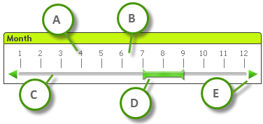
Example: Legend
- A: Value ticks
- B: Scale background
- C: Slider background
- D: Thumb tack
- E: Scroll arrows
Slider Background and Scale Background color can be defined as a solid color or a gradient via the Color Area dialog that opens when you click the corresponding button. The degree of transparency of the slider background can be set using the Transparency control to the right of the button. At 0% the background will be completely opaque. At 100% the background will be completely transparent.
Thumb Tack, Scroll Arrows and Unit Ticks color can be defined as a solid color or a gradient via the Color Area dialog that opens when you click the corresponding button.
In the Scroll Orientation group the slider can be displayed in the Horizontal or Vertical direction.
In the Label Orientation you can determine whether scale text should be oriented in Horizontal or Vertical direction.
In the Scale group you can define a slider scale. Select Use Automatic Scale for the scale to be automatically generated based on slider size and underlying values. The alternative Use Custom Scale lets you specify a number of scale settings:
- Major Units: The number defines the number of major units on the slider scale.
- Labels on Every n Major Unit: Defines the density of scale label text.
- Minor Units per Major Unit: Defines the number of minor units between each major unit on the slider scale.
Scroll arrows can be visible or hidden with the alternative Show Scroll Arrows.
Slider Style can be set as Solid or Shimmer.
If it is possible, it is recommended that you Use Custom Scale to define the scale settings.
The Slider/Calendar Object Properties: Presentation tab is opened by a right-click on a Slider/Calendar object and choosing the Properties command from the float menu. This is where the visual properties of the slider/calendar object can be configured.
The Colors group lets you define the color of the calendar control background. The Background color can be defined as a solid color or a gradient via the Color Area dialog that opens when clicking the button. The degree of transparency of the calendar control background can be set using the Transparency control to the right of the button. At 0% the background will be completely opaque. At 100% the background will be completely transparent.
On the Sort tab the sort order can be set for the slider data. This dialog is very similar to its counterpart under Document Properties.
Learn more
On the Number tab the number format can be set for the slider scale. This dialog is very similar to its counterpart under Document Properties.
Learn more
Font
Here the Font, Font style and Size of the font to be used can be set.
The font can be set for any single object (Object Properties: Font), or all objects in a document (Apply to Objects on Document Properties: Font).
Further, the default document fonts for new objects can be set on Document Properties: Font. There are two default fonts:
- The first default font (List Boxes, Charts, etc) is used for most objects, including list boxes and charts.
- The second default font (Text Objects and Buttons) is used for buttons and text boxes, which are objects that usually need a larger font.
Finally, the default fonts for new documents can be set on User Preferences: Font.
For charts, buttons and text objects (except search objects) a font Color can also be specified. The color may Fixed or it can be dynamically Calculated from an expression. The expression must be a valid color representation, which is created using the color functions. If the result of the expression is not a valid color representation, the font color will default to black.
Additional settings are:
- Drop Shadow: If this option is checked a drop shadow will be added to the text.
- Underline: If this option is checked the text will be underlined.
A sample of the selected font is shown in the preview pane.
Layout
A Layout setting will apply to the current object only, if it is made
from the Object Properties
page.
A Layout setting will apply to all objects of the specified type(s) in
the document, if it is made from the Document
Properties page.
Use Borders
Enable this setting in order to use a border around the sheet object. Specify the type of border by selecting it in the drop-down menu.
- Shadow Intensity: The Shadow Intensity drop-down menu makes it possible to set the intensity of the shadow that surrounds the sheet objects. There is also the choice of No Shadow.
- Border Style: The following predefined border types are available:
- Solid: A solid unicolored border.
- Depressed: Border giving the impression of depressing the sheet object from the background.
- Raised: Border giving the impression of raising the sheet object from the background.
- Walled: Border giving the impression of a wall around the sheet object.
- Border Width: This option is available for all border types. The width can be specified in mm, cm, inches (", inch), pixels (px, pxl, pixel), points (pt, pts, point) or docunits (du, docunit).
- Color: Click this button to open a dialog in which an appropriate base color can be chosen from the color palette for all border types.
- Rainbow: Creates a rainbow colored border for all border types. The rainbow will start with the selected base color on top of the sheet object.
When Simplified is the chosen Styling Mode in Document Properties: General, there is no choice of border type, there is only the Shadow Intensity drop-down menu and the Border Width setting.
Rounded Corners
In the Rounded Corners group the general shape of the sheet object is defined. These settings allow for drawing of sheet objects ranging from perfectly circular/elliptical via super elliptical to rectangular. Rounded Corners is only available if you have selected Advanced Styling Mode in Document Properties: General.
- Rounded Corners: Checking this option makes the alternatives for rounded corner shapes possible.
- Corners: Corners for which the check box remains unmarked will be drawn rectangular instead.
- Squareness: A variable number between 2 and 100 where 100 defines a rectangle with perfectly square corners and 2 corresponds to a perfect ellipse (a circle for a 1:1 aspect ratio). A squareness between 2 and 5 is usually optimal for achieving rounded corners.
- Corner Radius: This setting determines the radius of the corners in fixed distance (Fixed) or in percent of the total quadrant (Relative (%)). This setting lets you control the extent to which the corners will be affected by the underlying general shape set under Squareness. The distance can be specified in mm, cm, inches (", inch), pixels (px, pxl, pixel), points (pt, pts, point) or docunits (du, docunit).
Layer
In the Layer group an object can be defined as residing in one of three layers:
- Bottom: A sheet object with the Bottom layer property can never obscure sheet objects in the Normal and Top layers. It can only be placed on top of other sheet objects in the Bottom layer.
- Normal: When created, sheet objects reside in the Normal (middle) layer. A sheet object in the Normal layer can never be obscured by sheet objects in the Bottom layer and can never obscure sheet objects in the Top layer.
- Top: A sheet object in the Top layer can never be obscured by sheet objects in the Normal and Bottom layers. Only other sheet objects in the Top layer can be placed on top of it.
- Custom: The Top, Normal and Bottom layers correspond to internally numbered layers 1, 0 and -1 respectively. In fact all values between -128 and 127 are accepted. Choose this option to enter a value of your choice.
Theme Maker...
Opens the Theme Maker wizard where you can create a layout theme.
Apply Theme ...
You can apply a layout theme to the object, sheet or document.
Show
In the Show group it is possible to specify a condition under which the sheet object is displayed:
- Always: The sheet object will always be displayed.
- Conditional: The sheet object will be shown or hidden depending
on a conditional function which will be evaluated continuously depending on e.g.
selections etc. The sheet object will only be hidden when the condition
returns FALSE.
Users with Admin privileges for the document can override all show conditions by selecting Show All Sheets and Sheet Objects in Document Properties: Security. This functionality can be toggled by pressing Ctrl+Shift+S.
Options
In the Options group, it is possible to disallow moving and resizing of the sheet object. The settings in this group are only relevant if the corresponding check boxes are enabled in Document Properties: Layout and Sheet Properties: Security.
- Allow Move/Size: If this option has been deselected it will be impossible to move or resize the sheet object.
- Allow Copy/Clone: If this option has been deselected it will be impossible to make a copy of the sheet object.
- Allow Info: When the info function is in use an info icon will be displayed in the window caption
whenever a field value has information associated to it. If you don't
want the info icon to be displayed in the caption, you can uncheck this
option.
Info - Size to Data: Normally the borders around all table sheet objects in QlikView will shrink when selections cause the size of the table to be less than allocated size for the sheet object. By deselecting this check box this automatic adjustment of size will be turned off leaving any surplus space blank.
Scrollbars
Various controls for changing the scrollbar layout are located in the Scrollbars group:
- Preserve Scroll Position: With this setting enabled, QlikView will try to preserve the scroll position of tables and charts with a scroll bar when a selection is made in another object. The setting must be enabled in User Preferences: Objects as well. The scroll position is not preserved when you close the document.
- Scroll Buttons: Sets the scroll button color. Select a color by clicking the button. Note that medium gray tones often render the best results for scroll bars. Either color can be defined as a solid color or a gradient via the Color Area dialog that opens when you click the appropriate button.
- Scroll Background: Sets the scrollbar background color. Select a color by clicking the button.
- Scrollbar Width: This control affects both the width and the relative size of the scrollbar symbols.
- Scroll Style: Sets the scroll bar style. Select a style in the drop-down control.
The Classic scroll bar style corresponds
to QlikView 4/5 scroll bars. The Standard
scroll bar style gives a more modern look. The third style is Light,
which is a thinner, lighter bar.
The Styling Mode must be set to Advanced for the scroll bar style to be visible. This setting can be found on the General tab by opening the Settings drop-down menu and selecting Document Properties.
- Apply To...: Opens the Caption and Border Properties dialog where you can set where to apply the properties that have been set on the Layout page.
A Caption setting will apply to the current object only, if it is made
from the Object Properties
page.
A Caption setting will apply to all objects of the specified type(s) in
the document, if it is made from the Document
Properties page.
On the Caption page, specify layout options that are completely different from the general layout of the object.
- Show Caption: When this option has been checked a caption will be drawn at the top of the sheet object. List boxes and other "box objects" will have the option switched on by default whereas buttons, text objects and line/arrow objects will not.
- Title Text: In the text box you can enter a title to be shown in the caption of the sheet object. Use the Font... button to change the caption font.
Set the colors of the caption in its different states. The settings for Active Colors and Inactive Colors can be made separately from each other.
Click the Background Color or Text Color button to open the Color Area dialog. The Background Color can be defined as a solid or a gradient color on the Color Area dialog. Text Color can be defined a Fixed or a Calculated color using color functions.
- Wrap Text: If this option is checked, the caption will be displayed in two or more rows.
- Caption Height (Lines): Set the number of caption lines in this edit box.
The precise size and position of the QlikView object can be determined and adjusted by the size/position settings for the Normal or Minimized QlikView sheet object. These settings are measured in pixels:
- X-pos: Sets the horizontal position of the left side of sheet object in relation to the sheet's left edge.
- Y-pos: Sets the vertical position of the top side of sheet object in relation to the sheet's upper edge.
- Width: Sets the width of the QlikView sheet object.
- Height: Sets the height of the QlikView sheet object.
The orientation of the caption label can be altered with the Caption Alignment options:
- Horizontal: The label can be horizontally aligned: Left, Centered or Right within the caption area.
- Vertical: The label can be vertically aligned: Top, Centered or Bottom within the caption area.
Special Icons
Many of the object menu commands of the sheet objects can be configured as caption icons. Select commands to be shown as caption icons by marking the check box to the left of each command in the list.
- Allow Minimize: When this option has been checked a minimize icon will be displayed in the window caption of the sheet object, providing that the object is minimizable. Furthermore, this will make it possible to minimize the object by double-clicking the caption.
- Auto Minimize: This option becomes available when Allow Minimize is checked. When Auto Minimize is checked for several sheet objects on the same sheet, all but one will be automatically minimized at any time. This is useful e.g. for alternately displaying several graphs in the same sheet area.
- Allow Maximize: When this option has been checked a maximize icon will be displayed in the window caption of the sheet object, providing that the object is maximizable. Furthermore, this will make it possible to maximizing the object by double-clicking the caption. If both Allow Minimize and Allow Maximize are checked, double-clicking will effect minimizing of the object.
- Help Text: Here you may enter a help text to be displayed in a pop-up window. The
help text may be specified as a calculated formula. This option is not available at document level. Click the ...
button to open the Edit Expression
dialog for easier editing of long formulas.
Expression syntax for calculated formulasEnter e.g. a description of the sheet object. A help icon will be added to the window caption of the object. When the mouse pointer is over the icon, the text will be displayed in a pop-up window.