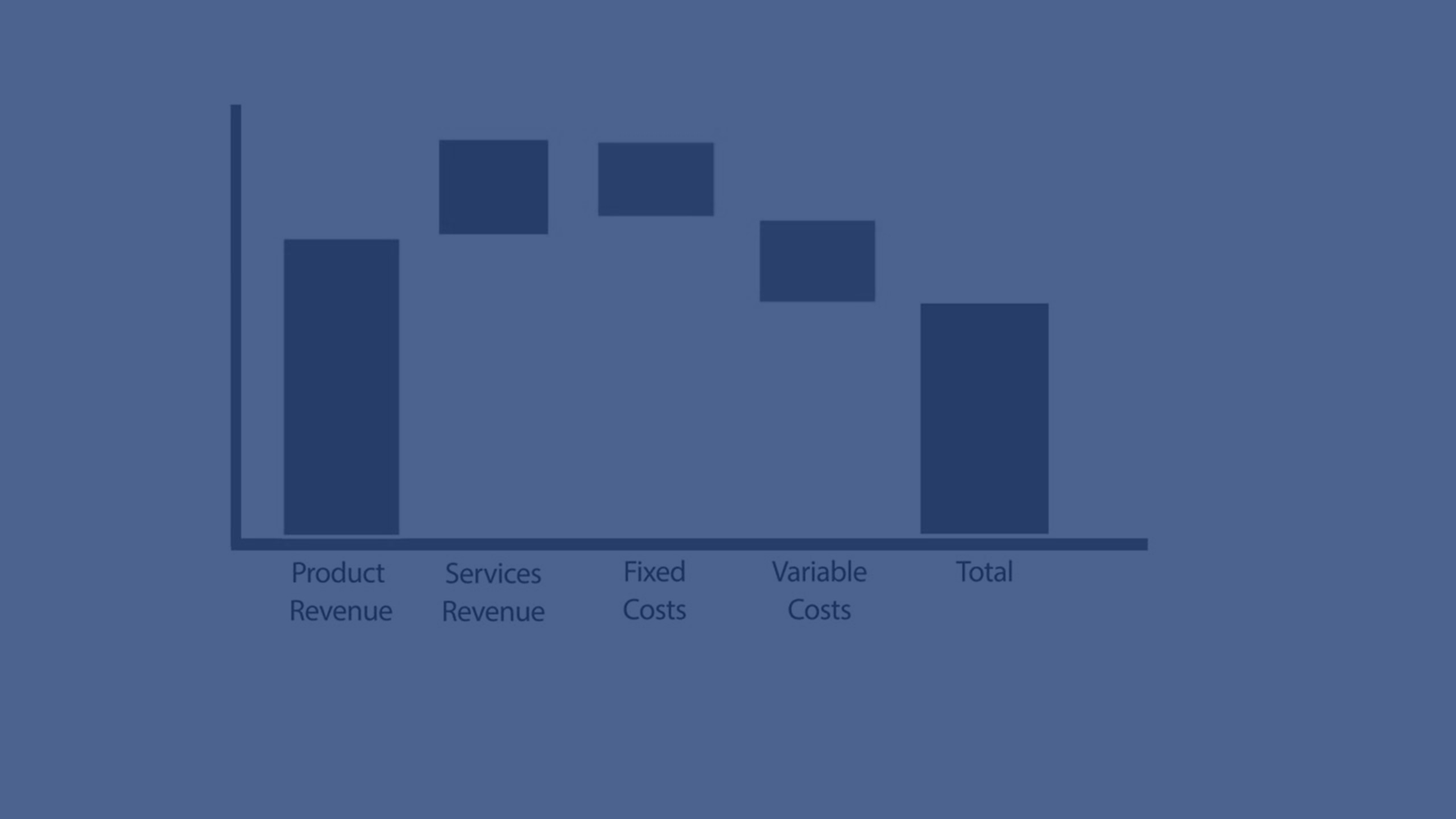
The waterfall chart is suitable for illustrating how an initial value is affected by intermediate positive and negative values. The starting and the final values are represented by whole bars, and intermediate values by floating bars. You can also show subtotals in the chart.
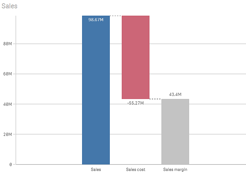
Waterfall chart displaying Sales, Sales cost, and Sales margin.


When to use it
The waterfall chart is suitable for illustrating how an initial value is affected by intermediate positive and negative values. One example of this is an income statement, when you want to show the positive and negative contributions of different accounts.
Advantages
The waterfall chart provides a quick understanding of the transition of a value.
Disadvantages
The waterfall chart is not relevant for detailed analysis of the data as you can't make selections in the chart or expand the data.
Creating a waterfall chart
You can create a waterfall chart on the sheet you are editing.
In a waterfall chart you need to use one measure for each bar in the chart. The order of the measures defines the order of the bars in the chart. For each measure, you need to define how it affects the previous value. You can add up to 15 measures in a waterfall chart.
Do the following:
- From the assets panel, drag an empty waterfall chart to the sheet.
-
Add the first measure.
This is the first bar of the chart. By default, it will use the measure operation Add, and show a positive value.
-
Add a second measure.
This is the second bar of the chart. If you want to show this measure as a negative contribution, change Measure operation to Subtract.
-
Continue to add measures, setting Measure operation to Add or Subtract in the advanced properties panel depending on how you want them to contribute.
-
Add subtotals. There are two ways of adding subtotal bars to the chart:
- If you have a data field containing subtotal data, add a measure with the subtotal data and select Subtotals as Measure operation.
- If you don't have a data field containing subtotal data, you can add an automatically calculated subtotal by selecting the Subtotals check box of the measure before where you want the subtotal bar.
When you have created the waterfall chart, you may want to adjust its appearance and other settings in the properties panel. For information about styling, see Styling the waterfall chart. For information about customizing other aspects of the chart's appearance, see Changing the appearance of a visualization.
Defining your measures
You can use the Measure operation option of each measure to set how it affects the previous value.
-
Add
The measure value adds to the previous bar. If this is the first measure, a whole bar is shown starting at 0.
-
Subtract
The measure value subtracts from the previous bar.
Information noteIf the data already contains a negative sign, the result of subtraction will be a positive change. -
Subtotals
The measure value is considered a subtotal.
Tip noteIf you do not have sub-totals as a field, you can add subtotals automatically by enabling Subtotals in the measure before you want the subtotal.
In the waterfall chart shown above, the first bar, Sales, is defined as Add. The second bar, Sales cost, is defined as Subtract, and the third bar, Sales margin, is defined as Subtotals.
Styling the waterfall chart
You have a number of styling options available under Appearance in the properties panel.
Click Styling under Appearance > Presentation to further customize the styling of the chart. The styling panel contains various sections under the General and Chart tabs.
You can reset your styles by clicking next to each section. Clicking
Reset all resets styles for all available tabs in the styling panel.
For general information about styling an individual visualization, see Applying custom styling to a visualization.
Customizing the text
You can set the text for the title, subtitle, and footnote under Appearance > General. To hide these elements, turn off Show titles.
The visibility of the different labels on the chart depends on chart-specific settings and label display options. These can be configured in the properties panel.
You can style the text that appears in the chart.
Do the following:
-
In the properties panel, expand the Appearance section.
-
Under Appearance > Presentation, click
Styling.
-
On the General tab, set the font, emphasis style, font size, and color for the following text elements:
-
Title
-
Subtitle
-
Footnote
-
-
On the Chart tab, set the font, font size, and color for the following text elements:
-
Axis label: Style the labels on the axes.
-
Value label: Style the labels for the measure values.
-
Legend labels: Style the labels of the individual legend items.
-
Customizing the background
You can customize the background of the chart. The background can be set by color and image.
Do the following:
-
In the properties panel, expand the Appearance section.
-
Under Appearance > Presentation, click
Styling.
-
On the General tab of the styling panel, you can select a background color (single color or expression). You can also set the background to an image from your media library or from a URL.
When using a background color, use the slider to adjust the opacity of the background.
When using a background image, you can adjust image sizing and position.
Customizing the border and shadow
You can customize the border and shadow of the chart.
Do the following:
-
In the properties panel, expand the Appearance section.
-
Under Appearance > Presentation, click
Styling.
-
On the General tab of the styling panel, under Border, adjust the Outline size to increase or decrease the border lines around the chart.
-
Select a color for the border.
-
Adjust the Corner radius to control the roundness of the border.
-
Under Shadow in the General tab, select a shadow size and color. Select None to remove the shadow.
