Navigation menu
The navigation menu adds sheet navigation options into your sheet.
Users can navigate between sheets from the assets panel. You can also add a sheet navigation menu to allow users to navigate directly in the sheets, without needing to open the assets panel.
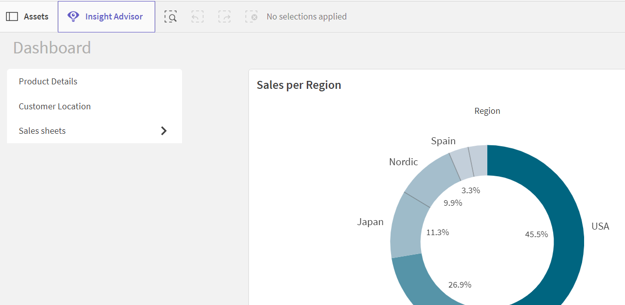
By default, the navigation menu displays all public sheets and groups in an app.
Navigation menu

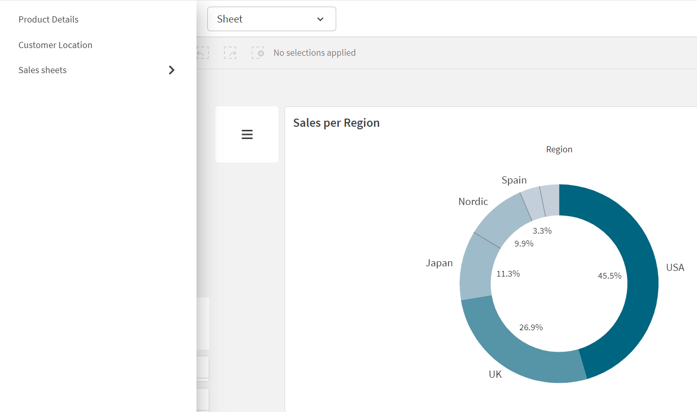
You can choose to have the navigation menu open a drawer menu over the app. When this is selected, the navigation menu become an icon ().
Drawer navigation menu

The navigation menu can only be added in advanced edit mode.
When to use it
The navigation menu is useful when you want to provide an alternative method of navigating sheets in an app.
Creating navigation menus
You can format and color the text in the menu. The background image has sizing and positioning options.
Do the following:
-
From the assets panel, drag a navigation menu on to the sheet.
Styling the navigation menu
You have a number of styling options available under Appearance in the properties panel.
Click Styling under Appearance > Presentation to further customize the styling of the chart. The styling panel contains various sections under the General and Chart tabs.
You can reset your styles by clicking next to each section. Clicking
Reset all resets styles for all available tabs in the styling panel.
For general information about styling an individual visualization, see Applying custom styling to a visualization.
Customizing the text
You can set the text for the title, subtitle, and footnote under Appearance > General. To hide these elements, turn off Show titles.
The visibility of the different labels on the chart depends on chart-specific settings and label display options. These can be configured in the properties panel.
You can style the text that appears in the chart.
Do the following:
-
In the properties panel, expand the Appearance section.
-
Under Appearance > Presentation, click
Styling.
-
On the General tab, set the font, emphasis style, font size, and color for the following text elements:
-
Title
-
Subtitle
-
Footnote
-
-
On the Menu tab, set the font, font size, and color for the following text elements:
-
Labels: Style the labels of the individual items.
-
Customizing the background
You can customize the background of the chart. The background can be set by color and image.
Do the following:
-
In the properties panel, expand the Appearance section.
-
Under Appearance > Presentation, click
Styling.
-
On the General tab of the styling panel, you can select a background color (single color or expression). You can also set the background to an image from your media library or from a URL.
When using a background color, use the slider to adjust the opacity of the background.
When using a background image, you can adjust image sizing and position.
-
On the Menu tab of the styling panel, select a default color for the menu items, a highlight color, and a hover color.
Customizing the border and shadow
You can customize the border and shadow of the chart.
Do the following:
-
In the properties panel, expand the Appearance section.
-
Under Appearance > Presentation, click
Styling.
-
On the General tab of the styling panel, under Border, adjust the Outline size to increase or decrease the border lines around the chart.
-
Select a color for the border.
-
Adjust the Corner radius to control the roundness of the border.
-
Under Shadow in the General tab, select a shadow size and color. Select None to remove the shadow.
-
On the Menu tab, under Border, adjust the Outline size to increase or decrease the border lines around the chart.
-
Select a color for the border.
-
Adjust the Corner radius to control the roundness of the border.
-
Under Shadow in the Menu tab, select a shadow size and color. Select None to remove the shadow.
Setting navigation menus as drawer menus
You can make your navigation menu a drawer menu. When set as a drawer menu, the navigation menu acts as a button that opens a menu over the whole app listing sheets. You can optionally add a menu icon () to the navigation menu.
Do the following:
-
In the properties panel, expand the Appearance section.
-
Under Appearance > Presentation, turn on Drawer menu.
-
Optionally select Show drawer icon.
Styling drawer menus
You can style your drawer button and panel.
Do the following:
-
In the properties panel, expand the Appearance section.
-
Under Appearance > Presentation, click
Styling.
-
Click Menu.
-
Under Drawer button, optionally customize the colors and add a background image.
-
Under Drawer panel, optionally customer the color and background image used by the panel.
Setting orientation and layout
Do the following:
-
In the properties panel, expand the Appearance section.
-
Under Appearance > Presentation, under Orientation, select Vertical or Horizontal.
-
Under Layout, select Fill or Minimal.
-
Under Position, select the position of the menu items in the navigation menu.
-
If you selected Horizontal or Minimal, optionally select Same item width to make all tabs have the same size.
Separating items in navigation menus
Do the following:
-
In the properties panel, expand the Appearance section.
-
Under Appearance > Presentation, turn on Separate items.
Showing large items
Do the following:
-
In the properties panel, expand the Appearance section.
-
Under Appearance > Presentation, select Show large items.
Showing item icons
Do the following:
-
In the properties panel, expand the Appearance section.
-
Under Appearance > Presentation, select Show item icons.
