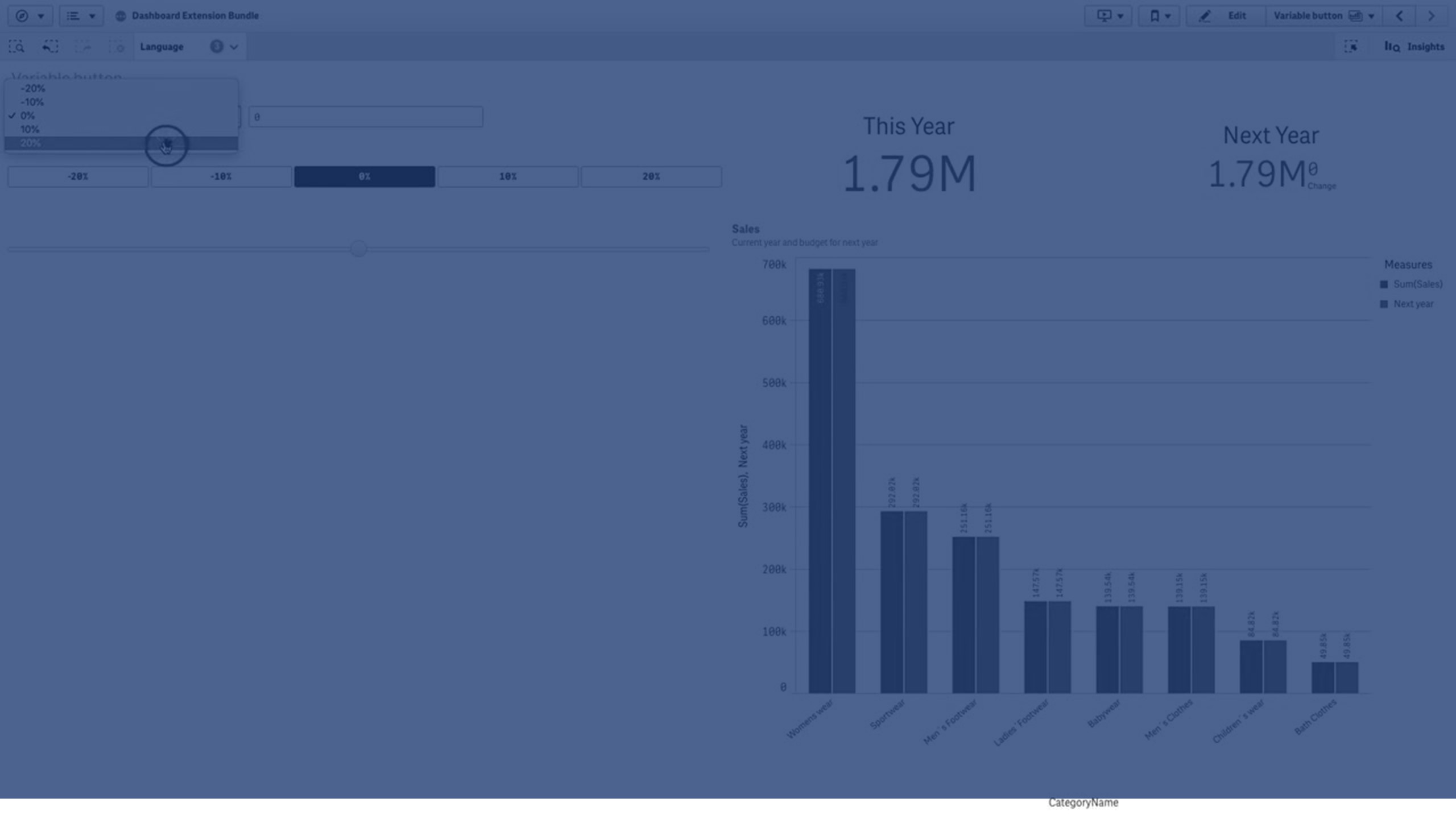
You can use the variable input control to set the value of a variable. It is included in Dashboard bundle.

When to use it
If you have visualizations with expressions that contain a variable, you can use the variable input control to let the user control the variable value.
Creating a variable input control
You can create a variable input control on the sheet you are editing.
Do the following:
- In the assets panel, open Custom objects > Dashboard bundle and drag a Variable input object to the sheet.
- Select the variable to use in Name under Appearance > Variable in the property panel.
-
Select how you want to input data in Show as:
-
Buttons lets you add a number of buttons with one button for each defined variable value.
You can select how to display the buttons in Display, select Row to show them in a horizontal row or Column to show them in a vertical column.
You can define the buttons in two different ways, fixed (Fixed) or (dynamic) Dynamic with the Fixed or dynamic values setting under Values.
If you select to use fixed values, you need to add each button with Add Alternative and define a value (Value) and a label (Label) for each button.
If you use dynamic values, you define the buttons with a string in Dynamic values.Use | to separate buttons, and ~ to separate value from label. For example, 'Germany~GER|France~FRA' will create two buttons labelled GER and FRA. The first will change the variable value to Germany, and the second changes the value to France. You do not need to specify labels if you want to use values as labels.
-
Drop down adds a drop down with one item for each defined variable value.
You can define the items in two different ways, fixed (Fixed) or (dynamic) Dynamic with the Fixed or dynamic values setting under Values.
If you select to use fixed values, you need to add each item with Add Alternative and define a value (Value) and a label (Label) for each item.
If you use dynamic values, you define the items with a string in Dynamic values.Use | to separate items, and ~ to separate value from label. For example, 'Germany~GER|France~FRA' will create two items labelled GER and FRA. The first will change the variable value to Germany, and the second changes the value to France. You do not need to specify labels if you want to use values as labels.
- Input box provides a simple input box that will update the variable value.
-
Slider creates a slider that updates the variable value. You define the minimum setting with Min and the maximum setting with Max under Values. You can also set the step to use with Step. If you select Slider label, the selected value is displayed when you drag the slider.
The variable value is updated when you stop dragging the slider, but you can select Update on drag if you want the variable value to be updated while you drag. This can be useful when you want visualizations based on the variable to update dynamically when dragging the slider. Use this option with caution, as the constant redrawing of charts can be annoying.
-
Customizing styling
You have a number of styling options available under Appearance in the properties panel.
Click Styling under Appearance > Presentation to further customize the styling of the chart. You can reset your styles by clicking
next to each section. Clicking
Reset all resets styles for all available tabs in the styling panel.
For general information about styling an individual visualization, see Applying custom styling to a visualization.
Customizing the text
You can set the text for the title, subtitle, and footnote under Appearance > General. To hide these elements, turn off Show titles.
The visibility of the different labels on the chart depends on chart-specific settings and label display options. These can be configured in the properties panel.
You can style the text that appears in the chart.
Do the following:
-
In the properties panel, expand the Appearance section.
-
Under Appearance > Presentation, click
Styling.
-
On the General tab, set the font, emphasis style, font size, and color for the following text elements:
-
Title
-
Subtitle
-
Footnote
-
Customizing the background
You can customize the background of the chart. The background can be set by color and image.
Do the following:
-
In the properties panel, expand the Appearance section.
-
Under Appearance > Presentation, click
Styling.
-
On the General tab of the styling panel, you can select a background color (single color or expression). You can also set the background to an image from your media library or from a URL.
When using a background color, use the slider to adjust the opacity of the background.
When using a background image, you can adjust image sizing and position.
Customizing the border and shadow
You can customize the border and shadow of the chart.
Do the following:
-
In the properties panel, expand the Appearance section.
-
Under Appearance > Presentation, click
Styling.
-
On the General tab of the styling panel, under Border, adjust the Outline size to increase or decrease the border lines around the chart.
-
Select a color for the border.
-
Adjust the Corner radius to control the roundness of the border.
-
Under Shadow in the General tab, select a shadow size and color. Select None to remove the shadow.
Limitations
For information about general limitations, see Limitations.
- The slider label can only display numeric values. This means, if the value is a date the numeric value of the date is displayed. If the value is a percentage value, the percentage character is not displayed.
