
Treemaps display hierarchical data by using nested rectangles, that is, smaller rectangles within a larger rectangle.

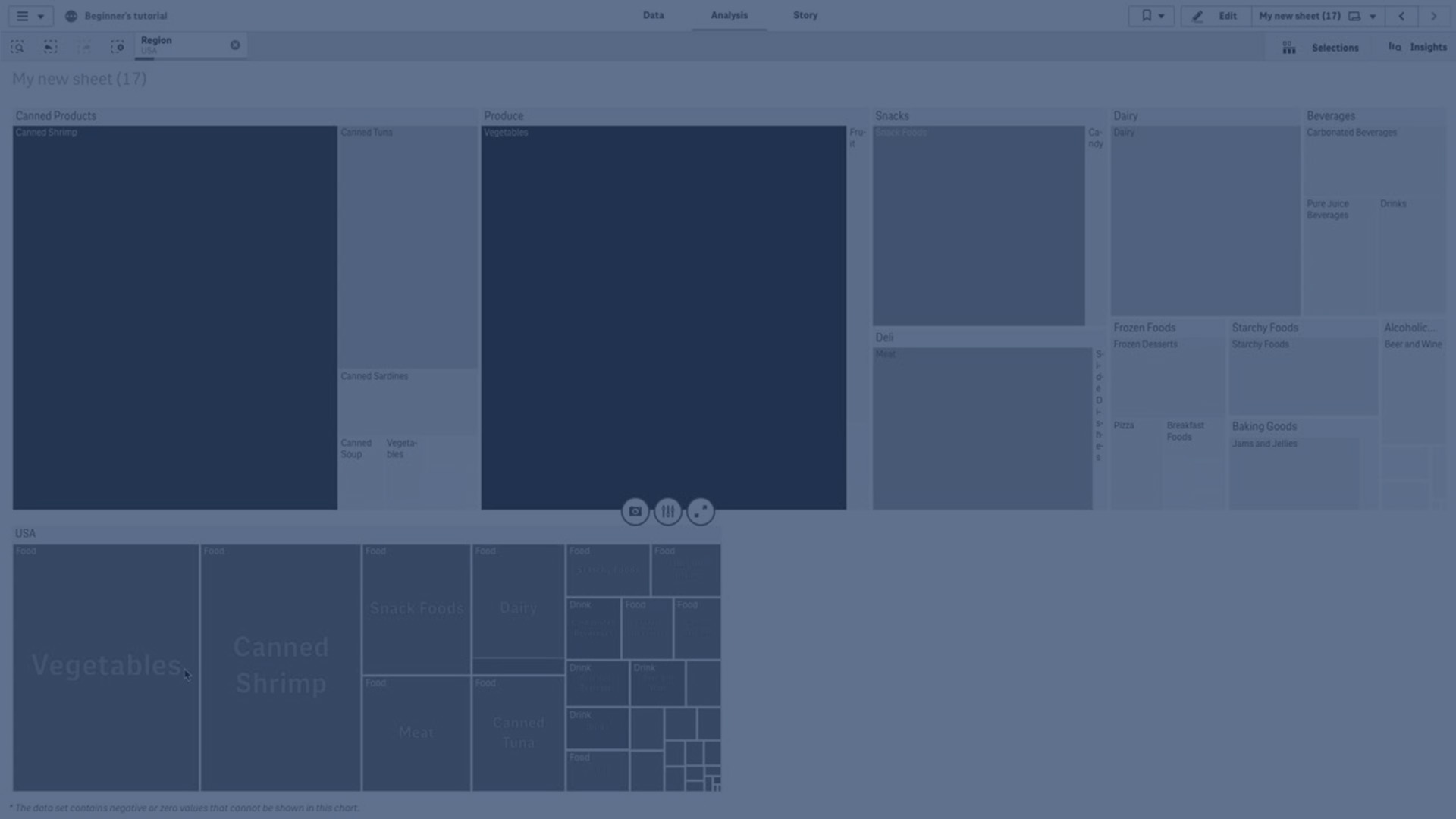
In this image you have several product groups, such as Produce, Canned Products, and Frozen Foods. Each product group consists of a large rectangle. You can regard the product groups as branches of the tree. When you select a product group, you drill down to the next level, the product type, for example, Vegetables, Meat, and Dairy. You can regard the product types as sub-branches of the tree. The branches have leaves. A leaf node's rectangle has an area proportional to a specified dimension of the data. In this example, the items Ebony Squash, Bravo Large Canned Shrimp, Red Spade Pimento Loaf, and so on, are the leaves. The leaf nodes are colored to show a separate dimension of the data.
Sorting is automatic according to size. By default, the coloring is by dimension, with 12 colors, but that can be changed in the properties panel. When you have more than one dimension, you can decide which dimension to color by. In this example, the coloring is not by dimension, but by expression (Avg(Margin)), a calculated measure and by using this expression, you can see which items have the highest average margin. The darker the color, the higher the average margin.
If the data set contains negative values, a text message is shown stating that the negative values cannot be displayed.
When to use it
Use a treemap when space is constrained and you have a large amount of hierarchical data that you need to get an overview of. Treemaps should primarily be used with values that can be aggregated.
Advantages
Treemaps are economical in that they can be used within a limited space and yet display a large number of items simultaneously.
When there is a correlation between color and size in the tree structure, you are able to see patterns that would be difficult to spot in other ways, for example, when a certain color is particularly relevant.
Disadvantages
Treemaps are not good when there is a big difference in the magnitude of the measure values. Nor is a treemap the right choice when mixing absolute and relative values.
Negative values cannot be displayed in treemaps.
Creating a treemap
You can create a treemap on the sheet you are editing.
Do the following:
- From the assets panel, drag an empty treemap to the sheet.
- Click Add dimension and select a dimension or a field. This should be the highest level in the hierarchy. It will be displayed as the main group in the chart.
- Click Add measure and select a measure or create a measure from a field. The measure will define the size of a rectangle.
- Add more dimensions in the order of hierarchy level . The last dimension you add defines the rectangles. The other dimensions define the grouping of the rectangles.
In a treemap you need at least one dimension and one measure, but to make full use of the treemap it is preferable to have two or three dimensions. You can only have one measure, but up to 15 dimensions. We do not recommend using more than three dimensions as the treemap may become unmanageable.
When you have created the treemap, you may want to adjust its appearance and other settings in the properties panel. For information about styling, see Styling the treemap. For information about customizing other aspects of the chart's appearance, see Changing the appearance of a visualization.
Styling the treemap
You have a number of styling options available under Appearance in the properties panel.
Click  Styling under Appearance > Presentation to further customize the styling of the chart. The styling panel contains various sections under the General and Chart tabs.
You can reset your styles by clicking  next to each section. Clicking Reset all resets styles in both General and Chart.
For general information about styling an individual visualization, see Applying custom styling to a visualization.
Customizing the text
You can set the text for the title, subtitle, and footnote under Appearance > General. To hide these elements, turn off Show titles.
The visibility of the different labels on the chart depends on chart-specific settings and label display options. These can be configured in the properties panel.
You can style the text that appears in the chart.
Do the following:
-
In the properties panel, expand the Appearance section.
-
Under Appearance > Presentation, click
Styling. -
On the General tab, set the font, emphasis style, font size, and color for the following text elements:
-
Title
-
Subtitle
-
Footnote
-
-
On the Chart tab, set the font, font size, and any other applicable properties for the following text elements:
-
Header labels: Style the header labels. You can customize the font, font size, and color.
-
Leaf labels: Style the labels for the leaf elements.
- Legend title: Style the title of the legend. You can customize the font, font size, and color.
- Legend labels: Style the labels of the individual legend items. You can customize the font, font size, and color.
-
Customizing the background
You can customize the general background and the background of the header area. The general background can be set by color and image, while the background of the header area can be set to a single color.
In the styling panel, you can configure background options.
Setting the general background
The general background of the chart includes the title area, as well as the chart itself, which might be partially covered by the header.
Do the following:
-
In the properties panel, expand the Appearance section.
-
Under Appearance > Presentation, click
Styling. -
On the General tab of the styling panel, you can select a background color (single color or expression), and also set the background to an image from your media library.
When using a background image, you can adjust image sizing and position.
Setting the header background
The header area is a branch-like frame surrounding the hierarchy of rectangles when two or more dimensions are added to the chart.
Do the following:
-
In the properties panel, expand the Appearance section.
-
Under Appearance > Presentation, click
Styling. -
On the Chart tab of the styling panel, select a background color under Header background color.
Customizing the border and shadow
You can customize the border and shadow of the chart.
Do the following:
-
In the properties panel, expand the Appearance section.
-
Under Appearance > Presentation, click
Styling. -
On the General tab of the styling panel, under Border, adjust the Outline size to increase or decrease the border lines around the chart.
-
Select a color for the border.
-
Adjust the Corner radius to control the roundness of the border.
-
Under Shadow in the General tab, select a shadow size and color. Select None to remove the shadow.
Display limitations
When displaying large amounts of data in a treemap, there may be cases when not each dimension value within a rectangle is displayed with correct color and size. These remaining values will instead be displayed as a gray, striped area. The size and total value of the rectangle will still be correct, but not all dimension values in the rectangle will be explicit.
To remove the gray areas, you can either make a selection or use dimension limits in the properties panel.