
The gauge shows a single measure value and visualizes how to interpret that value.

When to use it
The gauge is often used to present KPIs, for example, on an executive dashboard, and together with segmenting and color coding, it is an effective way of illustrating a performance result.
It is important to set relevant max and min values to support the interpretation of the value. You can use a reference line to provide additional context.
Advantages
A gauge is easy to read and understand and gives an instant indication of the performance within an area.
Disadvantages
The gauge is quite space-demanding in relation to the single value it visualizes.
Although visually compelling, the gauge is not always the best choice for presenting a single measure value. Problems when deciding the max and min values can indicate that some other visualization should be used.
If you only want to show a performance value, without a gauge, consider using a KPI instead.
Creating a gauge
You can create a gauge on the sheet you are editing. In a gauge you can only have one measure and no dimensions.
Do the following:
- From the assets panel, drag an empty gauge to the sheet.
- Click Add measure and select a measure or create a measure from a field.
When you have created the gauge, you may want to adjust its appearance and other settings in the properties panel.
The following settings are used by default in a gauge:
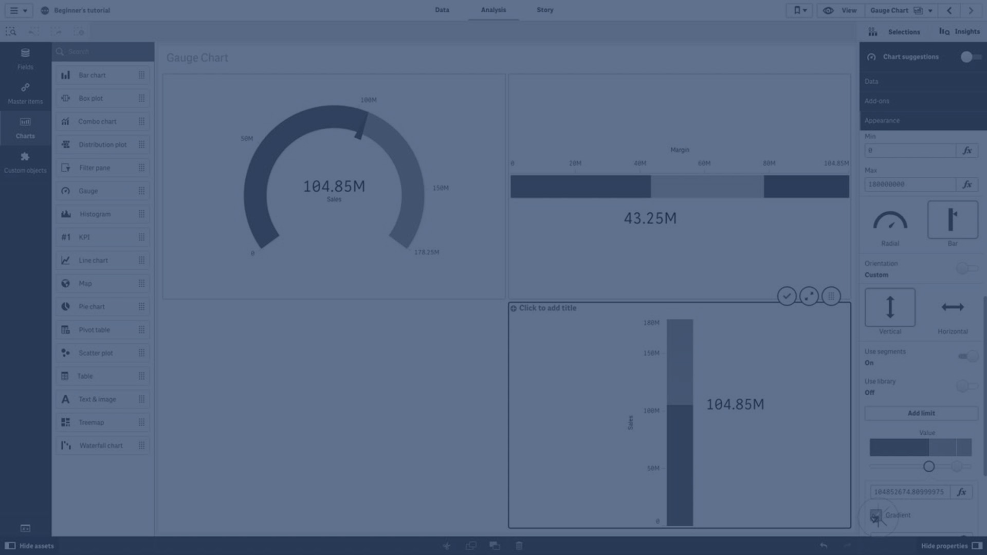
- A radial gauge.
- A single (blue) color.
- Range limits: min (0), max (100).
- No segments.
- Label and title are displayed in medium scale.
For example, you can change the radial gauge to a bar, and use a color gradient.

Styling the gauge
You have a number of styling options available under Appearance in the properties panel.
Click  Styling under Appearance > Presentation to further customize the styling of the chart. The styling panel contains various sections under the General and Chart tabs.
You can reset your styles by clicking  next to each section. Clicking Reset all resets styles in both General and Chart.
For general information about styling an individual visualization, see Applying custom styling to a visualization.
Customizing the text
You can set the text for the title, subtitle, and footnote under Appearance > General. To hide these elements, turn off Show titles.
The visibility of the labels and other titles on the chart depends on how it has been configured outside of the styling panel. For a gauge, these display options can be configured in other areas the Appearance section.
You can style the text that appears in the chart.
Do the following:
-
In the properties panel, expand the Appearance section.
-
Under Appearance > Presentation, click
Styling. -
On the General tab, set the font, emphasis style, font size, and color for the following text elements:
-
Title
-
Subtitle
-
Footnote
-
-
On the Chart tab, set the font and font color for the following text elements:
-
Axis title: Style the title for measure displayed in the gauge.
-
Axis label: Style the labels for gauge's range limits.
-
Value label: Style the label displaying the measure value.
-
Customizing the background
You can customize the background of the chart. The background can be set by color and image.
Do the following:
-
In the properties panel, expand the Appearance section.
-
Under Appearance > Presentation, click
Styling. -
On the General tab of the styling panel, you can select a background color (single color or expression), and also set the background to an image from your media library.
When using a background image, you can adjust image sizing and position.
Customizing the border and shadow
You can customize the border and shadow of the chart.
Do the following:
-
In the properties panel, expand the Appearance section.
-
Under Appearance > Presentation, click
Styling. -
On the General tab of the styling panel, under Border, adjust the Outline size to increase or decrease the border lines around the chart.
-
Select a color for the border.
-
Adjust the Corner radius to control the roundness of the border.
-
Under Shadow in the General tab, select a shadow size and color. Select None to remove the shadow.
Display limitations
When a measure value is outside the range limits, an arrow indicates whether the measure value is higher or lower than the range values.