
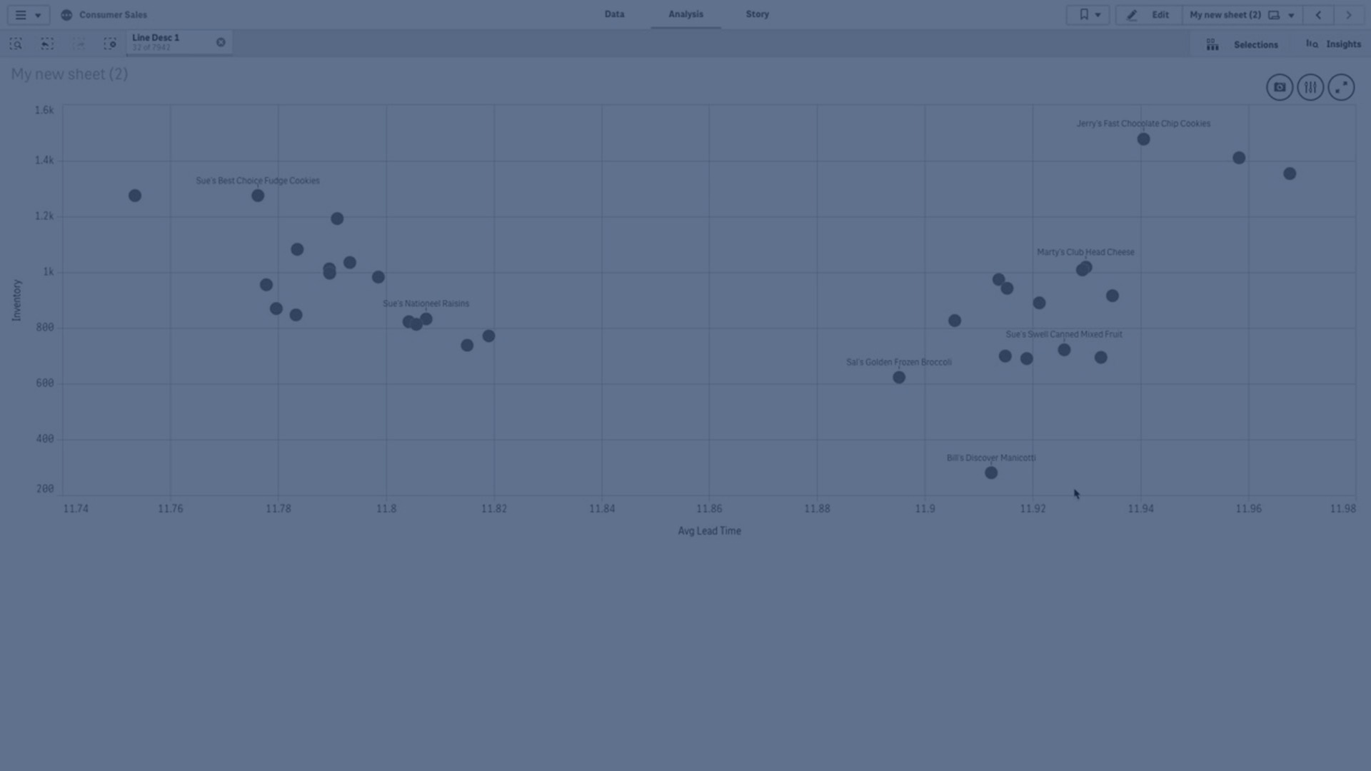
The scatter plot presents pairs of values from two or three measures.
This is useful when you want to show data where each instance has two numbers, for example, the relationship between Sales and Quantity per Customer. In the scatter plot below, a third measure (Cost) is used to generate the bubble size.
Scatter plot displaying the relationship between Sales and Quantity per Customer.

The scatter plot presents values from different measures over one dimension as a collection of points. In most charts you find your dimension on one of the axes, but for a scatter plot, the dimension is represented by the points in the chart and the measures are found on each of the two axes. When a third, optional, measure is used, its value is reflected in the bubble size. If you are analyzing large data sets and view compressed data, the density of the data points is reflected by color.
When to use it
The scatter plot helps you find potential relationships between values, and to find outliers in data sets. The scatter plot is useful when you want to show data where each instance has at least two metrics, for example, average life expectancy and average gross domestic product per capita in different countries.
Advantages
The scatter plot is a great way to visualize the correlation of two or more measures at the same time. The third measure is an efficient way of differentiating between values and simplifying the identification of, for example, large countries, large customers, large quantities, and so on.
Disadvantages
The scatter plot may be difficult to understand for an inexperienced user, because it has measure value on both axes, and the third, optional, measure adds complexity to the interpretation. Make sure a novice can interpret the scatter plot correctly. Using descriptive labels is a good way to make the visualization easier to interpret.
Values may be placed on top of each other and are then not visible until you zoom in.
Creating a scatter plot
You can create a scatter plot on the sheet you are editing.
In a scatter plot you need one dimension and at least two measures. You can have maximum one dimension and three measures, where the third measure is visualized as bubble size.
Do the following:
- From the assets panel, drag an empty scatter plot to the sheet.
- Click Add dimension and select a dimension or a field.
- Click Add measure and select a measure or create a measure from a field.
- Click Add measure and select a measure or create a measure from a field.
-
Optionally, if you want bubble size to be set according to a third measure:
Click Add measure and select a measure or create a measure from a field.
When you have created the scatter plot, you might want to adjust its appearance and other settings in the properties panel. For information about styling, see Styling the scatter plot. For information about customizing other aspects of the chart's appearance, see Changing the appearance of a visualization.
Styling the scatter plot
You have a number of styling options available under Appearance in the properties panel.
Click ![]() Styling under Appearance > Presentation to further customize the styling of the chart. The styling panel contains various sections under the General and Chart tabs.
Styling under Appearance > Presentation to further customize the styling of the chart. The styling panel contains various sections under the General and Chart tabs.
You can reset your styles by clicking ![]() next to each section. Clicking
next to each section. Clicking ![]() Reset all resets styles in both General and Chart.
Reset all resets styles in both General and Chart.
For general information about styling an individual visualization, see Applying custom styling to a visualization.
Customizing the text
You can set the text for the title, subtitle, and footnote under Appearance > General. To hide these elements, turn off Show titles.
The visibility of the different labels on the chart depends on chart-specific settings and label display options. These can be configured in the properties panel.
You can style the text that appears in the chart.
Do the following:
-
In the properties panel, expand the Appearance section.
-
Under Appearance > Presentation, click
 Styling.
 -
On the General tab, set the font, emphasis style, font size, and color for the following text elements:
-
Title
-
Subtitle
-
Footnote
-
-
On the Chart tab, set the font, font size, and color for the following text elements:
-
Axis title: Style the titles on the axes.
-
Axis label: Style the labels on the axes.
-
Value label: Style the labels for the bubbles representing each dimension value.
-
Legend title: Style the title of the legend.
-
Legend labels: Style the labels of the individual legend items.
-
Customizing the background
You can customize the background of the chart. The background can be set by color and image.
Do the following:
-
In the properties panel, expand the Appearance section.
-
Under Appearance > Presentation, click
Styling. -
On the General tab of the styling panel, you can select a background color (single color or expression), and also set the background to an image from your media library.
When using a background image, you can adjust image sizing and position.
Customizing the border and shadow
You can customize the border and shadow of the chart.
Do the following:
-
In the properties panel, expand the Appearance section.
-
Under Appearance > Presentation, click
Styling. -
On the General tab of the styling panel, under Border, adjust the Outline size to increase or decrease the border lines around the chart.
-
Select a color for the border.
-
Adjust the Corner radius to control the roundness of the border.
-
Under Shadow in the General tab, select a shadow size and color. Select None to remove the shadow.
Display limitations
Large data sets in scatter plots
You can set the maximum number of visible bubbles in a scatter plot if you are using advanced edit mode. Go to Presentation > Max visible bubbles. The default is 2,500. The maximum is 50,000. If you set a number less than 1,000, the scatter plot will behave as if the maximum is 1,000 visible bubbles.
If the number of displayed data points is less than Max visible bubbles, the data will be shown as individual bubbles. If there are more data points than the number set in Max visible bubbles, you will see an overview of your dataset as a table with colored boxes. This switch between compressed view and bubble view is done automatically. If there are more than 5,000 visible bubbles, then bubble labels and out of bound bubbles will not be shown.
Scatter plot with compressed data in a bubble view.

Zooming and panning
In a scatter plot, you can zoom and pan around in your data. The interaction differs depending on what device you are using. If you are zooming in you can see where in the data set you are located by looking at the mini chart in the bottom right corner. If you zoom in on large data sets you will be able to see the data shown as boxes with values inside. The values represent the number of points in each box.
You cannot make selections when the scatter plot is rendering during a pan or zoom.
Zooming and panning is not possible when you have made a selection in the compressed data view.
You can change the compression resolution in the visual exploration menu or in the properties panel.
Scatter plot with compressed data in a compressed view.

Coloring
Compressed scatter plots are always auto-colored by the primary data color. That means that any custom color definition made will not affect compressed data. The density of the data points is reflected by color. More dense data will be displayed in a darker color.
However, if you zoom or make selections so that the number of displayed data points is reduced to less than Max visible bubbles, the data will be colored as defined.