
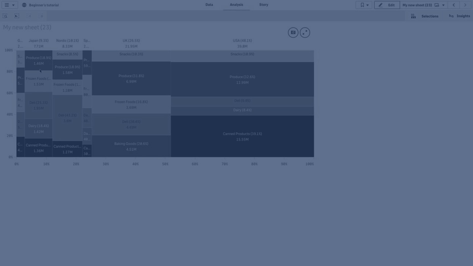
The mekko chart is suitable for comparing groups, while being able to compare category items contained within these groups. Mekko charts are also known as mosaic plots, Marimekko charts, and Mondrian diagrams. The dimension axis shows the groups, while the measure axis shows the normalized percentage value for each category item. The size of each group shows its value.
In this image, the dimensional groups represent different yearly quarters. The width of each quarter shows the normalized percentage value of the sum of sales, for that quarter. Each quarter is divided in several product categories, such as Produce, Canned Products, and Frozen Foods. The height of each product category corresponds to the normalized percentage value of the sum of sales of that product category, within that quarter. This allows you to easily compare between product categories inside a specific quarter, and between different quarters.

Sorting is automatic according to size. By default, the coloring is by dimension, with 12 colors, but that can be changed in the properties panel. You can decide which dimension to color by. In this example, the coloring is by product category to clearly distinguish the different categories and how their contribution to the sales change in each quarter.
If the data set contains negative values, a text message is shown stating that the negative values cannot be displayed.
When to use it
Use a mekko chart when you need to visualize normalized percentage values of grouped data. Mekko charts should primarily be used with values that can be aggregated.
Advantages
The mekko chart is easy to read and understand. You get a good comparison between groups, and a comparison of the impact of categories within each group.
Disadvantages
The mekko chart does not work so well with many dimension values due to the limitation of the axis length.
Mekko charts are not good when there is a big difference in the magnitude of the measure values. Nor is a mekko chart the right choice when mixing absolute and relative values.
Negative values cannot be displayed in mekko charts.
Creating a mekko chart
You can create a simple mekko chart on the sheet you are editing.
Do the following:
- From the assets panel, drag an empty mekko chart to the sheet.
- Click Add dimension and select a dimension or a field. This dimension defines the grouping.
- Add a second dimension in the order of hierarchy level. The second dimension you add defines the categories.
- Click Add measure and select a measure or create a measure from a field.
In a mekko chart you need two dimensions and one measure.
Each bar corresponds to the first dimension, divided into smaller categories based on the second dimension. The values of the measures determine the relevant height of the categories inside each bar, as well as the size of the bars.
When you have created the chart, you might want to adjust its appearance in the properties panel. For information about styling, see Styling the mekko chart. For information about customizing other aspects of the chart's appearance, see Changing the appearance of a visualization.
Styling the mekko chart
You have a number of styling options available under Appearance in the properties panel.
Click  Styling under Appearance > Presentation to further customize the styling of the chart. The styling panel contains various sections under the General and Chart tabs.
You can reset your styles by clicking  next to each section. Clicking Reset all resets styles in both General and Chart.
For general information about styling an individual visualization, see Applying custom styling to a visualization.
Customizing the text
You can set the text for the title, subtitle, and footnote under Appearance > General. To hide these elements, turn off Show titles.
The visibility of the different labels on the chart depends on chart-specific settings and label display options. These can be configured in the properties panel.
You can style the text that appears in the chart.
Do the following:
-
In the properties panel, expand the Appearance section.
-
Under Appearance > Presentation, click
Styling. -
On the General tab, set the font, emphasis style, font size, and color for the following text elements:
-
Title
-
Subtitle
-
Footnote
-
-
On the Chart tab, set the font, font size, and color for the following text elements:
-
Axis label: Style the labels on the axes.
-
Value label: Style the labels for the dimension and measure values, including the percentage contributed by each value towards the total of the grouping above it in the hierarchy.
-
Legend title: Style the title of the legend.
-
Legend labels: Style the labels of the individual legend items.
-
Customizing the background
You can customize the background of the chart. The background can be set by color and image.
Do the following:
-
In the properties panel, expand the Appearance section.
-
Under Appearance > Presentation, click
Styling. -
On the General tab of the styling panel, you can select a background color (single color or expression), and also set the background to an image from your media library.
When using a background image, you can adjust image sizing and position.
Customizing the border and shadow
You can customize the border and shadow of the chart.
Do the following:
-
In the properties panel, expand the Appearance section.
-
Under Appearance > Presentation, click
Styling. -
On the General tab of the styling panel, under Border, adjust the Outline size to increase or decrease the border lines around the chart.
-
Select a color for the border.
-
Adjust the Corner radius to control the roundness of the border.
-
Under Shadow in the General tab, select a shadow size and color. Select None to remove the shadow.