
The combo chart is suitable for comparing two sets of measure values that are usually hard to compare because of the differences in scale. It is basically a bar chart combined with a line chart.
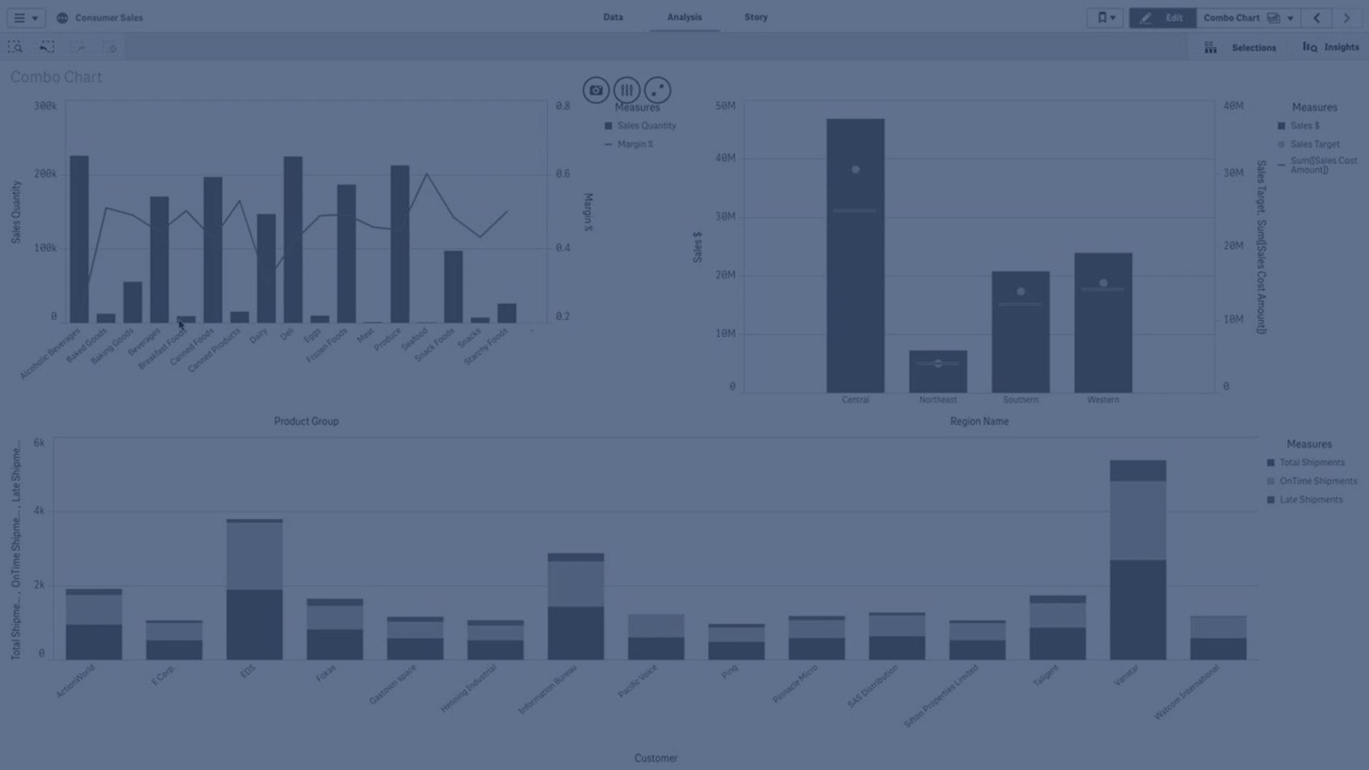
A typical example is when you have a bar chart with sales figures and want to combine these figures with the margin values (in percent). In a regular bar chart, the bars for sales would be displayed as usual, but the margin values would be almost invisible because of the very large difference between the numeric values for sales and margin.
A combo chart with the margin values (in percent) and bars with sales figures.

With a combo chart you can combine these values by, for example, using bars for the sales values and a line for the margin values. By default, the bars have the measure axis on the left and the margin values have a separate axis to the right. The two measures use the same dimension (YearMonth).
If you have yet another measure, for example, gross sales, with values that are roughly in the same range as the sales values, you can add the third measure as bars and either stack or group the new measure values with the sales values. With grouped bars, you can easily compare two or more items in the same categorical group. Stacked bars combine bars of different groups on top of each other and the total height of the resulting bar represents the combined result.
A combo chart with three measures; the margin values (in percent), bars with sales figures and the measure Gross sales grouped with the sales values.

The combo chart can only be displayed vertically.
When to use it
With the possibility to have different measure scales, one to the left and one to the right, the combo chart is ideal when you want to present measure values that are normally hard to combine because of the significant difference in value ranges.
But a combo chart can also be quite useful when comparing values of the same value range. In the image above, the combo chart only has one measure axis, but the relationship between the two categories sales and cost is clear.
Advantages
The combo chart is the best choice when combining several measures of different value ranges.
Disadvantages
The combo chart only supports one dimension, and can therefore not be used when you need to include two or more dimensions in the visualization.
Creating a combo chart
You can create a combo chart on the sheet you are editing. In a combo chart, you need at least one dimension and one measure.
Do the following:
- From the assets panel, drag an empty combo chart to the sheet.
- Click Add dimension and select a dimension or a field.
- Click Add measure and select a measure or create a measure from a field. Select to show the measure as a bar.
- Add another measure by selecting Add under Height of line. Enter an expression, or master measure item, or a field with an aggregation function applied. By default a line will appear as the measure. You can select More Properties to choose Presentation of the measure as either bars, line, or marker. You can select drop-down options to switch between the Primary axis to the left or the Secondary axis to the right (right and left axes are reversed if Right-to-left is turned on in App Settings). For markers you can choose between several different shapes.
You can only have one dimension, but you can continue adding up to 15 measures. You can only have two measure axes though. This means, if you add three or more measures with a large difference in value range it can be hard to display all measures with a good distribution of values.
When you have created the combo chart, you might want to adjust its appearance and other settings in the properties panel. For information about styling see Styling the combo chart. For information about customizing other aspects of the chart's appearance, see Changing the appearance of a visualization.
Styling the combo chart
You have a number of styling options available under Appearance in the properties panel.
Click  Styling under Appearance > Presentation to further customize the styling of the chart. The styling panel contains various sections under the General and Chart tabs.
You can reset your styles by clicking  next to each section. Clicking Reset all resets styles in both General and Chart.
For general information about styling an individual visualization, see Applying custom styling to a visualization.
Customizing the text
You can set the text for the title, subtitle, and footnote under Appearance > General. To hide these elements, turn off Show titles.
The visibility of the labels shown on the chart depends on how you configure the measure values to be displayed, as well as other chart-specific settings and label display options. Configure a measure to be shown as Bars, Line, or Marker by expanding the measure under Data > Measures, and clicking More properties. Configure additional chart and label options under Appearance > Presentation.
You can style the text that appears in the chart.
Do the following:
-
In the properties panel, expand the Appearance section.
-
Under Appearance > Presentation, click
Styling. -
On the General tab, set the font, emphasis style, font size, and color for the following text elements:
-
Title
-
Subtitle
-
Footnote
-
-
On the Chart tab, expand the Bars section.
-
Under Bar labels, style the labels for measure values configured as Bars. You can select the font, font size, and color.
-
Expand the Lines section of the Chart tab.
-
Under Point labels, style the labels for measure values configured as Line. You can select the font, font size, and color.
-
On the Chart tab, set the font, font size, and color for the following text elements:
-
Axis title: Style the titles on the axes.
-
Axis label: Style the labels on the axes.
-
Legend title: Style the title of the legend.
-
Legend labels: Style the labels of the individual legend items.
-
Customizing the background
You can customize the background of the chart. The background can be set by color and image.
Do the following:
-
In the properties panel, expand the Appearance section.
-
Under Appearance > Presentation, click
Styling. -
On the General tab of the styling panel, you can select a background color (single color or expression), and also set the background to an image from your media library.
When using a background image, you can adjust image sizing and position.
Customizing the bar segment outline and bar width
If your combo chart contains measure data represented as bars, you can adjust the outline surrounding each bar segment in the chart, as well as the width of the bars.
Do the following:
-
In the properties panel, expand the Appearance section.
-
Under Appearance > Presentation, click
Styling. -
On the Chart tab, expand the Bars section.
-
Under Outline, set the thickness and color of the outlines.
-
Adjust the slider for Bar width to set the width of the bars.
Customizing the lines and data points
If your combo chart contains measure data represented as lines, you can customize the appearance of the lines and data points in the chart.
Do the following:
-
In the properties panel, expand the Appearance section.
-
Under Appearance > Presentation, click
Styling. - On the Chart tab, expand the Lines section.
-
Under Data point size, adjust the slider to change the size of the data points in the chart.
-
Under Line options, adjust the line thickness, line type (solid or dashed), and line curve (linear or monotone).
Customizing the border and shadow
You can customize the border and shadow of the chart.
Do the following:
-
In the properties panel, expand the Appearance section.
-
Under Appearance > Presentation, click
Styling. -
On the General tab of the styling panel, under Border, adjust the Outline size to increase or decrease the border lines around the chart.
-
Select a color for the border.
-
Adjust the Corner radius to control the roundness of the border.
-
Under Shadow in the General tab, select a shadow size and color. Select None to remove the shadow.
Display limitations
Displaying out of range values
In the properties panel, under Appearance, you can set a limit for the measure axis range. Without a limit, the range is automatically set to include the highest positive and lowest negative value, but if you set a limit you may have values that exceed that limit. A bar that exceeds the limit will be cut diagonally to show that it is out of range. For a line data point value that is out of range, an arrow indicates the direction of the value.
Displaying large amounts of data in a combo chart
If the chart uses a continuous scale, a maximum of 2000 data points can be displayed. The actual maximum number of data points in the chart is affected by the distribution of the data. Above this actual maximum number of data points, data points are neither displayed, nor included in selections made in the chart.
To avoid displaying limited data sets, you can either make a selection or use dimension limits in the properties panel.