
This example shows how to make a histogram to the distribution of data over intervals, using weather data.
Dataset
In this example, we'll use the following weather data.
- Location: Sweden > Gällivare Airport
- Date range: all data from 2010 to 2017
- Measurement: Average of the 24 hourly temperature observations in degrees Celsius
The dataset that is loaded contains a daily average temperature measurement from a weather station in the north of Sweden during the time period of 2010 to 2017.
Visualization
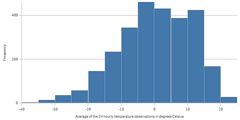
We add a histogram to the sheet and add the field Average of the 24 hourly temperature observations in degrees Celsius as dimension.
The visualization creates a frequency measure automatically, and sorts the temperature measurements into a number of bars according to frequency distribution.
We can adjust the size of the bars to get even intervals, by setting Bars to Custom and Bar width (x-axis) with a width of 5. This adjusts the bars to be intervals of 5 degrees Celsius as shown below:
Discovery
The histogram visualizes the frequency distribution of the temperature measurements. You can hover the mouse over a bar to see more details of the frequency.
We can see that most days, the temperature is between -5 and 15 degrees Celsius. There are days below -30, but they are not many.