
You can use the Trellis container to show a trellis chart based on a master visualization. The trellis chart shows a grid of the same chart for different dimension values. You can use the trellis chart to compare metrics for different groups of data. The Trellis container is included in the Visualization bundle.
Trellis chart based on a bar chart of sales data, shown for different product categories

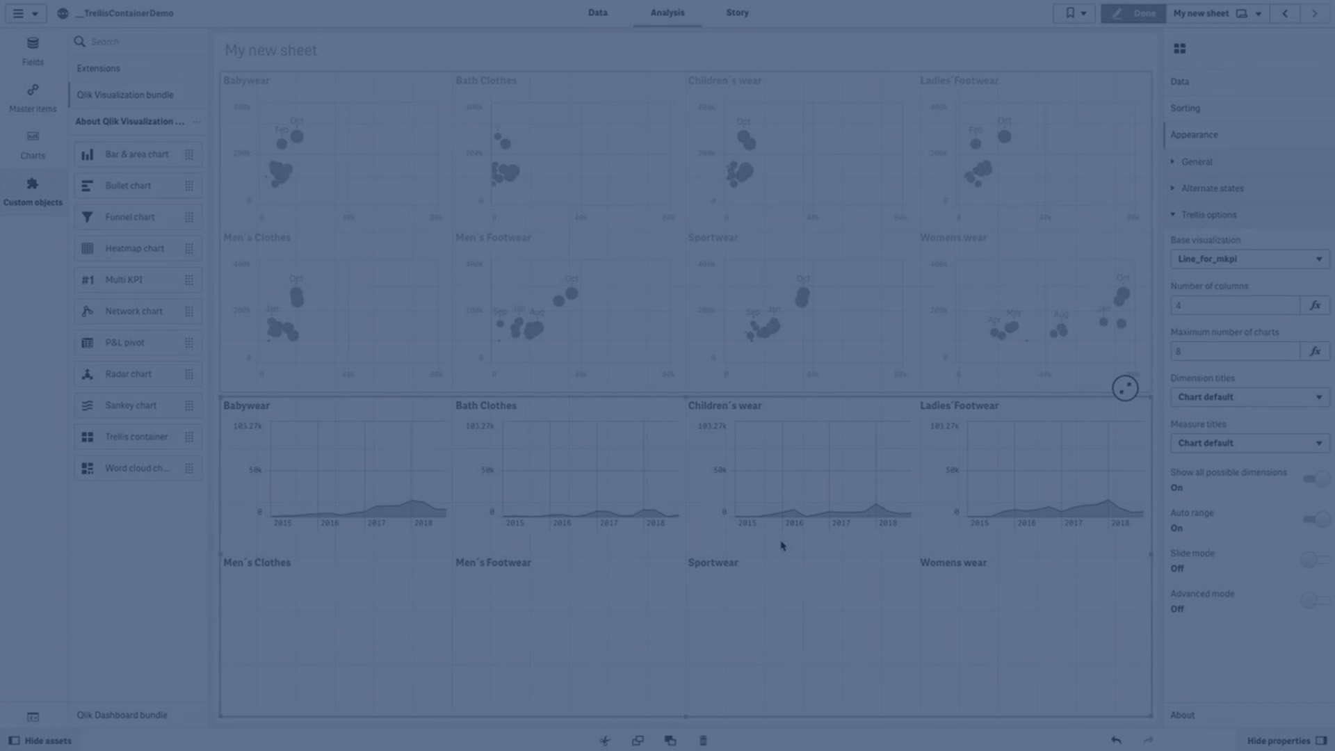
Creating a trellis chart
You can create a trellis chart on the sheet you are editing. The chart that you want to repeat for different dimension values must be a master visualization.
Do the following:
-
Create the chart that you want to repeat for different dimension values and save it as a master visualization.
- In the assets panel, open Custom objects > Visualization bundle and drag a Trellis container object to the sheet.
- Select which master visualization to show in Appearance > Trellis options > Base visualization in the property panel.
- Select the dimension that you want to use as the first grid dimension in Data > Dimensions.
- Optionally, add a second grid dimension to create a grid with one dimension in each axis.
You will now see a grid of charts, each based on the grid dimensions you selected.
Troubleshooting
I do not see a grid of charts, and receive this message: Too many dimension values!
Possible cause
There are more dimension values than the maximum number of charts allowed in the grid.
Proposed action
You can increase the number of charts allowed in Appearance > Trellis options > Maximum number of charts.
Changing the appearance of the chart
You can customize your chart with one or more features.
Setting the number of columns
You can set the number of columns in the chart grid with Appearance > Trellis options > Number of columns.
Setting the y-axis range of charts
You can select which y-axis range to show for the charts in the trellis chart with Appearance > Trellis options > Auto range.
- On will show the same range for all charts. This is the best option if you want to compare values between different charts.
- Off will show an optimized range for each chart.
Show border
You can show a border for the trellis chart with Appearance > Trellis options > Border. You can adjust width, color and style. It is also possible to define a custom border.
Slide mode
You can view the charts in slide mode instead of a grid by setting Appearance > Trellis options > Slide mode to On. In slide mode, you view one chart at a time. You can scroll between the charts.
Best practices for creating the master visualization
Here are some tips for creating a master visualization that will work well in a trellis chart:
- Show the title in the master visualization. In the trellis chart, the title is replaced with the grid dimension value of each chart.
- If you use expressions: create a label to hide the set expression.
- If you are using a combo chart: use only one axis, and set the minimum and maximum of the y-axis.
- If you are using a box plot: set the minimum and maximum of the y-axis.
- If you are using a scatter plot: set the x-axis.
- If you are using a map: use advanced mode, and set the layer color and title.
Using advanced mode
You can use advanced mode to specify where to insert set analysis and dimension values in the master visualization. Activate it by setting Appearance > Trellis options > Advanced mode to On.
You can use the following placeholders in formulas in the master visualization. They will be replaced in the trellis chart by the corresponding values:
| Placeholder | Replaced by value |
|---|---|
| $(vDim) | Dimension Name |
| $(vDimValue) | Dimension Value |
| $(vDimSet) | ,[Dimension Name]={'Dimension Value'} |
| $(vDimSetFull) | {<[Dimension Name]={'Dimension Value'}>} |
Limitations
For information about general limitations, see Limitations.
Unsupported visualizations
You cannot use the following visualizations in a trellis chart:
- Filter pane
- Histogram
Multi KPI visualizations with embedded master visualizations
It is not possible to use a Multi KPI chart that contains an embedded master visualization.
Selecting by dimension
If you make a selection on the dimension that is used as grid dimension in the trellis chart, the selection is not reflected in the trellis chart.
Example:
You have a filter pane with countries, and a trellis chart with country as the first grid dimension. When you select a country in the filter pane, the trellis chart will still show a chart for each country and ignore the selection.