
The Radar chart (Radar chart) displays a two-dimensional chart using radial axes to chart one or more groups of values over multiple variables. Radar charts can be used to visualize and compare performance to a set standard or to a group's performance. The Radar chart is included in the Visualization bundle.
Radar charts requires two dimensions and one measure. The y-axis goes from the center to the perimeter and the x-axis is the perimeter of the chart. Each value represents the distance from the center of the chart, and displays on axes starting from the center. The center of the chart represents the minimum value, and the edge the maximum value.
A radar chart can show multiple series, each separately connected with their values. The data only goes around the chart once. Adding values only increases the chart's granularity.
Understanding a radar chart
A radar chart consists of evenly spaced segments (axes) arranged radially around a point. There is one segment for each data value of the second dimension. The value of each measure is shown by a node on applicable axis. A line connects the values that belong to the same series creating the chart’s star-like shape.
A radar chart with one axis for each month of the Date.Month dimension.

When to use it
Radar charts let you compare and measure data with an arbitrary number of variables. This is helpful when comparing something's features or performance over several metrics. For example: before buying a computer, you can compare different computers across several features, such as memory storage, processing, and screen size. A radar chart is also useful when:
- Measuring quality improvements and performance.
- Comparing allocated amount versus actual spending in an organization.
- Identifying outliers, commonality, and clusters of data with similar values and features.
- Charting an athlete's strengths and weaknesses.
-
Comparing results of small-to-moderate-sized multivariate data sets.
Creating a radar chart
You can create a radar chart on the sheet you are editing.
Do the following:
- In the assets panel, open Custom objects > Visualization bundle and drag a Radar chart object to the sheet.
- Click the top Add dimension button and select the first dimension category to be measured (x-axis).
- Click the second Add dimension button to select the second dimension (y-axis).
- Click the Add measure button to select the measure of the chart.
Once dimensions and measure have been selected the radar chart displays automatically (in color) in the chart field.
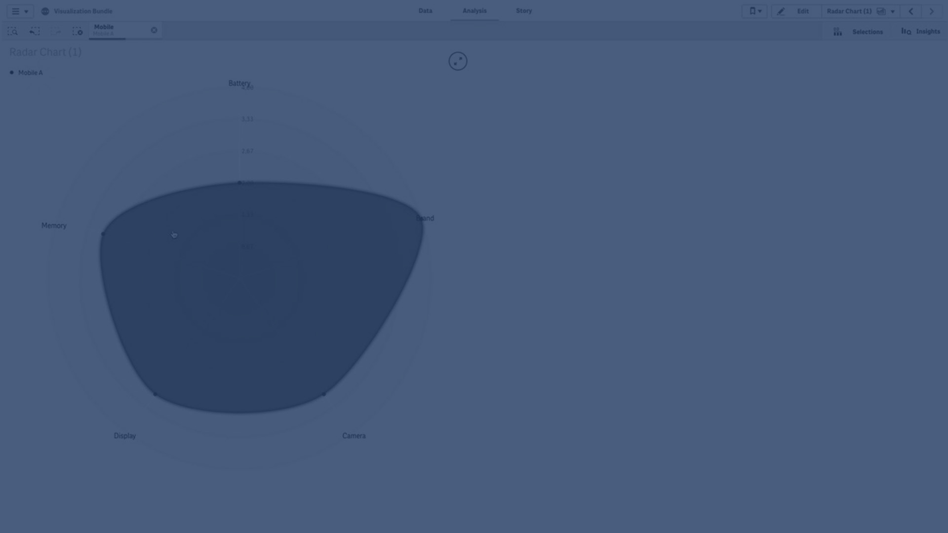
A radar chart with two dimensions and one measure.

Changing the appearance of the chart
You can customize your radar chart with one or more features.
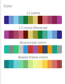
Changing the color scheme
You can change color scheme of your chart by choosing from four predefined options.
Do the following:
- Click Appearance > Design in the property panel.
- Select a color scheme under Color.
Changing the stroke type
You can also customize the shape line connecting each node under Appearance > Design > Stroke type in the properties panel. Select the shape from the menu.
Toggling the legend
The legend provides a small text description of each node of the chart. The legend expands to show its text, and the chart shrinks to accommodate the legend. To toggle the legend, move the slide button under Appearance > Design > Legend in the properties panel.
Limiting dimensions
You can set limits on your dimension values. To change limitations and terms go to Data > Dimensions in the properties panel. Click dimension, and under Limitation choose a limitation from the menu.
Toggling titles
This option can hide the name of the radar chart. To toggle the name, click Appearance > General in the properties panel. Move the Show titles slide button.
Number formatting
The default setting for Number formatting for measures and dimensions is Auto. You can change this setting to Number, and then select a number format.
Limitations
Radar charts have the following limitations:
- Radar charts can only process 100 unique values per dimension.
- Exported radar charts will not include the chart legend.
- For information about general limitations, see Limitations.