
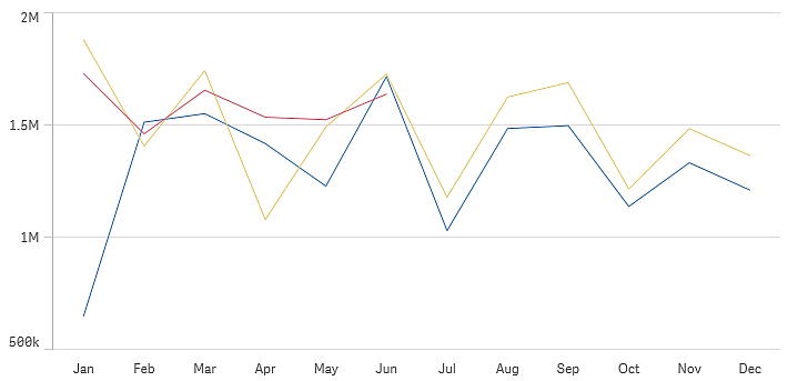
The line chart is used to show trends over time. The dimension is always on the x-axis, and the measures are always on the y-axis.
Your data set must consist of at least two data points to draw a line. A data set with a single value is displayed as a point.
If you have a data set where data is missing for a certain month, you have the following options for showing the missing values:
- As gaps
- As connections
- As zeros
When a month is not present at all in the data source, it is also excluded from the presentation.
When to use it
The line chart is primarily suitable when you want to visualize trends and movements over time, where the dimension values are evenly spaced, such as months, quarters, or fiscal years.
Advantages
The line chart is easy to understand and gives an instant perception of trends.
Disadvantages
Using more than a few lines in a line chart makes the line chart cluttered and hard to interpret. For this reason, avoid using more than two or three measures.
Creating a line chart
You can create a line chart on the sheet you are editing.
Do the following:
- From the assets panel, drag an empty line chart to the sheet.
- Click Add dimension and select a dimension or a field.
- Click Add measure and select a measure or create a measure from a field.
In a line chart you need at least one dimension and one measure.
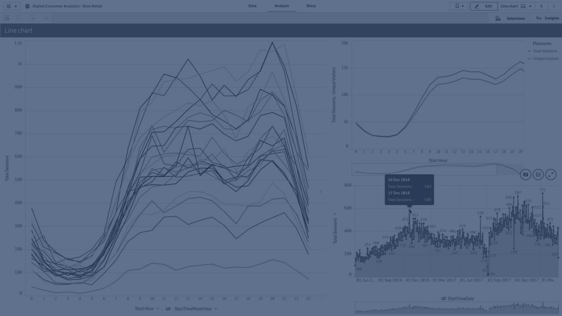
You can include up to two dimensions and one measure, or one dimension and up to 15 measures in a line chart.
| Dimensions | Measures | Result |
|---|---|---|
| 1 dimension | 1 measure | A simple line chart with a single line. |
| 2 dimensions | 1 measure | A line chart with the first dimension on the X-axis, and a line for each value of the second dimension. |
| 1 dimension | up to 15 measures | A line chart with one line for each measure. |
When you have created the line chart, you may want to adjust its appearance and other settings in the properties panel.
For more information, see Changing the appearance of a visualization.
Display limitations
Displaying large numbers of dimension values
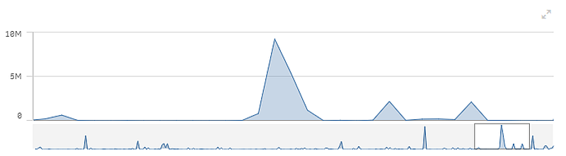
When the number of dimension values exceeds the width of the visualization, a mini chart with a scroll bar is displayed. You can scroll by using the scroll bar in the mini chart, or, depending on your device, by using the scroll wheel or by swiping with two fingers. When a large number of values are used, the mini chart no longer displays all the values. Instead, a condensed version of the mini chart (with the items in gray) displays an overview of the values, but the very low and the very high values are still visible. Note that for line charts with two dimensions, the mini chart is only available in stacked area mode.
Displaying out of range values
In the properties panel, under Appearance, you can set a limit for the measure axis range. Without a limit, the range is automatically set to include the highest positive and lowest negative value, but if you set a limit you may have values that exceed that limit. When a data point value cannot be displayed, due to the range limits, an arrow indicates the direction of the value.
When a reference line is out of range, an arrow is displayed together with the number of reference lines that are out of range.
Displaying large amounts of data in a line chart
When displaying large amounts of data in a line chart, the message "Currently showing a limited data set." is shown to indicate that not all data is displayed.
- If the chart uses a continuous scale, 2000 data points are displayed.
- If the chart uses a non-continuous scale, the number of data points displayed is in the range of 2500 to 5000. The limit depends on if the chart has one or two dimensions, and if coloring is used.
Above that number, data points are neither displayed, nor included in selections made in the line chart.
Additionally, only twelve dimension values are displayed for the second dimension in a chart with two dimensions and continuous scale.
To avoid displaying limited data sets, you can either make a selection or use dimension limits in the properties panel.