Custom array properties
Warning noteThis feature is considered EXPERIMENTAL and may be subject to change or be removed in future releases.
The array definition property template can be used to add a custom property of array type. When defining a list property, the following fields can be used:
| Field | Description |
|---|---|
| type |
This field is mandatory for array types and should always be defined as array. |
| label | Used for defining the label that is displayed in the property panel. |
| component |
This field should not be used for array types. |
| ref | Name or ID used to reference a property. |
| itemTitleRef | Used for defining the title of the section items. |
| allowAdd |
Boolean. true adds a button for adding new items. |
| allowRemove |
Boolean. true adds an Delete button. |
| addTranslation | Used for defining a label of the button used to add new items. |
| allowMove |
Boolean. true enables the ability to move the accordion item in the properties panel. |
Information noteHypercubes and List objects cannot be added inside array property templates. You must initiate listItems in initialProperties.
Example
Defining a custom array property
Defining a custom property of array type can look like below.
Example:
Information noteCustomization of properties always start with items:.
define( [
],
function ( ) {
return {
initialProperties: {
listItems: []
},
definition : {
type : "items",
component : "accordion",
items: {
settings: {
uses: "settings",
items: {
MyList: {
type: "array",
ref: "listItems",
label: "List Items",
itemTitleRef: "label",
allowAdd: true,
allowRemove: true,
addTranslation: "Add Item",
items: {
button: {
label:"Click me",
component: "button",
action: function(data){
alert("click!");
}
},
label: {
type: "string",
ref: "label",
label: "Label",
expression: "optional"
},
textarea: {
label:"My textarea",
component: "textarea",
maxlength: 100,//you shouldn't write too much
ref: "myTextarea"
}
}
}
}
}
}
},
paint: function ($element) {
//add your rendering code here
$element.html( "props-list" );
}
};
} );
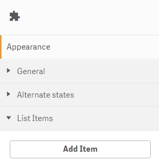
This is what it looks like in the property panel

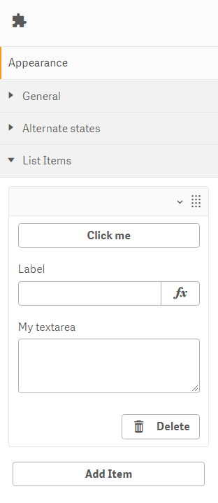
This is what it looks like when an item has been added

