Skip to main content Skip to complementary content

Using charts to filter

An easy way to apply a filter on your data is to use the charts showing the graphical representation of your data.

Filters can be used to isolate values, thus making it easier to apply functions on a specific category of data. Using the quality bar to select empty or invalid cells is one solution, but in this example, you are going to learn how to filter data via the charts located on the bottom right of the interface. In Talend Cloud Data Preparation, the statistics for each column are available in the form of a chart.

Imagine you want to have a better understanding of the age distribution of your customers, and identify those that are under the age of 18. To filter this specific group of customers using a chart, proceed as follows:

Procedure

  1. Click the header of the Age column to select its content.
    Age column selected.

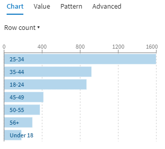
    The graphical representation of the column's content is displayed in the form of an horizontal bar chart, on the bottom right side of the screen. Each bar represents the number of occurrences of an age group. Hovering over each bar displays information about the data.

    Graphical representation of the column's content.
  2. In the chart, click the bar labeled Under 18.
    Your preparation now only displays the lines corresponding to clients under the age of 18. On the upper part of the screen, you can see that the filter Age=Under 18 is currently active. You now have the possibility to apply functions to this group of customers only.
    The filter is active.
  3. To clear the filter, simply click the x icon, on the right of the filter.

Results

The preparation now displays the full list of customers again.

Did this page help you?

If you find any issues with this page or its content – a typo, a missing step, or a technical error – please let us know!