Gauge Chart
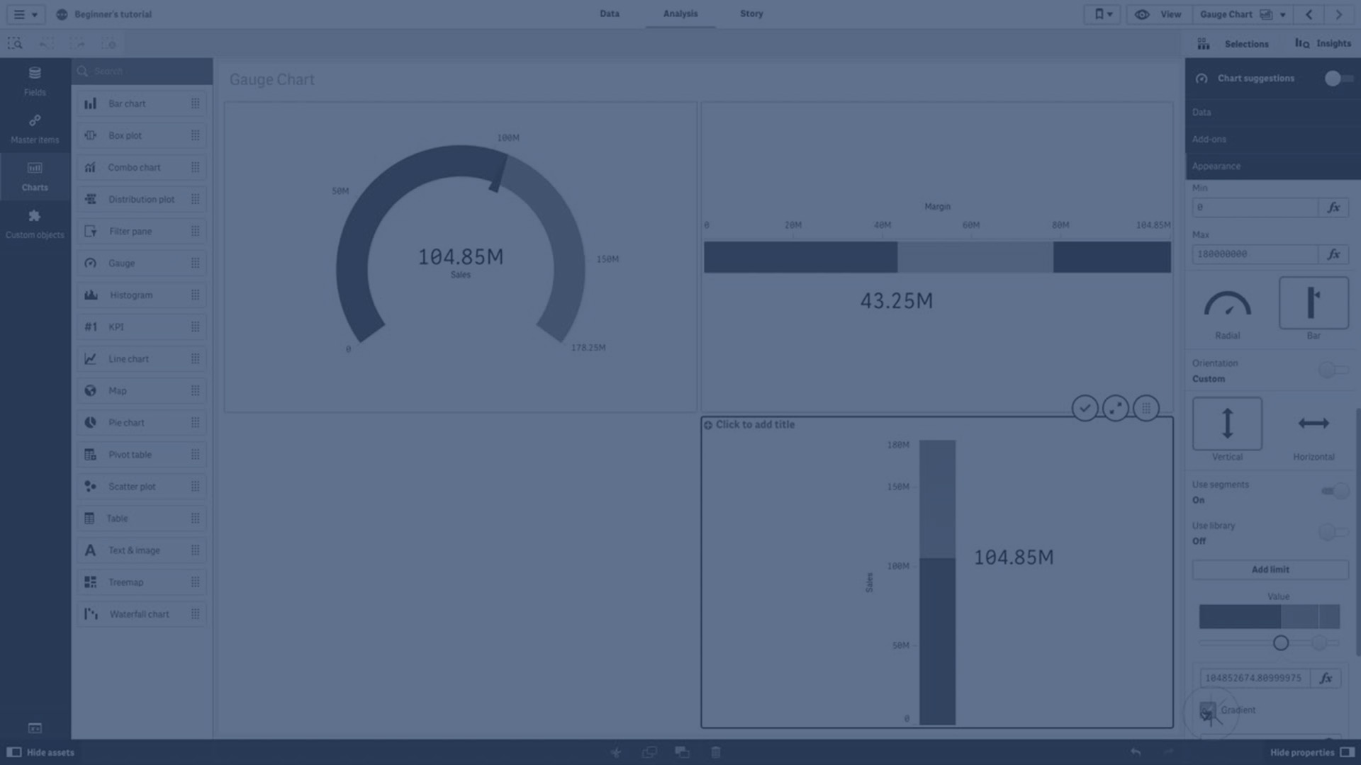
This video provides a comprehensive overview of how to use gauges for data visualization, specifically to display single measure values effectively. It covers the fundamentals of gauges, including setting measure values, defining segment thresholds, adding reference lines, and customizing colors. The tutorial also explains how to present gauges both as radial dials and bar charts, with step-by-step instructions for configuring limits, colors, and orientations. Ideal for creating clear and impactful KPI visualizations on dashboards, this guide ensures you can interpret and present performance results with ease.
⏱️ 0:00 | Introduction to Gauges
🕹️ Explains the purpose of gauges and how they visualize a single measure value along a range with segment thresholds and colors.
⏱️ 0:18 | Defining Thresholds & Reference Lines
📏 How to set segment limits, color segments or gradients, and add reference lines for context.
⏱️ 0:43 | Gauges in Dashboards & KPI Visualization
📊 Discusses the role of gauges on executive dashboards and importance of max/min values for interpretation.
⏱️ 1:12 | Using Expressions for Dynamic Limits
🔢 How to use expressions instead of fixed numbers to calculate limits and thresholds dynamically.
⏱️ 1:33 | Setting Segment Colors
🎨 Step-by-step on adding limits and assigning colors like red and green to gauge segments.
⏱️ 2:03 | Changing Gauge to Bar Style
📉 How to switch the gauge display from radial dial to bar chart and customize appearance.
⏱️ 2:40 | Adding Multiple Limits & Colors to Bar Gauge
🌈 Adding multiple range limits and coloring segments (red, yellow, green) on bar-style gauges.
⏱️ 3:15 | Vertical Bar Gauges & Orientation
↕️ Changing bar orientation from horizontal to vertical and customizing limits and colors.
⏱️ 3:55 | Applying Gradient Colors & Conclusion
🌟 Enabling gradient colors between limits and final wrap-up.