
The Radar chart (Radar chart) displays a two-dimensional chart using radial axes to chart one or more groups of values over multiple variables. Radar charts can be used to visualize and compare performance to a set standard or to a group's performance.
Radar charts requires two dimensions and one measure. The y-axis goes from the center to the perimeter and the x-axis is the perimeter of the chart. Each value represents the distance from the center of the chart, and displays on axes starting from the center. The center of the chart represents the minimum value, and the edge the maximum value.
A radar chart can show multiple series, each separately connected with their values. The data only goes around the chart once. Adding values only increases the chart's granularity.
A selection that is made in a radar chart is confirmed instantly. When applicable, make additional selections one at a time.
Understanding a radar chart
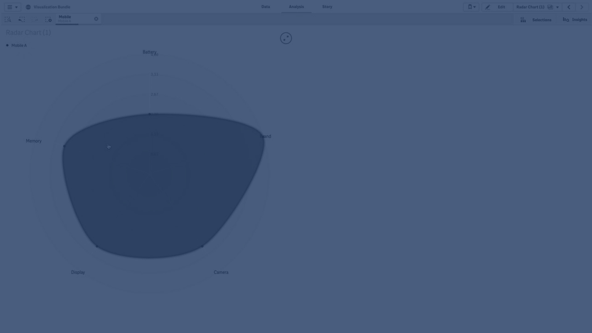
A radar chart consists of evenly spaced segments (axes) arranged radially around a point. There is one segment for each data value of the second dimension. The value of each measure is shown by a node on applicable axis. A line connects the values that belong to the same series creating the chart’s star-like shape.
A radar chart with one axis for each month of the Date.Month dimension.

When to use it
Radar charts let you compare and measure data with an arbitrary number of variables. This is helpful when comparing something's features or performance over several metrics. For example: before buying a computer, you can compare different computers across several features, such as memory storage processing, and screen size. A radar chart is also useful when:
- Measuring quality improvements and performance.
- Comparing allocated amount versus actual spending in an organization.
- Identifying outliers, commonality, and clusters of data with similar values and features.
- Charting an athlete's strengths and weaknesses.
-
Comparing results of small-to-moderate-sized multivariate data sets.
Creating a radar chart
Do the following:
- In the assets panel, open Charts
- Under Visualizations, drag a Radar chart object to the sheet.
- Click Add dimension and select a field or master dimension to use as the first dimension.
- Click Add dimension and select a field or master dimension to use as the second dimension.
- Click Add measure and select a field or master measure to use as the measure.
Styling radar charts
You have a number of styling options available under Appearance in the properties panel.
Click ![]() Styling under Appearance > Presentation to further customize the styling of the chart. You can reset your styles by clicking
Styling under Appearance > Presentation to further customize the styling of the chart. You can reset your styles by clicking ![]() next to each section. Clicking
next to each section. Clicking ![]() Reset all resets styles for all available tabs in the styling panel.
Reset all resets styles for all available tabs in the styling panel.
For general information about styling an individual visualization, see Applying custom styling to a visualization.
Customizing the text
You can set the text for the title, subtitle, and footnote under Appearance > General. To hide these elements, turn off Show titles.
The visibility of the different labels on the chart depends on chart-specific settings and label display options. These can be configured in the properties panel.
You can style the text that appears in the chart.
Do the following:
-
In the properties panel, expand the Appearance section.
-
Under Appearance > Presentation, click
 Styling.
 -
On the General tab, set the font, emphasis style, font size, and color for the following text elements:
-
Title
-
Subtitle
-
Footnote
-
Customizing the background
You can customize the background of the chart. The background can be set by color and image.
Do the following:
-
In the properties panel, expand the Appearance section.
-
Under Appearance > Presentation, click
Styling. -
On the General tab of the styling panel, you can select a background color (single color or expression). You can also set the background to an image from your media library or from a URL.
When using a background color, use the slider to adjust the opacity of the background.
When using a background image, you can adjust image sizing and position.
Customizing the border and shadow
You can customize the border and shadow of the chart.
Do the following:
-
In the properties panel, expand the Appearance section.
-
Under Appearance > Presentation, click
Styling. -
On the General tab of the styling panel, under Border, adjust the Outline size to increase or decrease the border lines around the chart.
-
Select a color for the border.
-
Adjust the Corner radius to control the roundness of the border.
-
Under Shadow in the General tab, select a shadow size and color. Select None to remove the shadow.
Limitations
Radar charts have the following limitations:
- Radar charts can only process 100 unique values per dimension.
- Exported radar charts will not include the chart legend.
- For information about general limitations, see Limitations.