
This example shows how to use a table to compare data which accumulate over a dimension.
Dataset
In this example, we will use a data file available in the Qlik Sense Tutorial - Building an App. Download and expand the tutorial. The file is available in the Tutorials source folder: Sales.xls
To download the file, go to Tutorial - Building an App.
Add the data file to an empty app. The dataset that is loaded contains sales data.
Measure
We use the sales volume as the measure that we create in Master items:
- Sales with the expression Sum(Sales). This is the sum of the sales volume.
Visualization
We add a table to the sheet and set the following data properties:
- Dimension: Year (Date.Year).
- Dimension: Month (Date.Month).
- Measure: Sales; the measure that was previously created.
The following table is created, with columns showing the year, the month, and the sum of sales for each month.
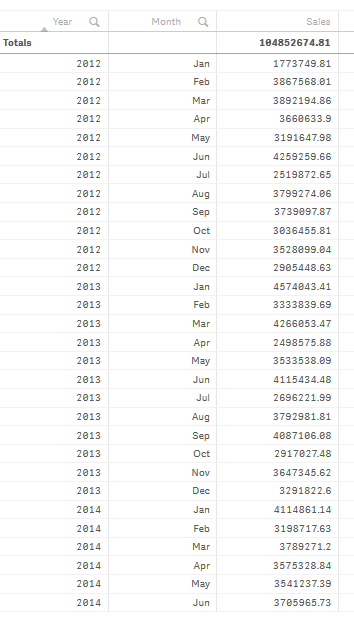
Make sure to set the Sorting with Year > Month > Sales.
Accumulation
To have our sales data accumulate over one dimension, we need to set an additional data property:
- Measure: Sales; the measure that was previously created.
We add this measure twice to reuse it for accumulation. To do this we need to apply a modifier to our Sales measure.
Do the following:
- Under Measure: Sales set the Modifier to Accumulation. This will set the measure to accumulate over one dimension.
- Set the Modifier>Dimension to Month. This sets the dimension over which the accumulation will take place.
-
Make sure Across all dimensions is turned off. We want the accumulation to restart at the beginning of each year.
Our table becomes as follows, with the last column showing sales accumulating from one month to the next, for each year.
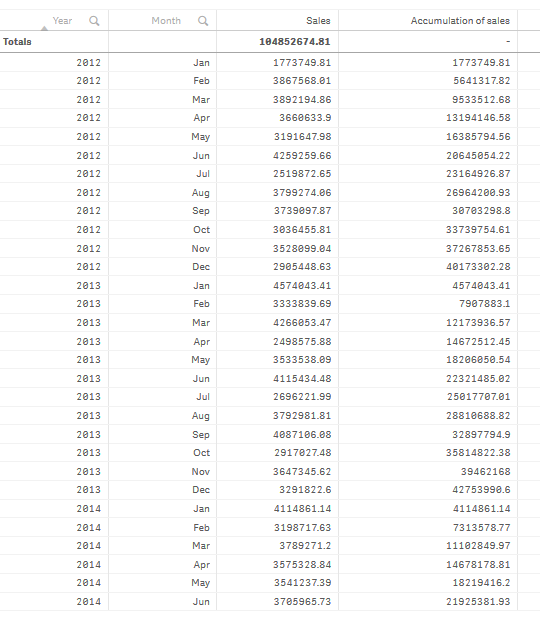
It is good practice to have the title of your charts represent their content. So consider changing the titles of the columns of your table to reflect that the last column contains an accumulation of sales.
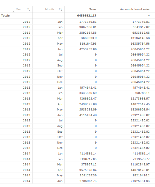
Our data for the year 2014 is insufficient as it stops at June. In order to achieve a better comparison between the accumulated sales of all three years we will choose a more appropriate range of months, from January to June.
Do the following:
- Click Done.
- Select all months from January to June and confirm your selection.
Our table becomes as follows, with the sales accumulating from January to June, inside each year.
Discovery
The table shows the sales volume of each month, grouped into years. By having the sales accumulate inside each year, we get a better understanding of the volume of sales for each year. We have made a selection of the months from January to June, to compare the same range of months between the three years. In the last column of the table we can see that the accumulated sales for 2014 so far have been higher than the accumulated sales for 2012, but not as high as the ones for 2013.