Last updated: 10/15/2026
Warning noteThis feature is considered EXPERIMENTAL and may be subject to change or be removed in future releases.
The array definition property template can be used to add a custom property of array type. When defining a list property, the following fields can be used:
| Field | Description |
|---|---|
| type |
This field is mandatory for array types and should always be defined as array. |
| label | Used for defining the label that is displayed in the property panel. |
| component |
This field should not be used for array types. |
| ref | Name or ID used to reference a property. |
| itemTitleRef | Used for defining the title of the section items. |
| allowAdd |
Boolean. true adds a button for adding new items. |
| allowRemove |
Boolean. true adds an Delete button. |
| addTranslation | Used for defining a label of the button used to add new items. |
| allowMove |
Boolean. true enables the ability to move the accordion item in the properties panel. |
Information noteHypercubes and List objects cannot be added inside array property templates. You must initiate listItems in initialProperties.
Example
Defining a custom array property
Defining a custom property of array type can look like below.
Example:
Information noteCustomization of properties always start with items:.
define( [
],
function ( ) {

	return {
		initialProperties: {
            listItems: []
        },
		definition : {
			type : "items",
			component : "accordion",
			items: {
				settings: {
					uses: "settings",
					items: {
						MyList: {
							type: "array",
                            ref: "listItems",
                            label: "List Items",
                            itemTitleRef: "label",
                            allowAdd: true,
                            allowRemove: true,
                            addTranslation: "Add Item",
                            items: {
                                button: {
									label:"Click me",
									component: "button",
									action: function(data){
										alert("click!");
									}
								},
								label: {
									type: "string",
									ref: "label",
									label: "Label",
									expression: "optional"
								},
								textarea: {
									label:"My textarea",
									component: "textarea",
									maxlength: 100,//you shouldn't write too much
									ref: "myTextarea"
								}
                            }
						}
					}
				}
			}
		},
		paint: function ($element) {
			//add your rendering code here
			$element.html( "props-list" );
		}
	};

} );
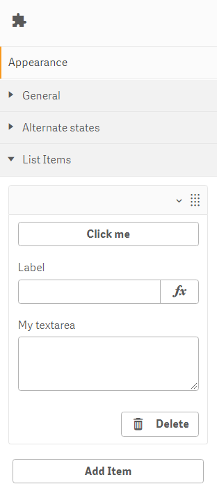
This is what it looks like in the property panel
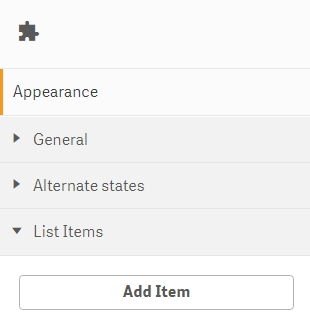
This is what it looks like when an item has been added