
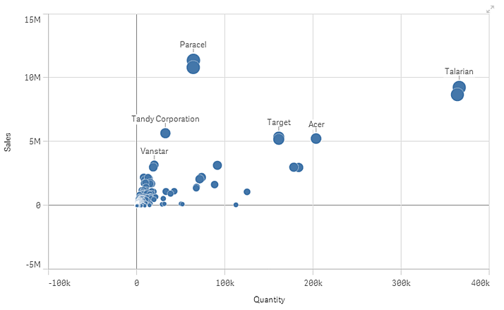
The scatter plot presents pairs of values from two or three measures. This is useful when you want to show data where each instance has two numbers, for example, the relationship between Sales and Quantity per Customer. In this scatter plot, a third measure (Cost) is used to generate the bubble size.
Number of dimensions and measures
In a scatter plot you need one dimension and at least two measures. You can have maximum one dimension and three measures.
Number of plots
For performance reasons, the maximum number of plots that can be displayed is limited. You can reduce the amount of data to display by making selections.
Zooming and panning
In a scatter plot, you can zoom and pan around in your data. The interaction differs depending on what device you are using.
Touch device interaction
On a touch device you pinch apart to zoom and swipe to pan. Plots that are outside the visible range are visualized as small dots along the axis lines.
With a three-finger tap you reset the zoom. You can also reset the zoom by tapping , which appears in the top right corner when you start zooming.
Computer (mouse) interaction
With a computer you use the mouse to zoom and pan in the visualization. Use the scroll wheel to zoom in and out. The zooming is made on the area where the pointer is. Plots that are outside the visible range are visualized as small dots along the axis lines.
You reset the zoom by clicking the scroll wheel or by clicking , which appears in the top right corner when you start zooming. You pan around in the chart by dragging. You also have the option of using the navigation tool that is available in the shortcut menu. Right-click in the scatter plot and select Navigation to open the tool.