
Description
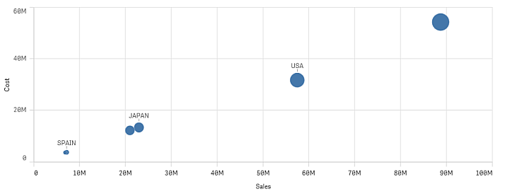
The scatter plot presents values from different measures over one dimension as a collection of points. In most charts, you find your dimension on one of the axes, but for a scatter plot, the dimension is represented by the points in the chart, and the measures are found on each of the two axes. When a third, optional, measure is used, its value is reflected in the bubble size.
When to use it
Scatter plots are ideal when you have a data set with a great many points, thousands or more. The scatter plot helps you find potential relationships between values, and visualize irregularity from a group. The scatter plot is also useful when you want to show data where each instance has two metrics, for example, average life expectancy and average gross domestic product per capita in different countries.
Advantages
The scatter plot is the only chart type that can show the correlation of two or more measures at the same time. The third measure is an efficient way of differentiating between values and simplifying the identification of, for example, large countries, large customers, large quantities, and so on.
Disadvantages
The scatter plot may be difficult to understand for an inexperienced user, because it has measure value on both axes, and the third, optional, measure adds complexity to the interpretation. Make sure a novice can interpret the scatter plot correctly.
Values may be placed on top of each other and not visible until zoomed in.