
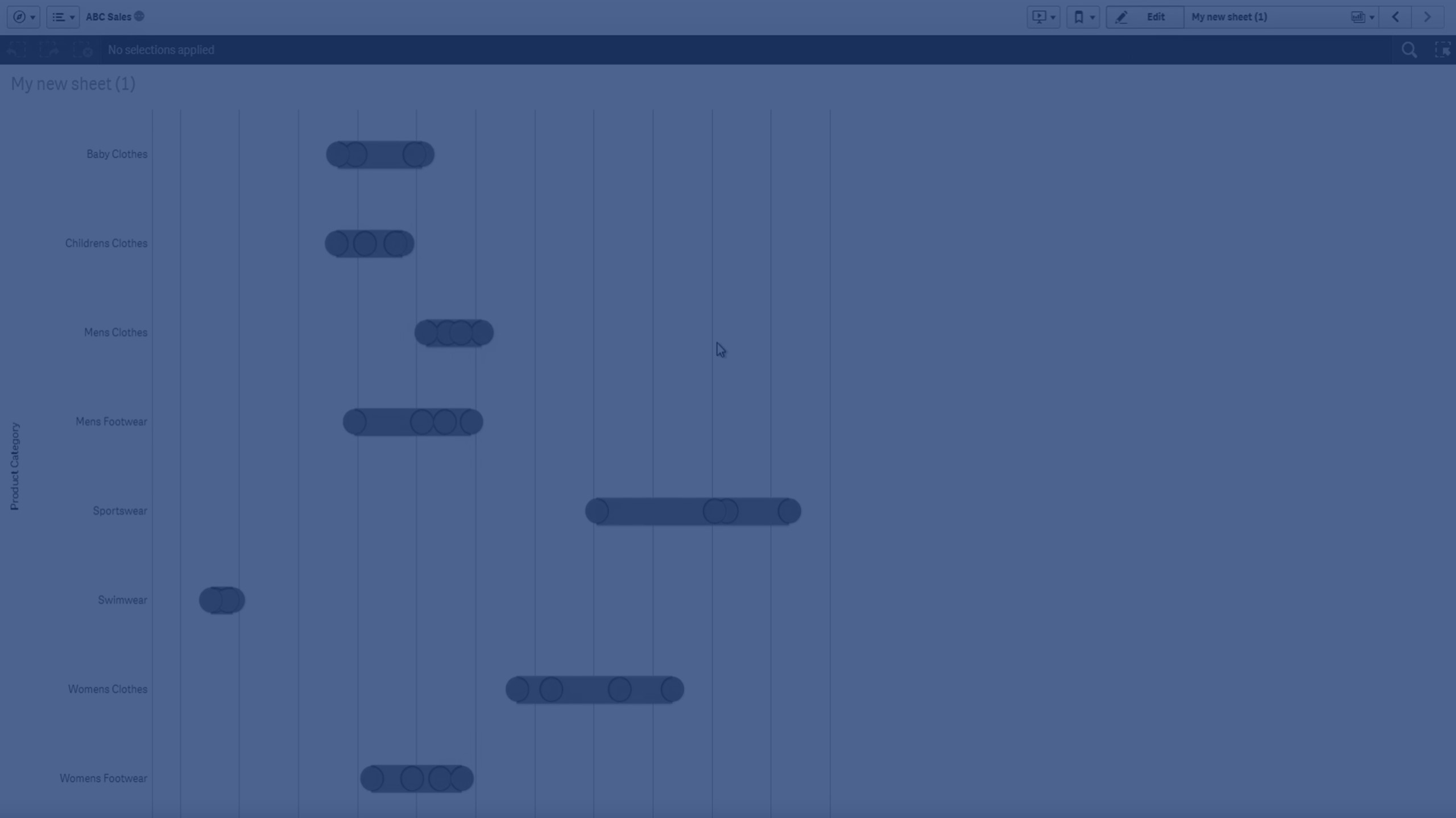
The distribution plot is suitable for comparing range and distribution for groups of numerical data. Data is plotted as value points along an axis.
You can choose to display only the value points to see the distribution of values, a bounding box to see the range of values, or a combination of both as shown here:

When to use it
The distribution plot is suitable for comparing range and distribution for groups of numerical data.
Advantages
The distribution plot visualizes the distribution of data.
Disadvantages
The distribution plot is not relevant for detailed analysis of the data as it deals with a summary of the data distribution.
Creating a distribution plot
You can create a distribution plot on the sheet you are editing.
In a distribution plot you need to use one or two dimensions, and one measure. If you use a single dimension you will receive a single line visualization. If you use two dimensions, you will get one line for each value of the second, or outer, dimension.
Do the following:
- From the assets panel, drag an empty distribution plot to the sheet.
-
Add the first dimension.
This is the inner dimension, which defines the value points.
-
Add a second dimension.
This is the outer dimension, which defines the groups of value points shown on the dimension axis.
-
Click Add measure and create a measure from a field.
Viewing the distribution of measure values in a dimension with a distribution plot
When you have created the distribution plot, you might want to adjust its appearance and other settings in the properties panel. For information about styling, see Styling the distribution plot. For information about customizing other aspects of the chart's appearance, see Changing the appearance of a visualization.
Styling the distribution plot
You have a number of styling options available under Appearance in the properties panel.
Click ![]() Styling under Appearance > Presentation to further customize the styling of the chart. The styling panel contains various sections under the General and Chart tabs. You can reset your styles by clicking
Styling under Appearance > Presentation to further customize the styling of the chart. The styling panel contains various sections under the General and Chart tabs. You can reset your styles by clicking ![]() next to each section. Clicking
next to each section. Clicking ![]() Reset all resets styles in both General and Chart.
Reset all resets styles in both General and Chart.
Customizing the text
You can set the text for the title, subtitle, and footnote under Appearance > General. To hide these elements, turn off Show titles.
The visibility of the different labels on the chart depends on chart-specific settings and label display options. These can be configured in the properties panel.
You can style the text that appears in the chart.
Do the following:
-
In the properties panel, expand the Appearance section.
-
Under Appearance > Presentation, click
 Styling.
 -
On the General tab, set the font, emphasis style, font size, and color for the following text elements:
-
Title
-
Subtitle
-
Footnote
-
-
On the Chart tab, set the font, font size, and color for the following text elements:
-
Axis title: Style the titles on the axes.
-
Axis label: Style the labels on the axes.
-
Legend title: Style the title of the legend.
-
Legend labels: Style the labels of the individual legend items.
-
Customizing the background
You can customize the background of the chart. The background can be set by color or to an image.
Do the following:
-
In the properties panel, expand the Appearance section.
-
Under Appearance > Presentation, click
Styling. -
On the General tab of the styling panel, select a background color (single color or expression) or set the background to an image from your media library.
When using a background image, you can adjust image sizing and position.
Display limitations
Displaying large amounts of data in a distribution plot
When displaying large amounts of data in a distribution plot, the message "Currently showing a limited data set." is shown to indicate that not all data is displayed.
- If the chart uses more than one dimension, 3000 data points are displayed.