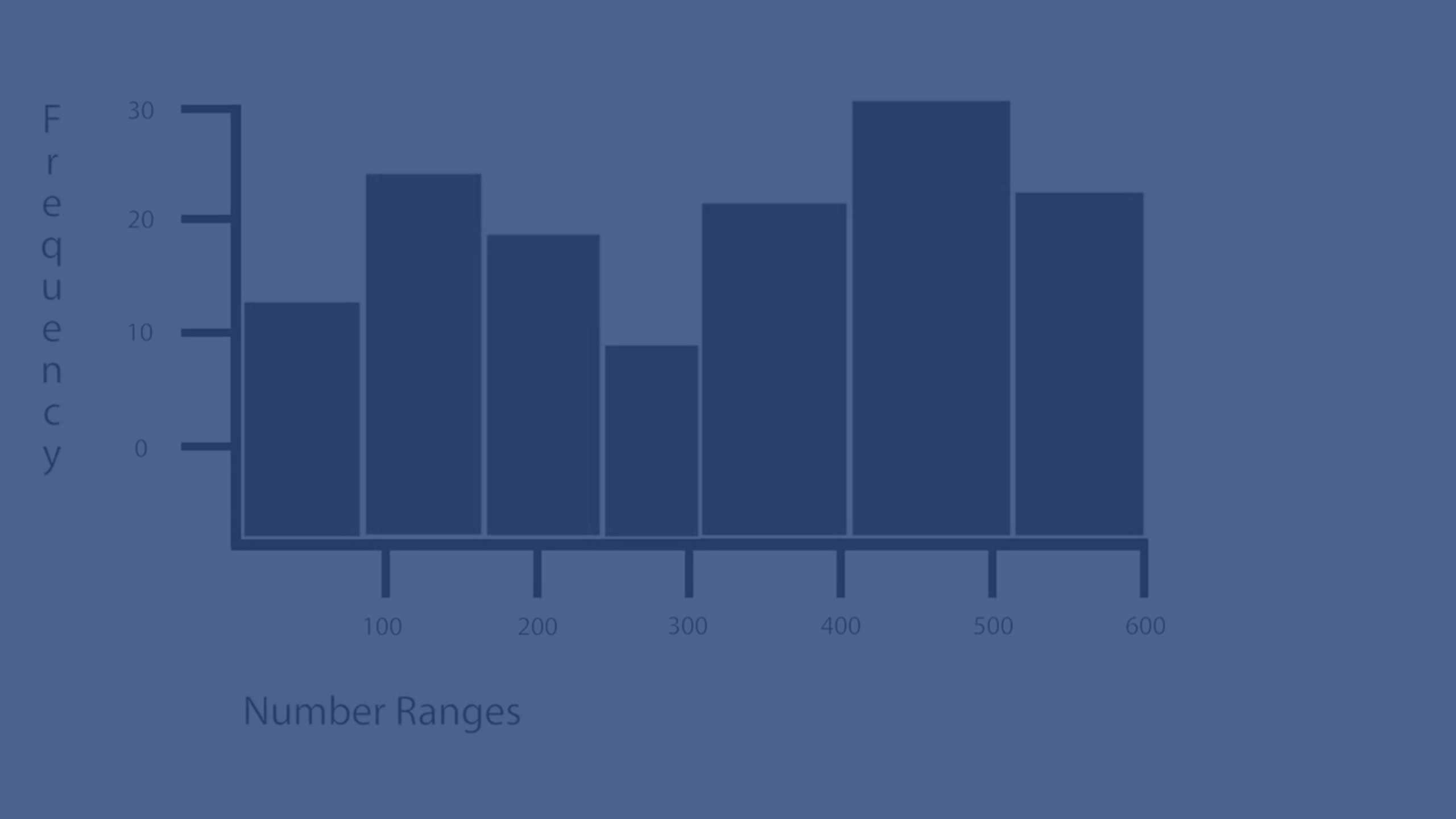
The histogram is suitable for visualizing distribution of numerical data over a continuous interval, or a certain time period. The data is divided into bins, and each bar in a histogram represents the tabulated frequency at each bin.


When to use it
The histogram is suitable for visualizing distribution of numerical data over a continuous interval, or a certain time period.
Advantages
The histogram organizes large amounts of data, and produces a visualization quickly, using a single dimension.
Disadvantages
The histogram is not relevant for detailed analysis of the data as it deals with a summary of the data distribution.
Creating a histogram
You can create a histogram on the sheet you are editing. You can only apply a single dimension to a histogram. Histograms do not need a measure, as the frequency of the binned data is automatically calculated.
Do the following:
- From the assets panel, drag an empty histogram to the sheet.
-
Add the dimension to calculate the frequency on.
When you have created the histogram, you may want to adjust its appearance and other settings in the properties panel. For information about styling, see Styling the histogram. For information about customizing other aspects of the chart's appearance, see Changing the appearance of a visualization.
Dimension limitations
There are some limitations to the dimension used in a histogram.
- The dimension must be a numerical field.
- You cannot use a master dimension that was created using the expression editor, even if the resulting field is numeric.
- The dimension cannot be based on an aggregation function.
Styling the histogram
You have a number of styling options available under Appearance in the properties panel.
Click Styling under Appearance > Presentation to further customize the styling of the chart. The styling panel contains various sections under the General and Chart tabs. You can reset your styles by clicking
next to each section. Clicking
Reset all resets styles in both General and Chart.
Customizing the text
You can set the text for the title, subtitle, and footnote under Appearance > General. To hide these elements, turn off Show titles.
The visibility of the different labels on the chart depends on chart-specific settings and label display options. These can be configured in the properties panel.
You can style the text that appears in the chart.
Do the following:
-
In the properties panel, expand the Appearance section.
-
Under Appearance > Presentation, click
Styling.
-
On the General tab, set the font, emphasis style, font size, and color for the following text elements:
-
Title
-
Subtitle
-
Footnote
-
-
On the Chart tab, set the font, font size, and color for the following text elements:
-
Axis title: Style the titles on the axes.
-
Axis label: Style the labels on the axes.
- Value label: Style the labels displaying the frequency value of each dimension value bin.
-
Customizing the background
You can customize the background of the chart. The background can be set by color or to an image.
Do the following:
-
In the properties panel, expand the Appearance section.
-
Under Appearance > Presentation, click
Styling.
-
On the General tab of the styling panel, select a background color (single color or expression) or set the background to an image from your media library.
When using a background image, you can adjust image sizing and position.
