Tutorial - Time series decomposition in Qlik Sense
This tutorial demonstrates using three chart functions to decompose a time series using the STL algorithm.
This tutorial uses time series data for the number of passengers using an airline per month to demonstrate the functionality of the STL algorithm. The STL_Trend, STL_Seasonal, and STL_Residual chart functions will be used to create the visualizations. For more information about time series decomposition in Qlik Sense, see Time series decomposition functions.
Create an app
Start by creating a new app and importing the dataset into it.
Download this dataset:
Tutorial - Time series decomposition
This file contains data regarding an airline's number of passengers per month.
Do the following:
-
From the hub, click Create new app.
-
Open the app and drop the Tutorial - Time series decomposition.csv file into it.
Prepare and load the data
In order for Qlik Sense to interpret the YearMonth field correctly, you might need to use Data manager to recognize the field as a date field, not a field with string values. Typically this step is handled automatically, but in this case the dates are presented in the slightly uncommon YYYY-MM format.
-
In Data manager, select the table and click
.
-
With the YearMonth field selected, click
and set the Field type to Date.
-
Under Input format, enter YYYY-MM.
-
Under Display format, enter YYYY-MM and click OK.
The field should now show the calendar icon.
-
Click Load data.
Now you are ready to start using the STL functions to visually represent your data.
Create the visualizations
Next, you will create two line charts to demonstrate the functionality of the STL_Trend, STL_Seasonal, and STL_Residual chart functions.
Open a new sheet and give it a title.
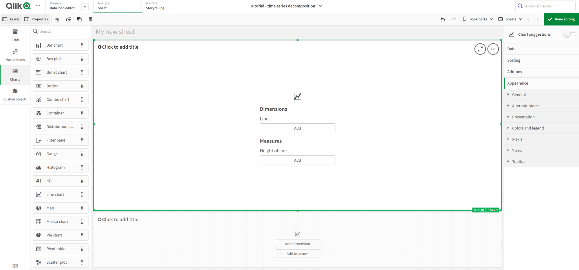
Add two line charts to the sheet. Resize and reposition the charts to match the following image.
Qlik SenseGrid outline of blank app sheet

First line chart: Trend and seasonal components
Do the following:
-
Add the title Seasonal and Trend to the first line chart.
-
Add YearMonth as a dimension, and label it Date.
-
Add the following measure and label it Passengers per month:
=Sum(Passengers)
-
Under Data, expand the Passengers per month measure and click Add trend line.
-
Set the Type to Linear.
You will compare this trend line to the smoothed output of the trend component.
-
Add the following measure to plot the trend component and label it Trend:
=STL_Trend(SUM(Passengers), 12)
-
Next, add the following measure to plot the seasonal component and label it Seasonal:
=STL_Seasonal(SUM(Passengers), 12)
-
Under Appearance > Presentation, set Scroll bar to None.
-
Keep the default colors, or change them to fit your preferences.
Second line chart: Residual component
Next, configure the second line chart. This visualization will display the residual component of the time series.
Do the following:
-
Drag a line chart onto the sheet. Add the title Residual.
-
Add Date as a dimension.
-
Add the following measure and label it Residual:
=STL_Residual(SUM(Passengers), 12)
-
Under Appearance > Presentation, set Scroll bar to None.
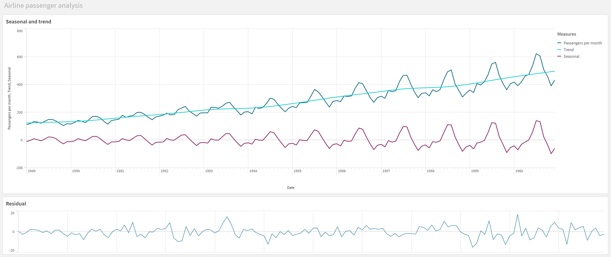
Your sheet should now look like the one below.
Qlik Sense sheet for airline passenger analysis

Interpreting and explaining the data
With the STL chart functions, we can gain a number of insights from our time series data.
Trend component
The statistical information in the trend component is deseasonalized. This makes it easier to see general, non-repeating fluctuations over time. Compared to the straight, linear trend line for Passengers per month, the STL trend component does capture changing trends. It displays some clear deviations while still presenting the information in a readable fashion. The smoothing behaviors in the STL algorithm helped to capture this.
The drops in number of airline passengers that are visible in the STL trend graph can be explained as part of the economic impact of recessions that occurred during the 1950s.
Seasonal component
The detrended seasonal component isolated recurring fluctuations throughout the time series, and removed general trend information from that part of the analysis. We started with a dataset consisting of year-month aggregations. With this data, it is implicit that we are segmenting the data into one-month granules. By defining a period value of 12, we set the chart to model seasonal patterns over the course of one-year (twelve-month) cycles.
In the data, there is a repeated seasonal pattern of surges in airline passengers in the summer months, followed by declines for the winter months. This is aligned with the idea that summer is typically a popular time to take vacations and travel. We also see that over the course of the time series, these seasonal cycles increase drastically in amplitude.
Residual component
The chart for the residual component shows all the information that was not captured in the trend and seasonal decomposition. The residual component includes statistical noise, but it can also indicate an incorrect setting of the STL trend and seasonal function arguments. Generally, if there are periodic oscillations in the residual component of the signal, or the information displayed is clearly not random, it is usually a sign that there is information in the time series not currently captured in the seasonal or trend components. In this case, you need to revisit your definitions of each function argument and possibly change the periodicity.
Smoother values
Since we did not specify any values for the trend and seasonal smoothers, the function will use the default values for these parameters. In Qlik Sense, the default smoother values in the STL algorithm produce effective results. As a result, in most cases, these arguments can be left out of the expressions.
The trend smoother value uses the dimension that is specified in the chart. Since the YearMonth field presents data by months, the trend smoother value will be the number of months. The seasonal smoother will reflect the periodicity defined. In this case, since we defined one period as lasting twelve months (one year), the seasonal smoother value is the number of years. This may sound confusing, but it really means that to find the seasonality, we need to look across a number of seasons. This number is the seasonal smoother.
Other useful information
Given that the seasonal cycles increase in amplitude over time, a more advanced analytics approach could make use of logarithmic functions to create a multiplicative decomposition. In practice, a simple measure of relative amplitude can be created in Qlik Sense by dividing the seasonal by the trend component. When this is done, we notice that over time, the summer peaks of each cycle grow larger in relative amplitude. The amplitude of the winter low points, however, do not increase over time.
