
This example shows how to make a combo chart that visualizes sales data. You will also compare different product groups against two measures with a different scale.
Dataset
In this example, we will use two data files from the Qlik Sense Tutorial - Building an App. To download the files, go to Tutorial - Building an App. Download and unzip the tutorial, and find the files in the Tutorials source folder:
- Sales.xls
- Item master.xls
Create a new app, and add the two data files. Make sure that they are associated by Item Number.
The dataset that is loaded contains sales data. The Item master table holds the information about the items ordered, such as product groups.
Measures
We need to create two measures in Master items:
- Sales volume: with the name Sales, and the expression Sum(Sales).
- Sales margin in percent: with the name Margin %, and the expression Avg(Margin/Sales)*100.
Visualization
We add a combo chart to the sheet and set the following data properties:
- Dimension: Product Group (product group).
- Measure: Sales (the master measure you created).
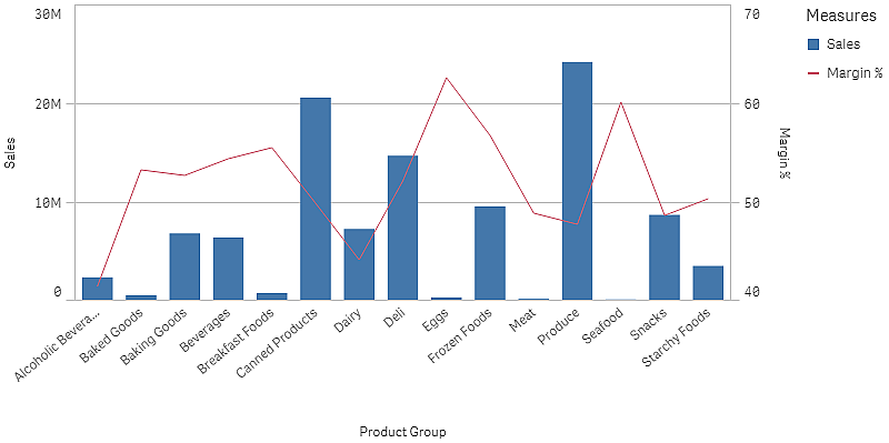
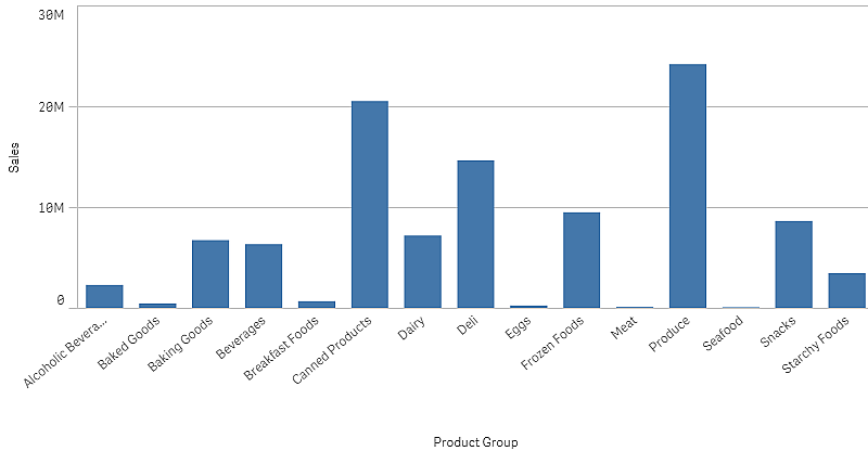
The following chart is created, with a bar showing the sales for each product group. It is a bar chart at this stage.
But we also want to show the sales margin, which has a different scale than the sales volume. Sales volume is in the scale of millions, while the margin is a percentage between 0 and 100. If we add margin as a bar next to sales volume, it would be too small to distinguish.
In the properties pane, go to Measures > Height of line. Use the drop down to add Margin % as a measure.
Discovery
The combo chart visualizes the sales volume and margin of different product groups. You can hover the mouse pointer over a product group and view the details. The bars show the sales volume with the scale to the left, and the line shows the margin with the scale to the right.
In the chart we can see that Produce and Canned Products have the highest sales volumes. Both groups have a lower margin than most other product groups.
Some product groups with low sales volume, like Eggs and Seafood, have a significantly higher margin.