
This example shows how to use a bar chart to visualize sales data which accumulate over a dimension.
Dataset
In this example, we will use a data file available in the Qlik Sense Tutorial - Building an App. Download and expand the tutorial. The file is available in the Tutorials source folder: Sales.xls
To download the file, go to Tutorial - Building an App.
Add the data file to an empty app. The dataset that is loaded contains sales data.
Measure
We use the sales volume as the measure that we create in Master items:
- Sales with the expression Sum(Sales). This is the sum of the sales volume.
Visualization
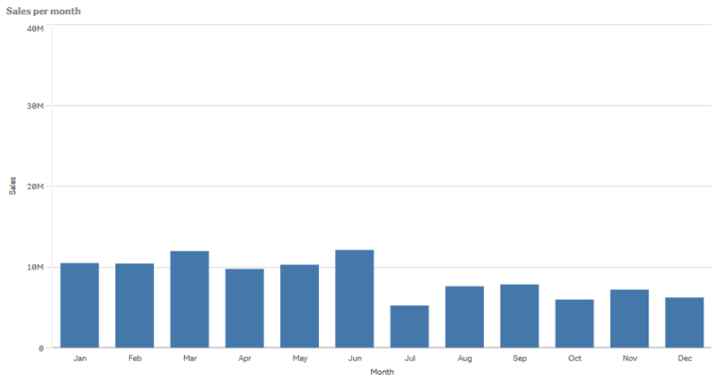
We add a bar chart to the sheet and set the following data properties:
- Dimension: Month (Date.Month).
- Measure: Sales; the measure that was previously created.
The following bar chart is created, with a bar showing the sum of sales for each month.
Accumulation
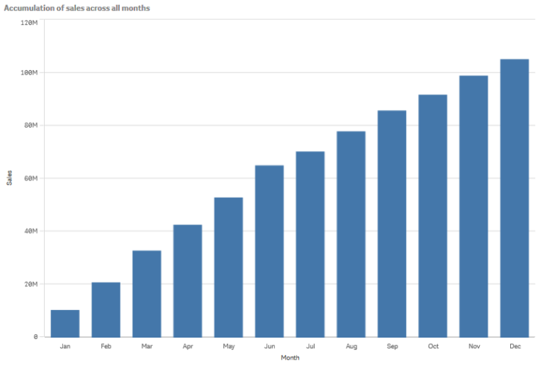
To have our sales data accumulate over one dimension, we need to apply a modifier to our Sales measure.
Do the following:
- Under Measure: Sales set the Modifier to Accumulation. This will set the measure to accumulate over one dimension.
Our bar chart becomes as follows, with the sales accumulating from one month to the next.
We want to achieve a visual separation of the periods of time, by adding the Quarter as a second dimension. The Quarter field groups the month bars into larger groups. By default, a grouped chart is selected when adding a second dimension.
Do the following:
- Add Dimension: Quarter (Date.Quarter).
- Under Measure: Sales set the Modifier>Dimension to Month. This sets the dimension over which the accumulation will take place.
If Across all dimensions is turned on, the accumulation continues across all quarters.
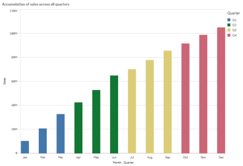
Notice how the bars of the previous two bar charts are the same.
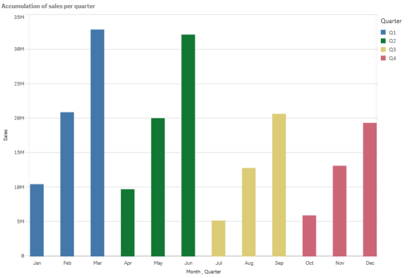
If Across all dimensions is turned off, the accumulation starts again at the beginning of each quarter. Our bar chart becomes as follows, with the sales accumulating from one month to the next, inside each quarter.
It is good practice to have the title of your charts represent their content. So consider changing the title of your new bar chart to reflect that the bars are now an accumulation of sales.
Discovery
The bar chart visualizes the sales volume of each month, grouped into quarters. By having the sales accumulate inside each quarter, we get a better understanding of the volume of sales for each quarter. You can hover the mouse pointer over a month and view the details.
In the bar chart we can see that Q1 has the highest sales volume. We can also see that even though Q4 had the lowest sales volume, the first two months of the quarter were better than the ones from Q3.