Creating pie charts
This section describes how to create pie charts with the Visualization API and qlik-visual.
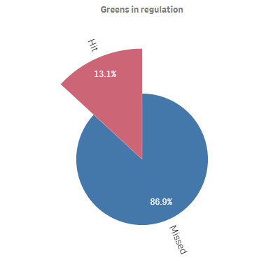
Creating a basic pie chart
In this example we create a basic pie chart, containing one dimension and one measure, and switch the titles off.
- Create the chart
Create the container for the chart. The visualization type is piechart.
Visualization API
app.visualization.create(
  'piechart',
  [],
  {}
)
qlik-visual
<qlik-visual appid="Tutorial-Golf.qvf" type="piechart" cols='[]' options='{}' > </qlik-visual> - Define dimension
Define the dimension as a column.
[ { "qDef": { "qFieldDefs": [ "GirResult" ], "qFieldLabels": [ "Greens in regulation" ] } } ] - Define measure
Define the measure as a column.
[ { "qDef": { "qFieldDefs": [ "GirResult" ], "qFieldLabels": [ "Greens in regulation" ] } }, "=Count(HoID)" ] - Switch off titles
Since the dimension label by default is visible in the visualization, we select to switch the titles off.
{ "showTitles": false }
Result
Code examples
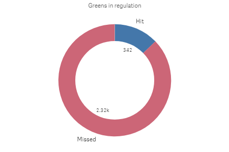
Creating a basic donut chart
In this example we create exactly the same chart as in Creating a basic pie chart, but we select to display it as a donut. This is done by simply adding the donut definition in the options.
- Define dimension
Define the dimension as a column.
[ { "qDef": { "qFieldDefs": [ "GirResult" ], "qFieldLabels": [ "Greens in regulation" ] } } ] - Define measure
Define the measure as a column.
[ { "qDef": { "qFieldDefs": [ "GirResult" ], "qFieldLabels": [ "Greens in regulation" ] } }, "=Count(HoID)" ] - Switch off titles
Since the dimension label by default is visible in the visualization, we select to switch the titles off.
{ "showTitles": false } - Display as donut
Since the dimension label by default is visible in the visualization, we select to switch the titles off.
{ "showTitles": false, "donut": { "showAsDonut": true } }
Result

Code examples
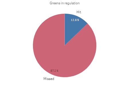
Using custom value labels
In this example we change so that the value labels are presented by their actual value instead of in percent.
- Change number formatting of measure
First we change the number formatting of the measure in the columns. Set "qType": "F" to indicate that a fixed number of decimals is used. Then set "qnDec": 0 to indicate that no decimals are used.
{ "qDef": { "qLabel": "Frequency", "qGrouping": "N", "qDef": "Count(HoID)", "qNumFormat": { "qType": "F", "qnDec": 0, "qUseThou": 0, "qFmt": "#,##0", "qDec": ".", "qThou": "," } } } - Define value label mode
We want to display the actual values instead of the share so inside the dataPoint object (in the options) we set "labelMode": "value".
{ "showTitles": false, "donut": { "showAsDonut": true }, "dataPoint": { "auto": false, "labelMode": "value" } }
Result
Code examples
Adding a radius measure
In this example we add a second measure to calculate the radius. The measure added is the average Stableford points.
- Create the chart
Create the container for the chart. The visualization type is piechart.
Visualization API
app.visualization.create(
  'piechart',
  [],
  {}
)
qlik-visual
<qlik-visual appid="Tutorial-Golf.qvf" type="piechart" cols='[]' options='{}' > </qlik-visual> - Define dimension
Define the dimension as a column.
[ { "qDef": { "qFieldDefs": [ "GirResult" ], "qFieldLabels": [ "Greens in regulation" ] } } ] - Define the first measure
Define the first measure as a column.
[ { "qDef": { "qFieldDefs": [ "GirResult" ], "qFieldLabels": [ "Greens in regulation" ] } }, "=Count(HoID)" ] - Define the second measure
Define the second measure as a column.
[ { "qDef": { "qFieldDefs": [ "GirResult" ], "qFieldLabels": [ "Greens in regulation" ] } }, "=Count(HoID)", "=Avg(Stableford)" ] - Switch off titles
Since the dimension label by default is visible in the visualization, we select to switch the titles off.
{ "showTitles": false }
Result