The switch definition property template can be used to add a custom property of switch type. When defining a switch property, the following fields can be used:
| Field | Description |
|---|---|
| type |
Used for all custom property type definitions. Can be either string, integer, number, array or boolean. This field is mandatory and should always be "boolean" for a switch property type definition. Information noteThe switch effect is achieved by defining the component field to "switch", see below.
|
| component | Used for defining how the property is visualized in the property panel. Used to override the default component that comes with the type setting. This field is mandatory for a switch property and should always be "switch". |
| label | Used for defining the label that is displayed in the property panel. |
| ref | Name or ID used to reference a property. |
| defaultValue | Used for defining the default value of your custom property. |
| options |
Array of options. Can be value and label. Example: |
Examples
Defining a custom property of switch type can look like below.
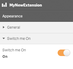
Example: Add custom switch property to Appearance accordion
	return {
		type: "items",
		component: "accordion",
		items: {
		settings: {
				uses: "settings",
				items: {
					MySwitchProp: {
						type: "boolean",
						component: "switch",
						label: "Switch me On",
						ref: "myproperties.border",
						options: [{
							value: true,
							label: "On"
						}, {
							value: false,
							label: "Not On"
						}],
						defaultValue: true
					}
				}
			}
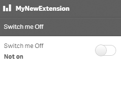
You can also define a new accordion item as a switch property.
Example: Add custom switch property as a new accordion item
	return {
		type: "items",
		component: "accordion",
		items: {
			MyAccordion: {
				type: "boolean",
				component: "switch",
				label: "Switch me Off",
				ref: "myproperties.border",
				options: [{
					value: true,
					label: "On"
				}, {
					value: false,
					label: "Not on"
				}],
				defaultValue: false
			}