The button group definition property template can be used to add a custom property of radio button type. When defining a button group property, the following fields can be used:
| Field | Description |
|---|---|
| type |
Used for all custom property type definitions. Can be either string, integer, number, array or boolean. This field is mandatory and should always be "string" for a button group property type definition. Information noteThe button effect is achieved by defining the component field to "buttongroup", see below.
|
| component | Used for defining how the property is visualized in the property panel. Used to override the default component that comes with the type setting. This field is mandatory for a radio button property and should always be "buttongroup". |
| label | Used for defining the label that is displayed in the property panel. |
| ref | Name or ID used to reference a property. |
| defaultValue | Used for defining the default value of your custom property. |
| options |
Array of options to use for dropdown, radiobuttons, buttongroup or switch components. For buttongroup it can be value, label and tooltip. Example |
Examples
Fetching options from an external resource
return {
type: "items",
component: "accordion",
items: {
settings: {
uses: "settings",
items: {
MyDropdownProp: {
type: "string",
component: "dropdown",
label: "Data source",
ref: "myproperties.datasource",
options: function() {
return $.get("datasource.php").then(function(items){
return items.map(function(item){
return {
value:item.toLowerCase(),
label:item
};
});
});
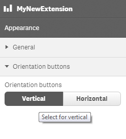
}Defining a custom button group
Defining a custom property of button group type can look like below.
Example: Add custom button group property to Appearance accordion
return {
type: "items",
component: "accordion",
items: {
settings: {
uses: "settings",
items: {
MyButtongroupProp: {
type: "string",
component: "buttongroup",
label: "Orientation buttons",
ref: "myproperties.orientation",
options: [{
	value: "v",
	label: "Vertical",
	tooltip: "Select for vertical"
}, {
	value: "h",
	label: "Horizontal",
	tooltip: "Select for horizontal"
}],
defaultValue: "v"
}
}
}
You can also define a new accordion item as a button group property.
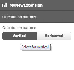
Example: Add custom button group property as a new accordion item
	return {
		type: "items",
		component: "accordion",
		items: {
			MyAccordion: {
				type: "string",
				component: "buttongroup",
				label: "Orientation buttons",
				ref: "myproperties.orientation",
				options: [{
					value: "v",
					label: "Vertical",
					tooltip: "Select for vertical"
				}, {
					value: "h",
					label: "Horizontal",
					tooltip: "Select for vertical"
				}],
				defaultValue: "v"
			}