Text property definition
Information noteSTABLE.
This API is reliable and breaking changes are unlikely.
This API is reliable and breaking changes are unlikely.
Fields
The text definition property template can be used to add a custom property of text type. When defining a text property, the following fields can be used:
type
This field is optional for links. Can be either string, integer, number, array or boolean.
Information noteThe link effect is achieved by defining the component field to "text", see below.
component
Used for defining how the property is visualized in the property panel. Used to override the default component that comes with the type setting.
This field is mandatory for a link property and should always be "text".
label
Used for defining the label that is displayed on the link.
Example
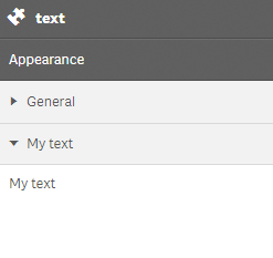
Defining a custom text
Defining a custom property of text type can look like below.
Example:
Information noteCustomization of properties always start with items:.
define( [
],
function ( ) {
return {
definition : {
type : "items",
component : "accordion",
items: {
settings: {
uses: "settings",
items: {
MyText: {
label:"My text",
component: "text"
}
}
}
}
},
paint: function ($element) {
//add your rendering code here
$element.html( "props-text" );
}
};
} );This is what it looks like in the property panel